|
|
|
Showing 4241 - 4250 of ~4957 |
| Image |
Comment |
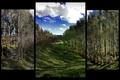
| 11/14/2005 06:46:37 AM | My Backyardby banditComment: 6 - Very nice. Criticism; although I can see the effect of the side panels, to me, given that the 'rows' are such a feature in this shot, to somehow have incorporated, or rather not cropped, the tips of the fore trees, would have made this better in my opinion. Whether by a different choice of sized frame, or higher placement, or even full length, not sure. |  Photographer found comment helpful. Photographer found comment helpful. |
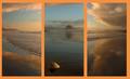
| 11/14/2005 06:38:59 AM | beach sunsetby beafliesComment: 5 - Good concept. Criticism; the framing color dominates and detracts from the colors and detail in your shots in my opinion. Like to see #2 with sharper focus on the shell, or perhaps just 'closer' to the shell/sharper angle, not sure. The feel within the shots is nice, especially the first, with the edge of the water coupled with the reflection, but I do not think #3 complements it, as the edge of the water is visually much further back, even though it also has a good reflection. |
| 11/14/2005 06:34:28 AM | Profile of a Manby Joey LawrenceComment: 7 - Good selection and good character. Criticism; tones work well on 1 & 3, 2 undecided on, like the shot, but doesn't 'flow' with the other two in my opinion, not because of the 'character', but the contrast/effect/'feel' - might be the denim/clothing, darker colors, not sure. Hard to explain but I tried. | | Photographer found comment helpful. |
| 11/11/2005 09:34:43 PM | Walking through a Postcard by seriocomicComment: 5 - Ok, the clouds and sky look amazing, colors are nice and rich, but, criticism; whilst no expert on 'Landscapes', to me this is more about the sky, and there is not enough 'land' (or even land/ocean) incorporated in this shot. A sharper perspective perhaps, ground up, not sure, may have made this a better shot for the Challenge. Down to 5 from 6 on 'review', based on my above comments and learning of 'landscapes', tough call for this Challenge. | | Photographer found comment helpful. |
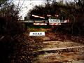
| 11/11/2005 09:27:46 PM | At the Dimming of the Dayby susiComment: 7 - Nice scene. Criticism; undecided, but likely would prefer it with more height, especially with the road/lines, but realize you were probably going for this framing, just that the 640w restrictions do not do justice to this shot. Nice colors, and as mentioned, like the 'lines' and use of them. |
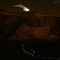
| 11/11/2005 09:15:59 PM | River of Lightby riotComment: 8 - Great shot. Criticism; difficult as I am not sure how you did this nor the time of day it was, and am certainly no expert in lighting, but would like to have been able to discern more 'color' in the volcano/mountain. Also to see the 'river' enhanced more, 'somehow', even just the color, would have been great. Perhaps a slightly tighter crop on the left, incorporating a fraction more on the right (dependent of course what is there), may have made this even better in my opinion. Certainly unique in the Challenge. As for a 'true landscape', again no expert on that, but sure comes close, just 'different' in my opinion. edit: post challenge - you fooled me - I had no idea - but I just learnt more about long exposure - thanks Message edited by author 2005-11-16 00:33:08. | | Photographer found comment helpful. |
| 11/11/2005 09:07:35 PM | Where to now?by linda12201Comment: 7 - One of the best for this Challenge in my opinion. Like the colors and view but the sky seems a bit 'blown'. |
| 11/11/2005 09:06:50 PM | | | Photographer found comment helpful. |
| 11/11/2005 09:06:34 PM | Autumn impasseby nico_blueComment: 7 - Good find for the Challenge. Criticism; like the rich colors but the 'dead end' seems to have become slightly lost in the contrast(?) effects, etc. | | Photographer found comment helpful. |
| 11/11/2005 09:05:47 PM | Death by fallby coraanneComment: 6 - Apt for the Challenge. Criticism; would like to have seen a different angle and perhaps crop, not sure. |
|
Showing 4241 - 4250 of ~4957 |
Home -
Challenges -
Community -
League -
Photos -
Cameras -
Lenses -
Learn -
Help -
Terms of Use -
Privacy -
Top ^
DPChallenge, and website content and design, Copyright © 2001-2026 Challenging Technologies, LLC.
All digital photo copyrights belong to the photographers and may not be used without permission.
Current Server Time: 07/22/2026 03:49:49 AM EDT.
|