|
|
|
Showing 4181 - 4190 of ~4957 |
| Image |
Comment |
| 11/19/2005 10:04:09 PM | Three strikes and you're a gonerby M.O.C.Comment: 6 - Like the concept. Criticism; like to see more 'context', but difficult depending how you did this. I am assuming car headlights, so good idea, just like to see perhaps a little sharper, especially in the fore sign, perhaps a slightly different 'composition' too, not sure. |  Photographer found comment helpful. Photographer found comment helpful. |
| 11/19/2005 10:02:59 PM | Autumn Redby mexicoComment: 6 - Nice color capture. Criticism; stronger light, especially for the Challenge, as well as bringing out the texture and detail in the leaf, would have made this better in my opinion. | | Photographer found comment helpful. |
| 11/19/2005 10:02:17 PM | Leaf Lightby PoobaComment: 7 - Like it. Criticism; not much, maybe even stronger lighting, allowing the veins and detail to be brought out to their full potential more. | | Photographer found comment helpful. |
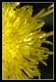
| 11/19/2005 10:01:25 PM | Rays of Lightby flip89Comment: 6 - Like this. Criticism; looks like sunlight, trust it's artificial. Not sure on the frame, likely detracts in my opinion, especially with this cropping which, while gives good detail to the unusual petals, also doesn't allow for the full 'dramatic' potential of them, especially coupled with the light, for the Challenge. Perhaps more 'length', ie more 'space' on the right, would have made this better in my opinion. Good color. |
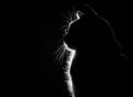
| 11/19/2005 09:57:00 PM | Purrrrfect Silhouette by dmmontyComment: 7 - Like this. Criticism; difficult, but I wonder about a different framing, perhaps vertical, but the horizontal works well here so who knows. I am sure you are aware of the 'specks' in front of the cat. Maybe, just the 'front' lit up, and the 'back' not visible at all may have given this an edge, but I do like the slight 'touch' on the back giving shape and context so who knows, just make them different, but still good, shots. edit:typos & congratulations Message edited by author 2005-11-23 00:59:34. | | Photographer found comment helpful. |
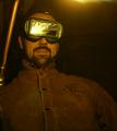
| 11/19/2005 09:54:48 PM | The Welderby russbbrinkComment: 7 - Good concept. Criticism; not much, maybe slightly darker allowing more 'drama' from the sparks reflection in the goggles and possibly a cropping out of the top right 'light', not sure. The colors are good. | | Photographer found comment helpful. |
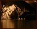
| 11/19/2005 09:53:44 PM | Sleeping beautyby theantonComment: 7 - Like this and the potential. Criticism; although I know difficult with the black of the dog and the 'shine'/contrast issues, just a touch too bright/shiny on his(?) face in my opinion and either he(?) is a very good 'faker' or you did very well to capture (sneak up on) him asleep. Really like the effect against the floor(?), just wish that the left side 'something' near his face were cropped (but I don't imagine you got too many chances with this shot), and that maybe the nose and 'up' were sharper focus, and as I said, the 'lighting'. Maybe the slightest nudge rotation up on the right, who knows. | | Photographer found comment helpful. |
| 11/19/2005 09:50:45 PM | Ready for Bedby CalliopeKelComment: 6 - Good 'feel'/moment capture. Criticism; the fabric(?) behind the dog's head, slightly detracts from the 'dramatic feel' / outline of the dog, perhaps a slightly different crop/composition, not sure. | | Photographer found comment helpful. |
| 11/19/2005 09:49:35 PM | Curlicueby DrAchooComment: 7 - Like this. Good concept. Good capture / lighting on the steam. Criticism; difficult, maybe slightly more 'dramatic lighting' (not so centered), not sure. Also possibly a slightly different 'composition' too, may have made this a better shot. | | Photographer found comment helpful. |
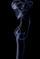
| 11/19/2005 09:44:00 PM | Sophisticationby photogenixComment: 8 - Good shot, good color and good capture. The title is apt and I think this shot also lends itself to other titles, including a possible 'silhouette' visible in the smoke. Criticism; not much, maybe even more vivid, but this is good like this. Perhaps a slightly different 'composition', possibly with more space on the right, not sure, and of course depending what the 'top' looked like and what you had to work with, the inclusion of more 'swirl' up the top may have also made this better in my opinion. |
|
Showing 4181 - 4190 of ~4957 |
Home -
Challenges -
Community -
League -
Photos -
Cameras -
Lenses -
Learn -
Help -
Terms of Use -
Privacy -
Top ^
DPChallenge, and website content and design, Copyright © 2001-2026 Challenging Technologies, LLC.
All digital photo copyrights belong to the photographers and may not be used without permission.
Current Server Time: 07/22/2026 06:25:43 AM EDT.
|