| Image |
Comment |
| 12/08/2005 08:34:44 PM |
Free Study Outtake Iby tonyvComment: '7' possibly even '8', like this. Gave the 'real entry' a 6 (wasn't enough detail in the main subject for me). |
 Photographer found comment helpful. Photographer found comment helpful. |
| 12/08/2005 08:32:12 PM |
chicagob&w.jpgby sabphotoComment: '5/6' - Real entry got 4. This seems crooked at a quick look, but could be perspective and reflections/shadows etc. |
| 12/08/2005 08:31:31 PM |
|
| 12/08/2005 08:28:24 PM |
|
| Photographer found comment helpful. |
| 12/08/2005 08:27:53 PM |
Free Study IX - Alternate Versionby ShaneBlakeComment: '5/6' - Hypothetically. Gave the 'real entry' 6. Like the colors in this better, but it has a 'raw/grainy' feel to it in my opinion etc. As with the other, seemed the horizon was not straight, but could just be the perspective/angle. |
| Photographer found comment helpful. |
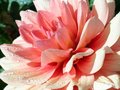
| 12/08/2005 05:21:48 PM |
dahlia, I think.jpgby rachelellenComment: I think it is a dahlia too. Judging by the 'off' green in the background it seems that the colors are not 'natural'. Possibly some 'blown' issues in the lighter areas on the petals, not sure. Perhaps a slightly more 'balanced' composition too may have made this better in my opinion. |
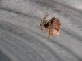
| 12/08/2005 05:19:25 PM |
spider in a culvert.JPGby rachelellenComment: Good perspective and potential. Nice colors - nice and simple. Needs better focus/sharper. Perhaps just too close, who knows. |
| 12/08/2005 04:12:42 PM |
Clarityby JennAppleComment: You are a member - I'd be interested in seeing this at 640 width (if possible) posted in your portfolio. I like the colors and think it has potential bigger. edit: thank you for posting the other version, I left a comment Message edited by author 2005-12-17 17:43:38. |
| Photographer found comment helpful. |
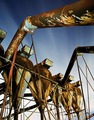
| 12/06/2005 11:55:05 PM |
Night Shiftby labudsComment: 9 - Very good. You made me clean my monitor twice until I saw your title. Criticism; not much, perhaps a bit more detail/sharper focus on one of those pipes, especially that dominant 'overhanging' one (but then you'd likely lose your 'night sky effect' so who knows) may have made this even better in my opinion. Perhaps a slightly different crop, trying to gain more 'balance', but again with the sky issues so who knows. Nice overall 'feel', like to see the 'rust' even more vivid as well. Possibly even a touch more 'darkness' somewhere, especially given your (good and apt) title. Up to 9 from 8. |
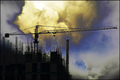
| 12/06/2005 11:53:03 PM |
Stalled by Natureby davidus428Comment: 9 - Excellent. Criticism; even though I'm assuming you've gone for the 'horizontal framing' on purpose, I think 640 height too would make this even better, especially in this restrictive medium. Good colors, shadowing. Title is a little lost on me but doesn't seem to be a 'forced one' so minor. Perhaps just a little more detail, especially in the steel framing, but again, likely is but not discernable at this size. Up to 9 from 8. |
Home -
Challenges -
Community -
League -
Photos -
Cameras -
Lenses -
Learn -
Help -
Terms of Use -
Privacy -
Top ^
DPChallenge, and website content and design, Copyright © 2001-2026 Challenging Technologies, LLC.
All digital photo copyrights belong to the photographers and may not be used without permission.
Current Server Time: 07/23/2026 03:28:16 PM EDT.