|
|
|
Showing 3751 - 3760 of ~4957 |
| Image |
Comment |
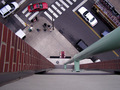
| 12/22/2005 11:33:57 PM | Altiphobia from the 9th Floorby _eugComment: 7 - Good perspective and composition. Criticism; not much, looks like it needs 'straightening', but just may be the angle. Coloring is good, as are the 'elements'; people grouped, bus, etc. Maybe a slight crop variation may have helped make this even better, not sure. |  Photographer found comment helpful. Photographer found comment helpful. |
| 12/22/2005 11:30:58 PM | Taphephobia by fadedbeautyComment: 8 - Very good. Criticism; the horizontal framing works well, but perhaps for 'here' and more impact, more height/'space' at the top/bottom may have made this even better in my opinion. | | Photographer found comment helpful. |
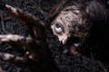
| 12/22/2005 10:56:58 PM | Mr. Agrizoophobia (In the wild, not taken in a zoo)by terjeComment: 7 - Good capture, nice 'fore' and background bokeh, good color and reflection as well. Criticism; think this has more potential (depending of course what you had to work with). Firstly the 3 extra pixels would have helped (this is 637), also, a nudge rotation up on the left, (or even going the other way and more diagonal) and a variation in the cropping, and as mentioned the size, would have made this even better in my opinion. | | Photographer found comment helpful. |
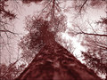
| 12/22/2005 10:51:29 PM | Dendrophobia... fear in the middle of the forestby greslizzzComment: 7 - Good shot and perspective. Looks almost dead straight. Criticism; angle adjustment to get it perfectly symmetrical if possible and perhaps a slightly tighter crop at the bottom to allow the focus sharper 'sooner' when 'looking upwards' (if that makes sense), may have made this better in my opinion. | | Photographer found comment helpful. |
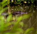
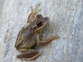
| 12/22/2005 08:12:34 PM | Marble-Frog.jpgby rox_roxComment: Nice capture, perspective and colors. Perhaps a little tighter crop on the left may have made this even better, not sure. Good seemingly natural lighting showing the skin texture quite well. 'If only' the eye were a little sharper, make this even better in my opinion, but you likely know that. | | Photographer found comment helpful. |
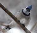
| 12/22/2005 07:53:47 PM | IMG_3163.jpgby Rando D300Comment: Like the angle, colors, bokeh and pose. 'If only' the beak/eyes/etc were a little sharper, but you know that, plus.. 'opportunity'. Perhaps a crop variation to get the branch diagonally symmetrical, but minor and your call, obviously. Nice capture. | | Photographer found comment helpful. |
| 12/22/2005 03:41:33 PM | | | Photographer found comment helpful. |
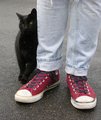
| 12/22/2005 02:59:52 PM | Mineby melismaticaComment: Like the colors and composition. I think that if this were more tightly cropped at the top to eliminate that 'white' mark and the cat was in focus and the main 'feature' here (rather than the jeans/shoes), would have made this better in my opinion. A different angle, again - to get the cat at a different, more dominant angle, would likely have helped too, but depends what you were trying to achieve. | | Photographer found comment helpful. |
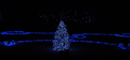
| 12/22/2005 02:55:46 PM | Christmas Crystalsby o2bskatingComment: Gave this a 3. The color was nice and the composition fairly well balanced. Criticism; depending what you had to work with, a slight variation in the crop to give more balance and symmetry may have made this better in my opinion. No expert on photography, especially long exposures (nor do I know what camera settings you have etc), but looking briefly at your settings, and from what I am learning on, eg; ISO, perhaps if you used a lower ISO that may have helped reduce the grain, not sure (I would suggest if you were interested in improving your night shots to research what your camera can do and how you can best use the features to try to achieve your desired shot). Depending also the 'access' to this scene, I think that a slightly sharper (ground level) perspective/angle may have worked better, or else just 'further to the left' to allow the tree to become more centered. If the size were 640 width would have been better (especially for 'here', try to 'show' your shot at the highest dimensions (640 width or height or both)), but again, if the quality was like this would only have 'enhanced' that grain that I can see remnants of here at this size. There are also two 'unusual dark shapes' under the tree, which slightly detracted, but minor. This Challenge was advanced editing, so perhaps you could have 'softened' the grain/dark areas, or just generally tried to 'manipulate' various parts of the image using the tools available to you (in whatever pp program you use), to try to achieve the type of shot you envisioned. Finally, this being a 'Holiday Catalog' Challenge, my interpretation (and many interpret Challenges differently) was that the shot would be something you would see in a Holiday (Christmas) Catalog. The only 'quick connection' (that is all most voters attempt - a 'quick connection'/look) that I could make was 'tree lights' being 'advertised' - and that was a bit of a stretch. Hopefully this comment helps you - I would have commented on a portfolio entry, but you have none (yet). | | Photographer found comment helpful. |
| 12/22/2005 07:50:39 AM | The Unbornby fotodudeComment: 2 - Toning likely works, and this shot seems to have potential as far as I can discern but difficult because - Criticism; there doesn't seem to be any detail/focus on any point, especially the fore leaf/sepal or bud, which in my opinion, should 'at least' be in focus, even if 'soft', but this doesn't appear to even be in focus and 'softened'. |
|
Showing 3751 - 3760 of ~4957 |
Home -
Challenges -
Community -
League -
Photos -
Cameras -
Lenses -
Learn -
Help -
Terms of Use -
Privacy -
Top ^
DPChallenge, and website content and design, Copyright © 2001-2026 Challenging Technologies, LLC.
All digital photo copyrights belong to the photographers and may not be used without permission.
Current Server Time: 07/26/2026 09:40:43 AM EDT.
|