|
|
|
Showing 3681 - 3690 of ~4957 |
| Image |
Comment |
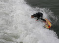
| 12/29/2005 05:46:15 PM | oops-IMG_8217.jpgby ZippyComment: '6' - likely. Difficult, but needs a little more detail. Not having a title doesn't matter so much in a shot like this, but it may have. edit: Just read this is 'Face Plant' from the thread. |  Photographer found comment helpful. Photographer found comment helpful. |
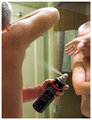
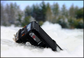
| 12/29/2005 05:44:07 PM | DPCCRW1570.jpgby mpetersComment: '2' or '3', likely - without a title here (although you have one in the thread) makes it more difficult, but most importantly, what is on the spray can is not easily recognizable as 'not deodorant', in my opinion. Other factors in the photo as well, make this have a 'raw' type feel, which detracts, in my opinion. | | Photographer found comment helpful. |
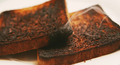
| 12/29/2005 05:28:51 PM | Honey I Burnt the Toastby AlexSaberiComment: 6 - Good set up. Criticism; perhaps a crop variation (depending what you had to work with of course), possibly a composition variation to allow the 'smoke' to be seen/come into play more and just a fraction sharper on the 'top toast', as the focus seems better on the bottom one, likely have made this even better in my opinion. |
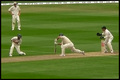
| 12/29/2005 05:25:58 PM | Dropped Catch !!by millsaComment: 7 - Good .. 'catch'. Color is good. Criticism; difficult, but more detail would have made this better but obviously camera/lens dependent. Depending what you had to work with, perhaps a nudge rotation up on the left and a crop trying to gain more symmetry and get the boundary line 'level', may have made this even better in my opinion. Not sure on the frame, 'works', but at this size perhaps is a little too dominant, again, in my opinion. | | Photographer found comment helpful. |
| 12/29/2005 04:53:43 PM | Freak'n String!! Oops!by GivemeashotComment: 5 - Good idea/potential. Criticism; sharper focus on the string (overall the shot seems blurred or out of focus), nudge rotation up on the left, or else perhaps more 'diagonal' composition and perhaps a variation in lighting to diminish the 'blown' part, may have made this better in my opinion. | | Photographer found comment helpful. |
| 12/29/2005 04:51:42 PM | On thin Ice ... ooopsby ShutterPugComment: 3 - Looks like good potential. Criticism; looks like this is a little blurry, or could be focus issues, hard to discern. I also can't tell if this is a little truck or train, so better focus and perhaps 'showing more' of your subject, may have made this better in my opinion. Also more 'context' of the 'oops' - ie; if it has 'gone off a cliff'/etc, then showing an edge there somewhere may have boosted this. | | Photographer found comment helpful. |
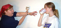
| 12/29/2005 04:49:24 PM | Not Milk?!by ChilibeanComment: 6 - Like it. Criticism; think this has more potential, a few suggestions would be clothing 'choice', especially on the girl on the right - a plain shirt or a particular color that would 'enhance' the 'milk', difficult, but either a different angle, or lighting adjustment, to get the detail on the tip of the paint brush more and a variation in cropping/framing, would have all likely made this better in my opinion. The facial expressions are near perfect. Good idea. | | Photographer found comment helpful. |
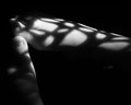
| 12/29/2005 03:38:23 PM | toes.jpgby wavelengthComment: '5', maybe '6', it took a while to see the shadow play/pattern, the feet are the dominant feature in this in my opinion, so if 'somehow' enhancing the pattern and minimizing the 'feet'/toes, may have made this better for this Challenge - but only 'hypothetical'/pretend anyway. Fairly nice 'clean feel' to this shot, save for the 'something' under the right heel. | | Photographer found comment helpful. |
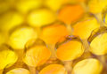
| 12/29/2005 03:36:08 PM | You Can't Resistby KonadorComment: '7', likely, it's unusual and looks like 'bubblewrap'/packing bubble wrap, with a 'golden glow' or 'tint', given your title, I at first thought 'candy', but realize it may be the '...to pop it' - nice abstract'ish' kind of pattern and nice colors and the shallow DOF enhances it, perhaps a little sharper on one of the bubbles that are in focus may have made this even better, not sure, especially given that that may have diminished the pattern effect. | | Photographer found comment helpful. |
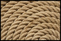
| 12/29/2005 03:33:11 PM | Dockline Artby JEFFJSBComment: '5', maybe '6' - the lighting or what seems to be 'glare' is too dominant on the rope in my opinion and overall not enough texture detail - although I realize to enhance the pattern you may have been going for this 'softness'. | | Photographer found comment helpful. |
|
Showing 3681 - 3690 of ~4957 |
Home -
Challenges -
Community -
League -
Photos -
Cameras -
Lenses -
Learn -
Help -
Terms of Use -
Privacy -
Top ^
DPChallenge, and website content and design, Copyright © 2001-2026 Challenging Technologies, LLC.
All digital photo copyrights belong to the photographers and may not be used without permission.
Current Server Time: 07/26/2026 06:05:35 AM EDT.
|