|
|
|
Showing 341 - 350 of ~4957 |
| Image |
Comment |
| 08/28/2009 04:57:47 PM | |  Photographer found comment helpful. Photographer found comment helpful. |
| 08/28/2009 04:57:06 PM | | | Photographer found comment helpful. |
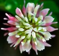
| 08/22/2009 06:36:16 PM | cloverby sohappy_02Comment:  Critique Club Critique
First Impressions
Critique Club Critique
First Impressions
Like the concept, but for this Challenge, the circle aspect is not strong enough, especially with the depth of field used here.
Photograph Information, Technicals & Composition Review
Parts of the clover flowers are overexposed and the detail has been lost. There also appears to be neat image or some other 'smoothing' process applied, which has resulted in additional loss of detail and texture.
I like the centered composition and it works for the concept, but as mentioned above, I think that for this Challenge, it would be difficult to take an image of clover and still have it appear as a 'circle' strong enough to be a player in this Challenge. The green in the rear is slightly out of balance, but fairly minor - but does make the square crop unbalanced.
Comments, Score & Placement Review
111/149 is likely a combination of non strong circle factor as well as some of the technicals in the image. An average of 4.16 from your 7 commenters is quite low: some of those comments are helpful, especially to show you why they have scored you low and why they don't think this met the Challenge. Your overall score of 4.76 reflects that most of the other voters who didn't comment probably felt the same way about your image as your commenters.
Summary
Nice concept, wrong Challenge for it. I like that you are directly over the clover, however 'next time', adjusting your camera settings so that you can retain your nice dof, but still allow some detail in the areas that are in focus, and not have them blown, will produce a stronger image. |
| 08/22/2009 06:18:36 PM | Softballby skyyakComment:
Critique Club Critique
First Impressions
I can make out a few circles, but they are not the main shape that comes to mind when I view this image.
Photograph Information, Technicals & Composition Review
In the context of the Challenge, trying to place the 'circled items' further into frame, perhaps along a 'third', would have helped give them more impact. I can't help but wonder about standing further over that bucket o' balls and getting an interesting circle full of different colored balls, but that is another image.
Oh - just read your Photographer's Comments and see you didn't shoot this image for this Challenge. It does usually help, especially with a Challenge theme such as this, where the subject matter is 'more important' than the photographic technique.
Comments, Score & Placement Review
128/149 is low down the pack, but I guess that is because most voters didn't see 'circle' when they viewed this image. Your score of 4.53 also reflects that.
You received quite a lot of comments and all are quite helpful, but none really give explanations of why you were scoring low overall, however your average of 5.33 from your commenters is quite good and shows some of them liked the image, regardless of the Challenge theme.
Summary
For this Challenge, there are a few circles happening in this image but none of them strong enough to make it a contender for a high place in this Challenge. | | Photographer found comment helpful. |
| 08/12/2009 03:08:01 PM | A small fortuneby olbolComment:
Critique Club Critique
First Impressions
I like the subtle colors.
Photograph Information, Technicals & Composition Review
Just read your Photographer's Comments: cannot help with the marks on the glass, they look like they are hand engraved, maybe a M5 4 at the top with a line underneath and then 1 6 1 V V 0 E (?) - no idea really.
Beside the flash reflection at the top of the glass, the technicals all seem to have produced a decent quality image. I like the background, however (and not to contradict what I said about the colors), the overall image is a little uninteresting. Perhaps if the letters were more discernible, not sure - what I see when I view this image is primarily the end of a bottle / jar of coins. It could possibly work as an abstract, but again, either some elements in sharper focus to add interest, otherwise perhaps a variation in angle. The centered composition is also a little static.
Difficult Challenge to shoot for - simply finding something that is 'round' or a 'circle', doesn't necessarily mean it will be interesting to view in an image. I'm not suggesting that this 'circle' doesn't have potential, I think it may - but no matter how creative you were photographing it, I'm just not sure how much engagement it would achieve.
The only real composition comment I'll make is that the colors of the coins within the bottle are not 'balanced'.
Comments, Score & Placement Review
82/149 is not bad placing - and your score is over 5 at 5.06. You may be semi pleased with this. You mention low scoring recent entries, and I just took a look at your recent scores - ok, so this is probably falling into an average.
Everyone comes to DPC for different reasons and those that do enter an image in a Challenge don't always aspire to score high - again, there is individual reasoning. If you want to score higher, you have to produce an image that engages the viewer in some way. However the catch is that what engages one viewer will not engage another. Go for mass appeal, and you'll likely score high. Of course, just submitting something that appeals strongly to you is an individual road to be on and if a majority like it too - then there is a little more substance to the gratification, in my opinion. Depends what you're seeking.
Your 5 commenters all tried to relay something that they liked within the image - which is always helpful to learn what is appealing to your viewers/voters.
Summary
Possibly better potential with some further tweaking in pp to bring about a little more depth and pop. Otherwise, 'next time' trying to select something with added interest, including the elements, would likely produce a stronger image.
edit: wording & typoMessage edited by author 2009-08-12 15:11:55. | | Photographer found comment helpful. |
| 08/11/2009 07:01:22 PM | Hold me mamma, Its raining...!by ankursomaniComment:
Critique Club Critique
First Impressions
Some quality issues mainly with this image. I gave this a 4 during voting. Looked like a zoo photo to me, but I can now see from your comments that looks like it was a natural scene. Shivthar Ghal looks like an interesting place which no doubt has bountiful photographic opportunities.
Photograph Information, Technicals & Composition Review
The tree branch creeping in at the top left corner is distracting, but fairly minor. Depending on the quality and scene you had to work with, I think not such a tight crop, giving more context would possibly have been better. As is, with this (seemingly) tight crop, the quality has deteriorated too much and the image suffers.
.025 seconds? - if so, this would also explain the lack of clarity. Regarding your title, although fairly minor, just seemed a little trite for me, but your call, of course.
Comments, Score & Placement Review
236/418 is fairly middle of the pack and a score of 5.59 is quite good, especially for the placement.
You have one especially helpful comment received. An average of 6.75 from your commenters overall, doesn't seem to reflect what most were saying.
Summary
Well spotted, good potential, just trying to get a more steady capture and then more attention paid to composition of the final image in processing would produce a stronger image. | | Photographer found comment helpful. |
| 08/11/2009 06:45:24 PM | Libertyby kenna718Comment:
Critique Club Critique
First Impressions
Don't mind the concept with the sun, flare and statue - but for a famous statue that has been photographed thousands of times, you'd have to either be very creative or produce a very technically sound image for it to truly captivate your audience. I voted this a 4 during the Challenge - primarily for the potential and what I perceived what some creativity.
Photograph Information, Technicals & Composition Review
Just read your comments - I think there is the potential to turn this 'backlit' (silhouetted) moment into a dramatic scene. Sure, the sun might not be that best placed to do so, but I still think there is potential in post processing with the image as is to give it more drama.
As is, cropping the sun out entirely, in fact a very bold crop almost half way down, leaving a few clouds at top right and on the left, frames her quite well. Possibly even a toning applied, but that would produce 'another' image.
'She' also needs a nudge up on the right to straighten her out.
Even with the framing and composition as is, perhaps there is potential, again with toning or b&w to push this into an artistic realm further, who knows.
Comments, Score & Placement Review
348/418 tells me that people perhaps saw a snapshot and also the sun 'hurt their eyes' so didn't linger long in the image. A score of 5.12 is fairly good for a low placement.
An average of 8.25 is excellent from your commenters and they all seemed to really like it. You have one especially helpful comment in there.
Summary
Good potential, well seen - just some experimenting in processing with the image as is. If you get the opportunity again, trying to garner a better angle for sun placement (and watching the exposure), may provide some added element interest. | | Photographer found comment helpful. |
| 08/11/2009 06:35:02 PM | One Rough Assignmentby trnqltyComment:
Critique Club Critique
First Impressions
The tilt bothered me when I first saw this - I voted this a 5 during the Challenge. Nice lighting.
Photograph Information, Technicals & Composition Review
With a shot such as this, commenting is difficult because I am not sure what you were aiming for - what the image is being used for. Is it selling the swimwear, etc.
The tilt - could be 'minor', of course depends again the purpose of the image, however, I think the image would be stronger with a straight horizon.
Her hands are quite nicely posed and her neutral facial expressions works, what I find distracting are the knees/legs 'sunk' into the sand. I think the angle and oof fore enhances that. The strap not cutting into her skin quite so tight at the back, but fairly minor - again, depends what the image is used for on what to 'look for'.
Her beautiful hair is lit and displayed well. Regarding her pose and you 'directing' - it does look very posed (again, purpose). I like the subtle reflections of the water on her legs and skin.
Comments, Score & Placement Review
113/418 is a fair placing, I'm guessing the horizon worked against you. Score of 6.01 - the quality of the technicals is there, so again, perhaps the horizon, possibly coupled with the somewhat static pose, didn't captivate the viewers.
You've a couple of helpful comments, and with an average score from your commenters overall of 7.5 they all liked it.
Summary
The model stands out well in the scene and the colors are all complementary. A variation in angle and direction perhaps would have given this a little more. This is an image that does need to have a purpose described to provide some better feedback and I'm sorry I haven't been able to do so. |
| 08/11/2009 06:15:12 PM | Touchby davehamComment:
Critique Club Critique
First Impressions
Ah - I liked this. I gave this a 6 during voting. Nice capture and nice light.
Photograph Information, Technicals & Composition Review
I think all your technicals work well with this image and are all quite sound. What this image would benefit from, in my opinion, is a much more refined crop and composition. Of course, this image would probably lend itself well to a b&w or toning conversion too - but 'another image'.
Composition suggestions would be: losing the car at the top of the image. Depending on what you had to work with and the quality, perhaps even a bold crop out of the 'bodies' - but not sure, might change the image too much and remove needed context. My favorite part is the water, light and of course the 'touching'. The backlighting really works well and contributes to the overall warm feel.
The OOF (out of focus) foreground on the right perhaps cropped a little more, but it does provide good 'lead' into the main subject. Perhaps the main subject (the touch/water) being placed on the 'thirds' more would enhance the image, but in this case, I don't think it matters that much.
Comments, Score & Placement Review
222/418, is fairly average placing and a score of 5.63 is quite good for a Free Study.
Ah - just looked at your profile and see this is your first entry. Congratulations on your first submission and welcome to DPC. I think this is a good image to kick it off with.
Your one comment received during the Challenge is very helpful.
Summary
Very nice moment captured and well seen. You did well to get the right parts in focus and work fast enough to capture all this. | | Photographer found comment helpful. |
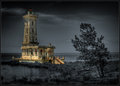
| 08/11/2009 06:02:39 PM | The Lighthouse at Point Abino - 1917by david_cComment:
Critique Club Critique
First Impressions
Hmm, I remember pondering this image for a while during voting (I gave it a 5). I did like it, but the more I looked at it, as a whole and also the lighthouse exclusively, the more I didn't think the processing/selective desat suited, or rather, complemented the image/scene/lighthouse. But of course, it's your image and vision.
Photograph Information, Technicals & Composition Review
Difficult, because anything I 'suggest' is going to change the image completely, but I'll 'give' anyway - perhaps mine will be a unique view, which you can take or leave as you see fit. With the image as is, I think it is stronger with a more refined crop, especially at the bottom and on the left. I'm a little OC with horizons and while I see the dilemma with the lighthouse if the image is straightened, a perspective correction may have allowed some adjustments to be made - but I'll hazard a guess that it would be difficult to do.
As for the toning, maybe just more 'soft' and subtle with the b&w tones, to allow the lighthouse to dominate more. I just wonder whether the image all b&w (and I know it is 'another image') would have more punch - but it's an out of the box type style and I'm a fan of that. It's individual.
There are some nice elements in the scene/image: the tree, the 'log' just behind it (although the angle doesn't allow that to come into play much), the clouds behind the 'light'. The greenish glass is also nice and, of course in b&w, that couldn't be appreciated.
I don't know if it is your masking and processing, but I get a 'spriteish' feel coming from certain parts of the image.
Also - glad to see you are pleased with a print of this. The details underappreciated at this size probably come into play a lot better. Would certainly make an interesting talking piece.
Comments, Score & Placement Review
8/418 - well, excellent result for you. 6.85 is also an excellent score.
An average of 7.56 from your commenters, and some interesting reactions by them. I always like the honest feedback provided during the anonymity of a Challenge.
Summary
As is, with a selective desat, maybe a little softer with the tones. Otherwise, a bold and individual entry that brings an edge to the 'competition' - which is always good. You will never please everyone's eyes, as long as your eyes are 'pleased' - that's the main thing. | | Photographer found comment helpful. |
|
Showing 341 - 350 of ~4957 |
Home -
Challenges -
Community -
League -
Photos -
Cameras -
Lenses -
Learn -
Help -
Terms of Use -
Privacy -
Top ^
DPChallenge, and website content and design, Copyright © 2001-2026 Challenging Technologies, LLC.
All digital photo copyrights belong to the photographers and may not be used without permission.
Current Server Time: 06/26/2026 04:54:57 PM EDT.
|