| Image |
Comment |
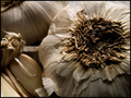
| 04/10/2006 09:23:00 PM |
Mediterraneanby AranchaComment: 7 - Like this. Tweaking of the colors/'lighting', whilst difficult I realize with the whites, may have made this even better in my opinion. Not sure on the frame color, perhaps a color from within the shot may have complemented and lifted the shot more. Texture detail middle-down, is good, 'if only' to have that detail in more of the shot, also make this even better in my opinion, especially for this Challenge. |
 Photographer found comment helpful. Photographer found comment helpful. |
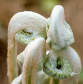
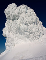
| 04/10/2006 09:12:22 PM |
Birth of a Fernby The EskimoComment: 6 - Very good concept. Difficult shot, I know. The detail and texture on/in the areas that are in focus is very good, unfortunately the OOF areas dominate more, in my opinion. A slight tweaking of the colors, perhaps a nudge rotation up on the right (for added symmetry and balance) and a more finely tuned crop, especially on the left, likely have helped this in my opinion, however you'd still be left with the fact that the two fronds are 'in the way', so perhaps a different angle, who knows. |
| Photographer found comment helpful. |
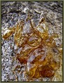
| 04/10/2006 09:07:09 PM |
Amber: Jewel of Natureby magueroComment: 6 - Nice. Good concept. Colors are good. Different angle perhaps, the OOF area dominates this too much within the composition in my opinion. Like the detail and clarity on the other areas though. Not sure on the frame. |
| Photographer found comment helpful. |
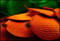
| 04/10/2006 09:03:18 PM |
Fuegoby TychoComment: 8 - Very nice. Good vivid coloring and the texture capture and detail is good. Difficult, but perhaps the focal point(s) adjusted slightly, don't know how, just like to see those 'bristles' more defined. Not sure what this is, will be back PC to see. The only two things in my opinion which detract from this shot, but both fairly minor, are the slightly 'blown' area middle left and the line/curve of the petal/frond/whatever bottom left. Also fairly minor but a more finely tuned cropped may have also made this even better, in my opinion. Nice title. |
| Photographer found comment helpful. |
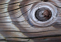
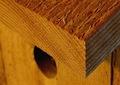
| 04/10/2006 07:47:45 PM |
Knottyby cabaComment: 8 - Nice colors and composition. More detail/texture discernible in the wood make this even better in my opinion, especially for this Challenge. Perhaps a little more at the top included (if you had it of course), but not sure, 'works' as is. |
| Photographer found comment helpful. |
| 04/10/2006 07:43:33 PM |
Watering Holeby atsxusComment: 8 - Nice texture capture and shot. Depending, of course, what you had to work with, quality and frame wise, more included and taking advantage of the 720 pixel allowance likely made this even better in my opinion. A more finely tuned crop at the top also. The beginning of the reflection looks like good potential, but perhaps more apt for another shot/Challenge. Not sure on the frame, but minor. |
| Photographer found comment helpful. |
| 04/10/2006 07:31:02 PM |
Clean&Fragileby garlicComment: 8 - Wow. Although it likely gives it a required context/perspective, a finer cropping, especially bottom right, likely make this even better in my opinion. Perhaps (depending what is there/you had to work with) a little more width too, not sure, perhaps just a different shot then, if that makes sense. Sure this looks great wall size and this size doesn't do the detail you've captured justice. |
| Photographer found comment helpful. |
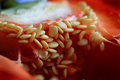
| 04/10/2006 07:25:13 PM |
Pimienta Rojaby debitiptonComment: 8 - Very good. Although the blue in the background both complements this and helps 'bring it out', some sort of variation (or elimination perhaps) of it (the blue), make this even better in my opinion, not sure what to suggest though. Like the angle and the macro. |
| Photographer found comment helpful. |
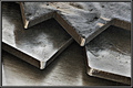
| 04/10/2006 07:20:58 PM |
Steel Teethby NobodyComment: 4 - Good concept. Gamma/something issues. Frame detracts at this size in my opinion. Depending what you had to work with, a variation in composition (more up the top - where the best focus is) may have made this better in my opinion. |
| Photographer found comment helpful. |
| 04/10/2006 07:17:10 PM |
Cedarby joebokComment: 7 - Nice concept and composition. Perhaps a tweaking of the 'lighting', the little bit of 'fluff' removed and a little sharper, make this even better in my opinion. |
| Photographer found comment helpful. |
Home -
Challenges -
Community -
League -
Photos -
Cameras -
Lenses -
Learn -
Help -
Terms of Use -
Privacy -
Top ^
DPChallenge, and website content and design, Copyright © 2001-2026 Challenging Technologies, LLC.
All digital photo copyrights belong to the photographers and may not be used without permission.
Current Server Time: 07/28/2026 10:21:24 AM EDT.