| Image |
Comment |
| 04/26/2006 06:14:47 AM |
Blue 'n Orangeby sangeethComment: 3 - I think for this shot to work, especially here at DPC where some good ones have been shown, you would need to have a very good 'drop shot', I don't think this is quite there, possibly mainly for focal reasons, although not sure. Colors are quite good but a slight tweaking may give more impact. |
 Photographer found comment helpful. Photographer found comment helpful. |
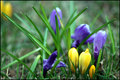
| 04/26/2006 06:12:59 AM |
Spring Flowersby jonandriComment: 3 - Good potential. Totally different angle focussing just on the purple and yellow crocuses(?), trying to minimize the green, make this better in my opinion for this Challenge. Not sure on the frame. |
| Photographer found comment helpful. |
| 04/26/2006 06:11:53 AM |
Simplisticby ElmakiasComment: 5 - Simple and the colors work in my opinion. The other 'factors' don't detract enough to take attention away from the color scheme. This more symmetrical would be better in my opinion. |
| Photographer found comment helpful. |
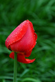
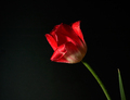
| 04/26/2006 06:11:02 AM |
Tulip after the rainby ladpupmoeComment: 6 - Nice and simple, good color. A variation in composition, with perhaps more 'empty space', or just a different placement, make this better in my opinion. |
| Photographer found comment helpful. |
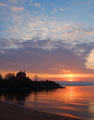
| 04/26/2006 06:10:03 AM |
Superior Sunriseby tlalondeComment: 4 - Risky shot for this Challenge in my opinion. Colors are good and you've captured them well, but in my opinion there are 'others' that play almost as much in this shot as well, therefore 'detract' slightly from the color scheme. |
| 04/26/2006 06:07:34 AM |
Splash!by LalliSigComment: 7 - Good. Difficult, but perhaps a more refined crop, especially at the bottom, also just looks like it needs a fraction of a fraction nudge rotate up on the left. Perhaps more stem in the shot, not sure. Just seems it needs a little 'extra', in my opinion. |
| Photographer found comment helpful. |
| 04/26/2006 06:04:48 AM |
After the Rainby muckpondComment: 4 - Would like to have seen nore green to balance this out. Background/empty space is too much in my opinion, and doesn't enhance the flower. Needs a bit more 'depth', as in seems a bit flat, so perhaps lighting adjusted, who knows. |
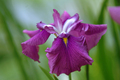
| 04/26/2006 06:03:20 AM |
Irisby photom1946Comment: 3 - Nice concept. For this Challenge especially though, a much tighter crop, eliminating the green, also the iris looks either wilted, or this angle is not capturing its uniqueness, not sure. |
| 04/26/2006 06:02:03 AM |
|
| Photographer found comment helpful. |
| 04/26/2006 06:01:21 AM |
Flower and Vaseby MattOComment: 4 - Nice concept. Looks crooked. A more uniform or varied base and background/drop and possibly also a better arrangement of the flowers (unless this is intentional) make this better in my opinion. Less glare on the vase too. Colors are good in the flowers, including the match up of the stems with the vase. |
| Photographer found comment helpful. |
Home -
Challenges -
Community -
League -
Photos -
Cameras -
Lenses -
Learn -
Help -
Terms of Use -
Privacy -
Top ^
DPChallenge, and website content and design, Copyright © 2001-2026 Challenging Technologies, LLC.
All digital photo copyrights belong to the photographers and may not be used without permission.
Current Server Time: 05/15/2026 11:43:13 AM EDT.