| Image |
Comment |
| 04/26/2006 06:51:25 AM |
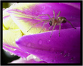
.by JPRComment: 6 - Good macro. Colors are subtle, and whilst 'pass' for me, still like to have seen them tweaked to be a little more vivid 'somehow', for this Challenge. I think the thick frame detracts from the delicacy of your subjects. |
 Photographer found comment helpful. Photographer found comment helpful. |
| 04/26/2006 06:50:11 AM |
sun rizeby santosComment: 3 - Not sure if your title is intentional or not. This bigger, 640 width would hav been better in my opinion. Colors look like they have good 'vivid' potential - bigger. |
| Photographer found comment helpful. |
| 04/26/2006 06:49:06 AM |
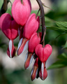
Bleeding Heartsby SammieComment: 6 - Nice capture and composition, although for this Challenge, would like to have seen it 'complemented' by more green. |
| Photographer found comment helpful. |
| 04/26/2006 06:48:32 AM |
naturally.....by raltonComment: 3 - Tweaking of colors and variation in composition make this better in my opinion. Bigger would have helped you too. |
| 04/26/2006 06:44:28 AM |
Delicate Flightby Little KingComment: 5 - Colors are quite nice. This looks, 'staged' though, not sure on the blur factor, who knows. The detail in the wall behind detracts, and 'adds' to the staged appearance. Focus more on the butterfly and perhaps a variaiton in composition and framing, may have made this better in my opinion. |
| Photographer found comment helpful. |
| 04/26/2006 06:42:59 AM |
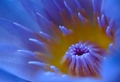
Greeting the Sunby wsteynComment: 8 - Wow, Nice. Shallow DOF works well here. Good nice sharp focus on the tips. Maybe just the composition/cropping, especially bottom left, but difficult likely, make this even better in my opinion. Like to see a little more height, especially with more at the bottom, but you've likely cropped it there for a reason. Nice macro. |
| Photographer found comment helpful. |
| 04/26/2006 06:41:21 AM |
|
| 04/26/2006 06:39:53 AM |
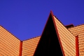
Rooftop abstractby birkinComment: 3 - Perhaps verging on red more than orange in parts, does 'meet the Challenge', and although a fairly good architectural type of shot, just not holding my interest/attention. Perhaps a more interesting angle, not sure. |
| Photographer found comment helpful. |
| 04/26/2006 06:38:20 AM |
Divine Radianceby librodoComment: 4 - Don't mind the concept. More detail in the fabrics and less on the skin, more blue incorporated/more vivid, make this better in my opinion. The hair detracts. Eye/eyes have potential, which I don't think has been captured. A more finely tuned crop/composition, especially top right corner (more or less) also likely have helped this. |
| Photographer found comment helpful. |
| 04/26/2006 06:35:44 AM |
Say Ahhh.....by rick13601Comment: 4 - Nice concept. The 'top' is a little distracting/detracts in my opinion, so if this is all you had to work with, perhaps cropping at the top to just get rid of it may have given this extra. Lighting seems a little harsh, which makes me think 'flash', so perhaps a little diffusion or 'further back', who knows. Not sure on the frame, although I can see you've gone to trouble with it, just think the colors do not enhance the subject as well as perhaps more subtle ones may have. |
| Photographer found comment helpful. |
Home -
Challenges -
Community -
League -
Photos -
Cameras -
Lenses -
Learn -
Help -
Terms of Use -
Privacy -
Top ^
DPChallenge, and website content and design, Copyright © 2001-2026 Challenging Technologies, LLC.
All digital photo copyrights belong to the photographers and may not be used without permission.
Current Server Time: 05/15/2026 12:47:06 PM EDT.