| Image |
Comment |
| 04/26/2006 07:21:33 AM |
Red and greenby Rino63Comment: 3 - Just not holding my attention long enough. The composition is ok and crop seems ok, just need the green more vivid, as well as the red, and something 'extra' to make this more intresting. Frame detracts from the colors for this Challenge in my opinion. |
 Photographer found comment helpful. Photographer found comment helpful. |
| 04/26/2006 07:19:57 AM |
Get the Fire Back into your Love Lifeby joshuadboothComment: 2 - 'ok'. I really see only white and orange primarily in this shot, the blue only seeps through because of the reflections/lighting/etc. Don't see a strong scheme here, other than 'Nike', but this wasn't a Nike Challenge. |
| 04/26/2006 07:18:36 AM |
orangenessby ronragComment: 7 - Nice. Wish the seemingly tealish blue were more vivid/boosted though, 'somehow'. |
| Photographer found comment helpful. |
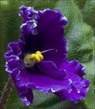
| 04/26/2006 07:17:40 AM |
Violetby MWittComment: 4 - Quite a nice close up of what appears to be an African Violet, however the leaf is competing too much both color and focal-wise, in my opinion. |
| Photographer found comment helpful. |
| 04/26/2006 07:16:21 AM |
Oppositeby gazdiComment: 5 - Architecture is nice. Your call, obviously, but a tighter crop/composition variation, likely given this a little extra in my opinion. A more finely tuned crop at the bottom and a little more definition also. |
| Photographer found comment helpful. |
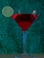
| 04/26/2006 06:57:48 AM |
Lime and Wineby ZemmComment: 3 - The background and base detract too much in my opinion. Focus just on the 'liquid' and the lime would have likely made this better, again, my opinion. The lime more dominant and 'no reflection' in the glass too. |
| Photographer found comment helpful. |
| 04/26/2006 06:56:38 AM |
|
| Photographer found comment helpful. |
| 04/26/2006 06:55:38 AM |
Vinyl Vibrationsby RyShuComment: 3 - They'd have to be Christmas records. 'Meets the Challenge', but just doesn't hold my attention/interest enough. The focus on the 'base' detracts from your main 'subject(s)' slightly too with it being so dominant, in my opinion. |
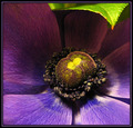
| 04/26/2006 06:54:19 AM |
Infringementby seebrownComment: 7 - Very nice. 'If only' that green leaf didn't dominate so much, my opinion, for this Challenge. Still, fairly minor. Nice composition and macro (seemingly). Good detail too. Difficult, but maybe just a tweaking of the yellow in the center 'somehow' to get it a little more vivid, though not sure. |
| Photographer found comment helpful. |
| 04/26/2006 06:51:56 AM |
Someday..by RyencoolComment: 6 - High key enough to allow the green and red to dominate. Like the stop sign, adds. |
Home -
Challenges -
Community -
League -
Photos -
Cameras -
Lenses -
Learn -
Help -
Terms of Use -
Privacy -
Top ^
DPChallenge, and website content and design, Copyright © 2001-2026 Challenging Technologies, LLC.
All digital photo copyrights belong to the photographers and may not be used without permission.
Current Server Time: 05/15/2026 01:56:43 PM EDT.