| Image |
Comment |
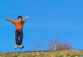
| 04/26/2006 07:39:21 PM |
Great Dayby cloudsmeComment: 2 - Not a bad jump shot, not a bad 'happy shot', title suits, but for this Challenge, would like to have seen the emphasis on the color scheme primarily. A more refined crop also have helped this in my opinion. |
 Photographer found comment helpful. Photographer found comment helpful. |
| 04/26/2006 07:36:35 PM |
Spoon over plateby anirenoComment: 4 - Meets the Challenge enough, composition quite good, not sure the two blues match up that well but your call. Not quite abstract enough in my opinion. |
| Photographer found comment helpful. |
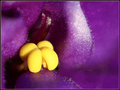
| 04/26/2006 07:34:12 PM |
african violetby suemackComment: 7 - Nice macro and colors. Difficult, but if the yellow had a little more detail too, make this even better in my opinion. Nice abstract. |
| Photographer found comment helpful. |
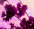
| 04/26/2006 07:32:41 PM |
Profiles of Purpleby KelliComment: 5 - Nice and good potential. More yellow, especially to 'complement' the 'purple' of the azaleas, make this better in my opinion. Also looks a little too close/blurred and possibly a bit of grain. A more refined crop would also have likely given this a little extra, again in my opinion. |
| Photographer found comment helpful. |
| 04/26/2006 07:31:22 PM |
Nature's colorsby scrum8Comment: 6 - Nice. Good composition and cropping. Just like to see a little wider/deeper focal area, but difficult. Perhaps a little sharper/more definition as well. |
| Photographer found comment helpful. |
| 04/26/2006 07:30:05 PM |
BEANS-N-NEEDLESby dolikemagooComment: 3 - Looks 'snapshottish' and too haphazard without being intentionally so. Too close and OOF and overall not balanced or enough 'depth'. Perhaps a tweaking in pp may have given this a little extra, not sure. |
| Photographer found comment helpful. |
| 04/26/2006 07:28:15 PM |
Springby pitsamanComment: 5 - Nice. More in frame perhaps, but definitely less grain (although that does kind of add something, in a way, especially the 'blueness') make this better in my opinion. Not sure on the frame. |
| Photographer found comment helpful. |
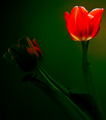
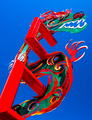
| 04/26/2006 07:27:15 PM |
Outshineby typologicComment: 5 - Unusual, not sure I like it - undecided. Definitely more space to the right of the 'red', make this more balanced and better in my opinion. Original though, seemingly. |
| Photographer found comment helpful. |
| 04/26/2006 07:26:06 PM |
Just Oneby Rando D300Comment: 3 - Colors are quite nice. Think I get the concept, but not sure you've quite achieved it. Perhaps choice of clothing, attention to minor details like nail polish, etc and trying to create more 'fantasy' via more OOF, who knows, may have made this better in my opinion. Ultimately, for a viewer looking at this, especially 'quickly' during a Challenge, likely won't hold their attention nor hold the same meaning, as it may have for you - in my opinion. |
| Photographer found comment helpful. |
| 04/26/2006 07:23:23 PM |
Sky Watcherby IRINAEDMComment: 2 - Coming across more red than orange to me, but may have been orange in person. Like the unusual perspective. Perhaps a little too 'bright' overall, not sure. |
| Photographer found comment helpful. |
Home -
Challenges -
Community -
League -
Photos -
Cameras -
Lenses -
Learn -
Help -
Terms of Use -
Privacy -
Top ^
DPChallenge, and website content and design, Copyright © 2001-2026 Challenging Technologies, LLC.
All digital photo copyrights belong to the photographers and may not be used without permission.
Current Server Time: 05/15/2026 03:07:19 PM EDT.