| Image |
Comment |
| 04/26/2006 07:59:19 PM |
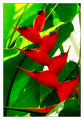
Naturallly Complementedby ericwooComment: 4 - Nice angle. The reds, and some other areas, seem blown or 'something', loss of detail and perhaps loss of control/contrast/too saturated, who knows. |
 Photographer found comment helpful. Photographer found comment helpful. |
| 04/26/2006 07:54:21 PM |
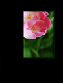
Harmonyby bledfordComment: 2 - Different. Risky with this framing here. Ultimately though, I'm seeing more pink here than red, so color scheme(s) not as strong as could/should be, in my opinion. Hue adjustment may have helped, depends what you were aiming for. Not sure your framing enhances your shot, but your call. Nice shot overall, but not strong enough Challenge wise, in my opinion. |
| Photographer found comment helpful. |
| 04/26/2006 07:52:00 PM |
-Untitled-by chris_clarryComment: 3 - Bigger, either sharper/more focus else softer and more DOF play, variation in crop, composition (including use of space/color) and bigger (640) make this better in my opinion. More purple incorporated too, especially for balance. |
| Photographer found comment helpful. |
| 04/26/2006 07:50:06 PM |
Open Upby xilamareeComment: 5 - Nice. Softness works here in my opinion. Having said that, still like to see a little more definition, even in the lines/shapes. Perhaps a little more height too, not sure. Difficult, but the colors tweaked more, especially for the Challenge. A sharper angle/perspective to reduce that 'gray' also. |
| Photographer found comment helpful. |
| 04/26/2006 07:48:30 PM |
|
| 04/26/2006 07:47:49 PM |
Flying Highby gsalComment: 5 - Unusual 'capture'. Fits quite well for the Challenge. Perhaps a crop variation, or some adjusting pp to give it a little extra, not sure. Arm looks a bit yellow, which may be a result of pp, who knows. |
| Photographer found comment helpful. |
| 04/26/2006 07:46:30 PM |
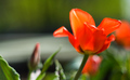
Edgy Colorsby ngartzComment: 2 - Looks more red than orange to me, but may have been so in person, who knows. Adjusting the hue likely have helped this. Concept, not holding my attention. Focus is also off, but might be intentional. |
| 04/26/2006 07:45:15 PM |
Lemon Flowerby svetaComment: 2 - Not sure on the concept. Candle, is blown, whether because it is lit or not not sure, either way blown and one of the first things you see. Fabric is too dominant too, not the color, but the fabric itself. A variation in lighting, composition and cropping likely all have helped this in my opinion. |
| Photographer found comment helpful. |
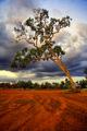
| 04/26/2006 07:43:24 PM |
Colours Of Australiaby JudiComment: 4 - Nice. Sharper perspective, incorporating more 'earth'/colors, make this better for this Challenge in my opinion. Too much green competing here to really 'showcase' the color scheme. A more refined crop, especially on the right as well. |
| Photographer found comment helpful. |
| 04/26/2006 07:42:02 PM |
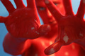
A Collection of Clichesby mpetersComment: 4 - Colors are quite good. Not 'clean enough' to be a good refraction shot though in my opinion. Also a little risky doing such a shot here so soon after that other Challenge, unless it is 'special'. |
| Photographer found comment helpful. |
Home -
Challenges -
Community -
League -
Photos -
Cameras -
Lenses -
Learn -
Help -
Terms of Use -
Privacy -
Top ^
DPChallenge, and website content and design, Copyright © 2001-2026 Challenging Technologies, LLC.
All digital photo copyrights belong to the photographers and may not be used without permission.
Current Server Time: 05/15/2026 03:07:22 PM EDT.