| Image |
Comment |
| 04/26/2006 09:05:11 PM |
A Dripby visionistComment: 1 - Hard stretch to see a color scheme here. Not holding my attention otherwise. |
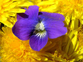
| 04/26/2006 09:04:30 PM |
Humble Beautyby Joy MooreComment: 6 - Nice. The 'pollen spill' is unusual. The focus a little 'wider' else the flower 'pushed back' a little more, make this even better in my opinion. |
 Photographer found comment helpful. Photographer found comment helpful. |
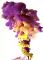
| 04/26/2006 09:02:42 PM |
Yurpleby igniteComment: 6 - Unusual. Wish it were 640. Your call obviously, but wonder if a flip in 'some' direction may have actually enhanced this. Also, some areas seem a little 'blown', the white background enhances that somewhat as well in my opinion. Like to see sharper focus on all or 'key areas'. |
| Photographer found comment helpful. |
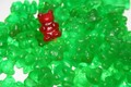
| 04/26/2006 09:00:40 PM |
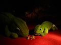
Gummy bearby die screamingComment: 2 - Don't mnd the concept but think needs a bit of work to achieve full potential. Sharper focus, variation in angle and lighting and composition, all have helped this, in my opinion. Just looks a bit 'snapshottish'. |
| Photographer found comment helpful. |
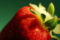
| 04/26/2006 08:59:30 PM |
Strawbby redmoonComment: 7 - Nice macro. Variation in the background color, especially for this Challenge and more green (including said background) may have made this better in my opinion. Fairly minor, but for a macro like this, small details like the 'hair' need attention. |
| Photographer found comment helpful. |
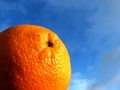
| 04/26/2006 08:57:05 PM |
Sunbathingby GunnsiComment: 4 - Composition seems quite good, just a little grain in the sky and the glare on the orange, but fairly minor. |
| Photographer found comment helpful. |
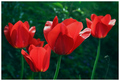
| 04/26/2006 08:56:20 PM |
Simple Beautyby goinskiingComment: 5 - Nice. Fairly good definition inthe fore tulip, perhaps a little more play on the depth/angle may have given this a little extra in my opinion. Also, depending what you had to work with, perhaps more height too, not sure. |
| Photographer found comment helpful. |
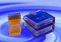
| 04/26/2006 08:55:10 PM |
Colorful Fragranceby ArtanComment: 3 - Meets the Challenge color-wise quite well, just not holding my attention otherwise. |
| Photographer found comment helpful. |
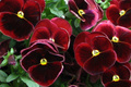
| 04/26/2006 08:54:28 PM |
Red Pansiesby KathyComment: 3 - More green incorporated, sharper, more definiton and overall a little more balanced, make this better in my opinion. |
| 04/26/2006 08:53:40 PM |
|
| Photographer found comment helpful. |
Home -
Challenges -
Community -
League -
Photos -
Cameras -
Lenses -
Learn -
Help -
Terms of Use -
Privacy -
Top ^
DPChallenge, and website content and design, Copyright © 2001-2026 Challenging Technologies, LLC.
All digital photo copyrights belong to the photographers and may not be used without permission.
Current Server Time: 05/15/2026 11:41:14 PM EDT.