|
|
|
Showing 2951 - 2960 of ~4957 |
| Image |
Comment |
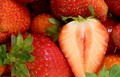
| 04/27/2006 07:30:56 PM | Strawberriesby Kimberly75Comment: 4 - Colors seem to have come through 'true'. Focus seems off and/or a little 'blurry'. Traces of grain/something as well, which could be due to resizing, who knows. Like the crop. Just like to have seen the colors tweaked more and (although looks difficult with the 'white' of the cut strawberry), as mentioned, more detail and texture. Again, quality dependent, this at 640 would have had more impact as well. |  Photographer found comment helpful. Photographer found comment helpful. |
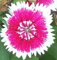
| 04/27/2006 07:28:40 PM | Spring Flowersby jhall29Comment: 2 - Don't mind the close crop, but the quality needs to be there. Not sure what you've done pp with this but it appears totally flat and void of detail. Color-wise, bordering on red, but not strongly enough in my opinion, although I realise that this flower may have been more red in person, but you haven't captured that, especially with the processing. For this Challenge, perhaps tweaking in pp may have helped you, but you'd still be left with the quality issues. |
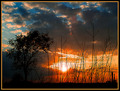
| 04/27/2006 07:25:59 PM | Orange and Blue Sunsetby gt7435bComment: 3 - Like to have seen the blue more, even if tweaked pp. Perhaps a tighter crop would have helped, who knows. Frame detracts from the simplicity of the image in my opinion. |
| 04/27/2006 07:24:15 PM | Complementary Lifeby greignerComment: 4 - Whilst bordering on orange to me, I can see traces of red. LIke the perspective, just wish the reds/oranges had more detail in them and not 'blown' so much in areas, same with the leaves top/top right. |
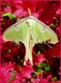
| 04/27/2006 07:23:02 PM | Nature Colorsby woodseyComment: 4 - Nice capture and good potential. For me (and indeed your frame color shows it as well), this is more pink and green, rather than red. There are traces of yellow in the shot, etc etc.. so it's a 'pass', just, from me, but not as strong as I'd like to have seen for this Challenge. Perhaps tweaking the colors, including hue, may have given this extra, who knows. Difficult, but like to have seen a little more texture and detail in the moth, but opportunity capture, etc. Also, compositionally, perhaps a little more space either side (depending what you had of course), else perhaps even more 'angled' and 'off-set', if that makes sense, may have given this a little more overall balance and made it a stronger image, in my opinion. | | Photographer found comment helpful. |
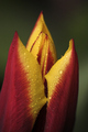
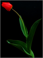
| 04/27/2006 07:17:47 PM | Waking Upby mexicoComment: 3 - I'm seeing predominantly red, yellow then green here. Perhaps a different angle or crop, using the red/green or, if the tulip(?) is 'purple' further down, then 'showing' that, and the yellow, may have made this a bit stronger for this Challenge in my opinion. | | Photographer found comment helpful. |
| 04/27/2006 07:15:38 PM | Mixed Tulipsby wardComment: 4 - Nice shot and angle of the tulips. Perhaps an even more 'front on' angle, using the yellow ones 'more', and diminishing the blue (and green) as much as possible for this Challenge, make this better in my opinion. Nice shot as is, but for the Challenge there's too much blue - in my opinion. |
| 04/27/2006 07:13:15 PM | butterfliesby HeidieComment: 4 - Left a comment before but seems it didn't 'stick'. Like the concept with this, and whilst the 'red' is bordering on brown, still 'pass' to me. I think if a slight variation in composition and cropping, especially to allow the 'shadow play' to be shown more within the frame, make this better in my opinion. It's the shadow play that really gives this a little extra, in my opinion. | | Photographer found comment helpful. |
| 04/27/2006 06:23:18 AM | Passionby M.O.C.Comment: 6 - Nice. A little tighter crop at the top for more balance make this even better in my opinion. Also like to see more detail and texture. The black slightly accentuates the slightly blown sepal, but fairly minor. Perhaps a variation in lighting may have also given this a little extra, not sure. A tighter crop also help 'showcase' the color scheme as well. | | Photographer found comment helpful. |
| 04/26/2006 11:59:12 PM | SEASONS!by vikasComment: 5 - Nice. More focus on the flower as well/flower further forward and perhaps not quite so tightly cropped around the flower, may have made this better in my opinion. The 'spots' top right detract, but fairly minor and yes I realize, 'basic editing'. | | Photographer found comment helpful. |
|
Showing 2951 - 2960 of ~4957 |
Home -
Challenges -
Community -
League -
Photos -
Cameras -
Lenses -
Learn -
Help -
Terms of Use -
Privacy -
Top ^
DPChallenge, and website content and design, Copyright © 2001-2026 Challenging Technologies, LLC.
All digital photo copyrights belong to the photographers and may not be used without permission.
Current Server Time: 05/16/2026 12:29:27 PM EDT.
|