| Image |
Comment |
| 06/19/2006 06:58:13 PM |
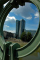
CAL-EH-FORN-YAby bryanbrazilComment: 6 - Good, but like to see more definition and color in the fore foliage/frame - not sure how, perhaps fill flash, coupled with some tweaking pp. |
 Photographer found comment helpful. Photographer found comment helpful. |
| 06/19/2006 06:57:15 PM |
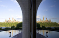
Uniquaby nycpawnpusherComment: 2 - Further back to incorporate more of the frame and the frame in better focus, make this better in my opinion - although the subject matter within frame doesn't hold my attention. |
| 06/19/2006 06:56:21 PM |
Duplicityby redeemerComment: 6 - Quite well done. Just the overexposure on the left, which you're likely well aware. Perhaps b&w/toning may have helped workaround that here. Good 'different' concept of framing. |
| 06/19/2006 06:54:55 PM |
Soccer Ballby ericbarComment: 2 - Possibly good potential, even using the oof fore framing. Bigger (640 width) and a more balanced compostion/crop likely helped. |
| 06/19/2006 06:53:37 PM |
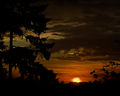
Our Sunby bcobleComment: 2 - Nice scene/shot - not framed strongly enough for this Challenge in my opinion. Maybe a tighter crop, who knows. |
| Photographer found comment helpful. |
| 06/19/2006 06:51:56 PM |
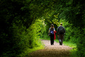
Remeber that walk ...by vikasComment: 6 - Nice. Difficult, but the dof even closer as well, may have made this even better, but would likely have diminished the illusion of the framing at the bottom. Not sure, but perhaps a more finely tuned crop at the top, making a more horizontal framing. More at the bottom (even if oof), possibly as well. Selective desat may have given this extra as well, who knows - nice scene/candid as is, in my opinion. +m in your title. |
| Photographer found comment helpful. |
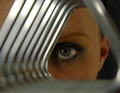
| 06/19/2006 06:47:18 PM |
Trianguleyeby behindthescenesComment: 4 - Good potential. Difficult, as I like the oof/bokeh effect in the triangles, however at least part of that 'frame' in sharper focus, a more finely tuned crop and composition and attention paid to finer details such as skin/make up, make this better in my opinion. Overall perhaps further back, incorporating more of the 'triangle(s)' and a slight shift in focus (especially so the skin(?) top left is not so apparent), also help this, in my opinion. edit:typo Message edited by author 2006-06-21 07:57:30. |
| Photographer found comment helpful. |
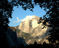
| 06/19/2006 06:43:20 PM |
Half Domeby steffyldComment: 3 - Difficult, but more definition and light in the 'frame' and perhaps overall the colors tweaked for added depth and drama, make this better in my opinion. Depending what was there, more 'frame' incorporated bottom/bottom left as well. |
| Photographer found comment helpful. |
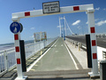
| 06/19/2006 06:41:53 PM |
The wonky bridge entranceby WobbleComment: 3 - Despite your title, still think this needs a fairly good rotate up on the left. A more finely tuned crop to 'use' the frame more, also would have helped. |
| Photographer found comment helpful. |
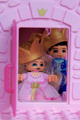
| 06/19/2006 06:41:03 PM |
Princess in the Castleby ZILAComment: 3 - Like to see the frame in better focus, and perhaps more of it incorporated for added balance compositionally. A slight nudge rotation up on the right, perhaps a variation in angle, for added 'effect' and a little further back, make this better in my opinion. |
Home -
Challenges -
Community -
League -
Photos -
Cameras -
Lenses -
Learn -
Help -
Terms of Use -
Privacy -
Top ^
DPChallenge, and website content and design, Copyright © 2001-2026 Challenging Technologies, LLC.
All digital photo copyrights belong to the photographers and may not be used without permission.
Current Server Time: 05/16/2026 10:59:26 AM EDT.