| Image |
Comment |
| 01/26/2010 05:11:17 PM |
cata hariby skewsmeComment: 6 - Funny - make a cool fabric design and/or 'wall art'. I like your title. |
 Photographer found comment helpful. Photographer found comment helpful. |
| 01/26/2010 05:09:06 PM |
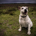
Grim Day, Happy Maxby JimiRoseComment: 8 - Lovely portrait and I like how he 'pops' out against the dreary day, but with the added elements of color in the flowers - my only real wish is that it had a nudge rotate up on the left to straighten a little (but could just be perspective). I like how the wide angled lens(?) has accentuated his paws. |
| Photographer found comment helpful. |
| 01/26/2010 05:02:26 PM |
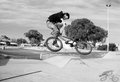
My Best 2009by subject22Comment: 4 - I like the potential with this shot - perhaps a much bolder crop, uncentering the rider and, depending what you had to work with, a slight nudge rotation up on the right to 'straighten', may have given this more of an edge - that coupled with some more refined processing, especially to add some drama and minimise the overexposed lighter areas of the image/background. Alas, you'd still be left with some competing distractions that take full attention away from the rider and his shadow. |
| Photographer found comment helpful. |
| 01/26/2010 04:57:43 PM |
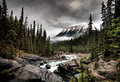
Mistaya Riverby dragonladyComment: 9 - What a pleasure to look at, and I like the drama that the processing has brought out in the scene. |
| Photographer found comment helpful. |
| 01/26/2010 04:24:39 PM |
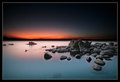
Stillnessby TerramarComment: 8 - It's a shame this isn't 800 - I can see that you've also captured some rocks beneath the surface of the wter and to be able to see the detail on those would be good - hopefully it is there wall sized for you, as is all the other 'finer' elements to this nice capture. For me, the frame perhaps detracts a little from the feel & scene, but your call. |
| Photographer found comment helpful. |
| 01/26/2010 04:22:12 PM |
The Beauty of Death by skarpi_xxxComment: 9 - Oh boy, this takes this familiar scene to another level - he has a friend now - I like the subtle reflection(s) in the moving(?) water - very dramatic image. I wonder about the right hand side of it 'pushed' a little more to balance out (especially sat wise) with the left, but maybe the way it dominates as is, helps the horse(?) take centre stage over the Icelandic Ice Age creature. |
| Photographer found comment helpful. |
| 01/25/2010 11:27:29 PM |
|
| Photographer found comment helpful. |
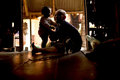
| 01/24/2010 04:22:20 PM |
A Precious Lifeby power47Comment: 6 - I nearly missed the cat - I like the darkness of this, which is still lifted by the smiling faces and loving moment captured. After seeing the cat, just wish for a little more light to see his/her face, and maybe also that of the little girl. |
| 11/14/2009 05:58:31 PM |
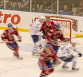
The Blur Of A Momentby SledZepplinComment:  Critique Club Critique
First Impressions
Critique Club Critique
First Impressions
Nice movement with the colors but overall too busy, especially with the mix of movement and stillness of the spectators/crowd. I gave this a 4 during voting.
Photograph Information, Technicals & Composition Review
Depending what your aim was with the image (just taking a shot during the game, or going for a specific effect), perhaps trying to focus further to the fore, especially at the players and the action and using a shallower depth of field to eliminate / reduce the crowd, would have produced a stronger image. Again, depends what you were going for - from your Photographer's Comments, I cannot tell.
Comments, Score & Placement Review
390/403 is quite low down the pack and your 5.2 average from your commenters seems to reflect their comments, some of which seem to be especially helpful.
Summary
Perhaps cropping out the spectators and going for a more abstract/movement type of image may have produced something that held more interest but as is, I suspect it didn't hold people's attention long enough because of the busyness and slight snapshot feel to the image.
edit:typoMessage edited by author 2009-11-15 14:33:52. |
| Photographer found comment helpful. |
| 11/11/2009 07:17:05 PM |
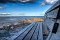
Ocean Viewby kcuiComment:
Critique Club Critique
First Impressions
Do/did like this perspective and the inclusion of the bench. I remember pondering this for a very short while, imagining myself sitting on the bench looking out to sea and thought you captured that 'moment' quite well. I gave this a 6 during voting.
Photograph Information, Technicals & Composition Review
The image needs just a fraction more width, room to the left of the bench (maybe at the bottom too), in my opinion as the bench dominates the shot a little too much - plus because some of it (especially the fore) is OOF (out of focus), it (the oof) dominates a little too much at the fore of the image. Having said that, I do like how the bench is minimized somewhat in the image as a whole, because that does let the 'view' dominate - if that all makes sense.
I like how you have left the dark clouds in - they provide a good framing. The light on the rocks is unusually placed within the image compositionally, but does work. The lines on the bench lead you out to that.
Barely noticeable, but the horizon is out by a whisker.
Comments, Score & Placement Review
117/403 is a decent showing in a Free Study and at least you score over 6. 7.83 average score from your commenters does strongly reflect their comments - all of which seemed to appreciate your vision and how you have captured & processed it.
Summary
As mentioned above, a little more room at the left and possibly at the bottom, makes the 'expanse' grow in the image and as a viewer, takes you 'there' a little easier. |
| Photographer found comment helpful. |
Home -
Challenges -
Community -
League -
Photos -
Cameras -
Lenses -
Learn -
Help -
Terms of Use -
Privacy -
Top ^
DPChallenge, and website content and design, Copyright © 2001-2026 Challenging Technologies, LLC.
All digital photo copyrights belong to the photographers and may not be used without permission.
Current Server Time: 06/26/2026 09:26:12 PM EDT.