| Image |
Comment |
| 07/04/2006 09:11:12 PM |
|
 Photographer found comment helpful. Photographer found comment helpful. |
| 07/04/2006 09:08:17 PM |
|
| Photographer found comment helpful. |
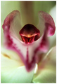
| 07/04/2006 09:07:04 PM |
Orchid's Anatomyby patrinusComment: 7 - Nice. More space either side and a fraction nudge rotate up on the left, likely made this better, in my opinion. |
| Photographer found comment helpful. |
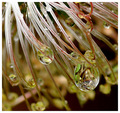
| 07/04/2006 09:04:34 PM |
Clematis Alpina (The Water Collector)by geewhyComment: 7 - Very nice study and refractions. Guessing this is not 640 because of quality issues, but 'if only' it was would have been good. The 'line'/something bottom right detracts, but fairly minor. |
| Photographer found comment helpful. |
| 07/04/2006 08:56:14 PM |
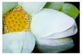
Lotus Flowerby 2mccsComment: 7 - Very nice. Nice composition and crop. Main detractor in my opinion is the blown petal, which may well have been an 'in camera' issue, hence impossible to 'repair' in pp, apologies in advance if wrong and this is intentional. |
| Photographer found comment helpful. |
| 07/04/2006 08:52:10 PM |
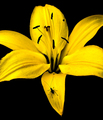
Pictures of Lilyby smartypantsComment: 8 - Very nice and simple. Although an obvious off-center composition, perhaps a fraction more space, especially top/top right, may have made this even better in my opinion - would also allow the sharpest focal point (which seems to be on the stigma), to take 'center stage' more, if that makes sense. |
| Photographer found comment helpful. |
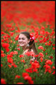
| 07/04/2006 08:49:49 PM |
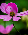
excuse me ...by gocComment: 7 - Good use of colors and contrast and shapes. Perhaps a variation in cropping and composition may have given this a little extra, not sure. |
| Photographer found comment helpful. |
| 07/04/2006 08:48:57 PM |
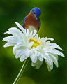
The Inspector by scalvertComment: 9 - Wow, nice capture. Will be back PC to see if this was staged. Nice and simple - just like to have seen a little more detail in the flower especially, and perhaps the bird & background colors 'lifted' - but likely near impossible with the resulting contrast issues with the white flower. Good title. Also, depending what you had to work with, perhaps a tighter crop at the bottom and more space included above the bird - but who knows, works very well as is. |
| Photographer found comment helpful. |
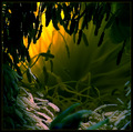
| 07/04/2006 08:45:44 PM |
Shelterby wavelengthComment: 7 - Nice. Perhaps a fraction dark, but likely intentional. Difficult, but more height frame-wise, may have made this even better in my opinion - but given the size restrictions, not much to be done 'here' - if that makes sense. Nice title. |
| Photographer found comment helpful. |
| 07/04/2006 08:41:29 PM |
e x o t i c aby RKTComment: 7 - Nice. Likely intentionally dark, but perhaps a fraction more light play may have given this a little extra. |
| Photographer found comment helpful. |
Home -
Challenges -
Community -
League -
Photos -
Cameras -
Lenses -
Learn -
Help -
Terms of Use -
Privacy -
Top ^
DPChallenge, and website content and design, Copyright © 2001-2026 Challenging Technologies, LLC.
All digital photo copyrights belong to the photographers and may not be used without permission.
Current Server Time: 05/16/2026 06:41:40 PM EDT.