| Image |
Comment |
| 10/05/2006 03:56:31 PM |
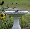
Privacy Pleaseby DianaComment: 6 - Nice capture. Perhaps a variation in cropping at the bottom to eliminate the bricks/paving/edging (or maybe cloning them out, who knows)and a fraction nudge rotate up on the left to 'straighten', likely have made this even better in my opinion. The one on the left is easy to miss on 'quick view'. Difficult with the white bird bath, but just a slight tweaking of color saturation/contrast/something may have also lifted this a little more. |
 Photographer found comment helpful. Photographer found comment helpful. |
| 10/05/2006 03:39:03 PM |
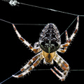
Stringsby silverscreenComment: 7 - Really like this, especially the detail on the upper threads and the transparency captured. 'If only' the dof were a little more bringing the whole spider into focus. The bottom thread looks a bit 'odd', whether that is a result of oof or pp not sure. Depending what you had to work with, I wonder if nudge rotating this up on the right to gain more symmetry and balance, especially in the sharper areas, may have given this a little extra. The little 'bundle' of strings top left, whilst fairly good detail, detracts slightly in my opinion, and could likely afford to have been cropped out, especially as it is already 'chopped'. Like the composition. |
| Photographer found comment helpful. |
| 10/04/2006 11:03:58 PM |
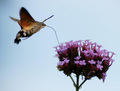
I'm flying for a drink !by David NewlandComment: 8 - Nice and clean. Good capture. Like the focal area(s). Perhaps a fraction more in focus, not sure, but definitely more stop motion (difficult obviously) make this even better in my opinion. Like the composition (although maybe a little tighter at the bottom, losing some more stem, not sure) and simple colors - although perhaps the colors tweaked just a fraction, may have given this even more, who knows. |
| Photographer found comment helpful. |
| 10/04/2006 10:57:50 PM |
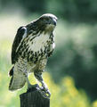
Final Squeezeby vtruanComment: 6 - Good capture, looks natural too. Think I can even decipher the head. Apologies in advance if wrong, but this shot looks like it has more potential (pp) than has been achieved. Obviously quality dependent, but perhaps a slightly tighter crop, slight variation in composition to allow for more dominance and possibly selective sharpening/contrast/dodge etc, may have given this a little more 'drama'. |
| Photographer found comment helpful. |
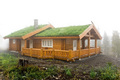
| 10/04/2006 10:39:43 PM |
Cabin in the mistby TrollManComment: 5 - That's some cabin. Wish it were captured a little more dramatically, especially 'using' the mist even more. A variation in composition/framing may have also aided the overall 'feel'/image. Perhaps adjusting the contrast a fraction to allow more tonal ranges, not sure. If you had it, perhaps using a larger aperture to soften the surroundings, especially the foreground - which may also have been achieved in pp, subtly. |
| Photographer found comment helpful. |
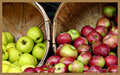
| 10/04/2006 10:34:51 PM |
Autumn Applesby gerdagriceComment: 3 - Like the concept and composition. Frame dominates too much and detracts in my opinion. Sharper focus on the apples and the fore/bottom ones (at least a few) not 'chopped', make this even better in my opinion. Focus looks sharper on the black something object behind the barrels/baskets. |
| 10/04/2006 10:28:44 PM |
Sittin prettyby Trumpeteer4Comment: 3 - This seems either out of focus or a little blurry. The focus on the stem/leaves seems a fraction sharper so could be focal issues. The saturation/contrast also seems to be 'blown', losing detail in the petals - this could be exaggerated by the use of 'neat image' or such, but apologies in advance if wrong. Overall there is no 'depth' to this shot (especially against the black background) and very little definition, in my opinion. The thin frame, including color choice, works quite well. Might seem minor, but your title with a " ' " or a "g", would be better. |
| Photographer found comment helpful. |
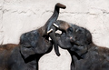
| 10/04/2006 10:09:51 PM |
A Love/Hate Relationshipby LoreneComment: 6 - Nice capture and composition. Shame about the tusks. The background 'line' makes this seem like it needs a nudge rotate up on the right, in my opinion, for balance. edit:changed 'left' to 'right'Message edited by author 2006-10-08 06:29:39. |
| Photographer found comment helpful. |
| 10/04/2006 10:02:15 PM |
Enchantingby jaxedComment: 6 - Nice colors and clarity. Wish it were bigger (720). That fore wing in a little more focus too, but difficult. |
| Photographer found comment helpful. |
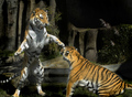
| 10/04/2006 10:00:13 PM |
Attackby md8speedComment: 6 - Good capture. Wonder, if the quality was there, if a much tighter crop, allowing the 'attacker' to dominate more, yet still showing the submission (seemingly) of the 'attackee', may have made this even better. Apologies in advance if wrong (and could be just motion blur) but looks like some dodge/hallowing areas visible in places. |
| Photographer found comment helpful. |
Home -
Challenges -
Community -
League -
Photos -
Cameras -
Lenses -
Learn -
Help -
Terms of Use -
Privacy -
Top ^
DPChallenge, and website content and design, Copyright © 2001-2026 Challenging Technologies, LLC.
All digital photo copyrights belong to the photographers and may not be used without permission.
Current Server Time: 06/10/2026 11:56:58 PM EDT.