|
|
|
Showing 2511 - 2520 of ~4957 |
| Image |
Comment |
| 11/22/2006 03:14:29 PM | Still Loveby smelby89Comment: 6 - Good potential, however the cat doesn't look too happy/content to me. Something funky going on mid to top left too in the 'black'. Like the textures of the hair and fur, wish they were sharper/stronger. |
| 11/22/2006 03:12:49 PM | Hello Up Thereby alanfreedComment: 7 - Good, just not sure on the white socks(?) and somewhat 'bland/studio' background. |  Photographer found comment helpful. Photographer found comment helpful. |
| 11/22/2006 03:07:52 PM | Corridor of Flagsby Hye5Comment: 4 - Don't mind the concept but think a straightening and much tighter crop on each side to eliminate the distracting background elements, likely make this better in my opinion. The colors / flags combined with the architecture style and color, make this seem to border on 'clashing'/busy too, but again, eliminating the background/sides and trying to 'use' the unusual combinations, may have worked. Otherwise, maybe a toning/b&w - who knows. | | Photographer found comment helpful. |
| 11/22/2006 03:05:15 PM | Pagan Sundayby pineappleComment: 8 - Nice image, toning works well, like the newspaper element. A more refined crop, especially on the left, or else a little more included, may make this even better in my opinion. Unusual framing does work, takes a bit of time to adjust / decide on, but your call anyway, obviously. | | Photographer found comment helpful. |
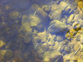
| 11/22/2006 02:58:05 PM | Trout Belowby justineComment: 7 - Nice shot that probably can't be appreciated as much at this size. A more refined crop, minimising or 'using more' the reflections, as well as trying to get the fish to 'pop' just a fraction more, may have made this even better in my opinion. Nice and clean and the colors seem natural. Like the 'over' perspective, but perhaps like to have seen it even more 'over'/direct, if possible - apologies in advance though if this is straight over the top. | | Photographer found comment helpful. |
| 11/22/2006 07:57:23 AM | On the prowlby jaimeDpComment: 4 - Like the potential and good perspective. Background elements are too distracting in my opinion. More importantly, the quality does not seem to be there, as well as a bit of blur. Focus seems to be sharpest on the legs, so adjusting that, especially to include the face/eyes and trying to gain more stop motion, make this better in my opinion. Also, bigger (640 height) and a variation in crop, even if you still preferred it with the ears chopped - but then, depends what you had to work with, obviously. | | Photographer found comment helpful. |
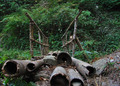
| 11/22/2006 07:50:58 AM | Acrossby abhraComment: 6/5..6 - Looks like good potential, especially for this Challenge. A tighter crop (especially to eliminate the 'something' upper right, as well as minimise the oof areas bottom left) - perhaps still leaving this off-centered compositionally, slight nudge rotation up on the left to straighten and some tweaking of levels/etc in pp to give this a little more depth, may have made this even better in my opinion. Like the strong perspective, although it does distort the bridge to the point where the logs dominate perhaps a little too much, not sure. | | Photographer found comment helpful. |
| 11/22/2006 07:37:25 AM | Fall From Belowby philcozzComment: 8 - Nice colors. I actually like the 'smoothness' in this shot and think that with the texture more discernible, would change the feel of the shot completely - still another good shot, just different. Maybe the bottom left cropped out may have made this even better, but it does add to the balance. Good angle with the upper leaves/stems/bokeh visible in the background, enhancing the perspective. Perhaps a little more in/filling up the frame, else more of a square framing may have also made this even better in my opinion. Nice clean and 'crisp' feel to it. Like your title. | | Photographer found comment helpful. |
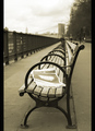
| 10/28/2006 06:19:31 AM | Track 2 - Union Stationby CutterComment: 7 - Nice image and colors. A more refined crop, especially left and bottom, quality dependent, may have made this even better in my opinion. | | Photographer found comment helpful. |
| 10/28/2006 06:12:32 AM | Evening Glimmerby ShmeeComment: 7 - Nice image and composition. Mainly the grain and to some extent the 'cloudiness', detracts in my opinion, but fairly minor. Likely just this medium, but would like to see more 'width' but probably looks good as is wall sized. | | Photographer found comment helpful. |
|
Showing 2511 - 2520 of ~4957 |
Home -
Challenges -
Community -
League -
Photos -
Cameras -
Lenses -
Learn -
Help -
Terms of Use -
Privacy -
Top ^
DPChallenge, and website content and design, Copyright © 2001-2026 Challenging Technologies, LLC.
All digital photo copyrights belong to the photographers and may not be used without permission.
Current Server Time: 06/11/2026 08:51:49 AM EDT.
|