| Image |
Comment |
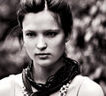
| 11/24/2006 04:36:17 PM |
Mby whiteroomComment: Nice image and portrait. Wonder if slightly more of a vertical framing would enhance her/the image even more - perhaps cropped slightly tighter on the right, but your call, obviously.
edit to say: didn't realise when I said the above that that is kinda what you did in this shot:
 Message edited by author 2006-11-24 17:08:53. Message edited by author 2006-11-24 17:08:53. |
 Photographer found comment helpful. Photographer found comment helpful. |
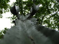
| 11/24/2006 11:05:58 AM |
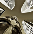
Dragon Rider'sby chipsterComment: 2 - Strong perspective, but cannot decipher enough of what the subject is, despite your title. The dominant oof areas within the frame/composition are also too distracting. Focus seems best right up the top of the 'something', but there is very little of that visible. |
| Photographer found comment helpful. |
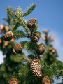
| 11/24/2006 11:02:57 AM |
Attack of the Conesby colorcarnivalComment: 4 - Like this, including the concept & unusual perspective. Perhaps more of a refined crop (mainly to eliminate the oof 1 and 2 1/2 cones) along with possibly a squarer framing, may have made this even better in my opinion. Depending what you had to work with (obviously), a variation in composition, bringing the main subjects further to the right as well. edit:typo & to add glad you found my comment helpfulMessage edited by author 2006-11-30 14:25:54. |
| Photographer found comment helpful. |
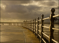
| 11/23/2006 03:25:58 PM |
The Promenadeby mimidComment: 6 - Like the colors and scene. A more refined crop, especially left and right, some 'tweaking' in pp to gain a little more depth/drama, as well as the 'posts' in just a little more focus make this even better in my opinion. Like the reflections in the puddles - if they were featured more 'somehow', likely give this even more of an edge. |
| Photographer found comment helpful. |
| 11/23/2006 03:24:00 PM |
To the sky by nico_blueComment: 8 - Very nice. Toning works very well here, adding good depth/drama. Might be a shot that cannot be appreciated at this size and the resizing has caused aspects like the (seemingly) 'overexposure' to be accentuated. Maybe an even squarer framing/crop, who knows, else a more refined crop, mainly to eliminate the white 'something' near bottom left corner. Likewise, undedided if I would prefer to see more of the 'different' building coming into frame on the left, else it cropped out altogether and the chimera/'gargoyle' featuring more prominently. Excellent perspective. |
| Photographer found comment helpful. |
| 11/23/2006 03:11:49 PM |
Daylight Illuminationby dahvedComment: 4 - Like the perspective. Variation in composition and framing, perhaps going for wider or even more of a square framing, likely enhance this subject/'use' the square lights more, and make it even better in my opinion. |
| Photographer found comment helpful. |
| 11/23/2006 03:09:57 PM |
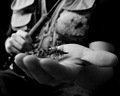
Mr. Fisherman and his lucky fly.by Dan_CottleComment: 6 - Like the concept. Wish the focal area was a little wider (or else more to the fore - reducing the focus on the forearm as well) to include the fingers a little more, even if they were still oof, but the fly was more in focus, and more visible. A slight variation in composition too, perhaps bringing a little more space into the left of frame, not sure. The b&w works well, as would likely any other toning. The character/'story' is good. A more refined crop as well, especially at bottom. Good use of perspective. |
| 11/22/2006 11:25:35 PM |
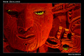
NZby rinacComment: 8 - Good idea. Good layout and colors. Nice and clean design work. Maybe the face texture/focus a little sharper, may have made this even better in my opinion. Not sure, but perhaps a little gree somewhere on the outside/lines/text/something as well. Minor, but the glare/reflection detracts slightly. |
| Photographer found comment helpful. |
| 11/22/2006 10:49:22 PM |
Greetings from the Seashoreby noranekoComment: 4 - Like the concept. Like to have seen the state put in somewhere, but fairly minor. More important is the color of the matting/frame isn't enhancing the crab in my opinion. Don't mind the font choice, but the font 'distortion' is not exaggerated enough to give it the punch I imagine you were intending. The oval shape seems a bit off (tilted and compositionally), but could be intentional, so again, perhaps exaggerating that a little more might have given this an edge. |
| Photographer found comment helpful. |
| 11/22/2006 10:40:47 PM |
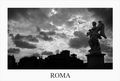
Romeby pmottaComment: 8 - Nice and clean. Even though you cannot see too much of Rome, it (image+framing+text=postcard) has good character and a good depiction. Toning works well. As mentioned, perhaps a little more detail in the buildings/architecture, however you would likely lose that very good and unusual sky. |
| Photographer found comment helpful. |
Home -
Challenges -
Community -
League -
Photos -
Cameras -
Lenses -
Learn -
Help -
Terms of Use -
Privacy -
Top ^
DPChallenge, and website content and design, Copyright © 2001-2026 Challenging Technologies, LLC.
All digital photo copyrights belong to the photographers and may not be used without permission.
Current Server Time: 06/11/2026 03:16:39 PM EDT.