| Image |
Comment |
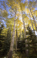
| 10/07/2006 06:13:23 PM |
Aspen Glowby remarshComment: 7 - Nice lighting, colors, composition and framing. Just wish a fraction more contrast, or possibly saturation, not sure - but likely difficult with exposure issues. May well be exactly as you intended anyway. Perhaps a more refined crop at the bottom, or a softening to help the 'glow' dominate more, not sure. |
 Photographer found comment helpful. Photographer found comment helpful. |
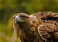
| 10/07/2006 06:11:01 PM |
The Hunterby RissaComment: 8 - Oh... very nice. 'If only' the face/beak/eye were as sharp as the wing/etc.. but difficult - and at any rate, may well have made a 'different image' - if that makes sense. Depending what you had to work with, I do wonder about a variation in composition framing, but your call, obviously, and you likely had reason(s) for composing like this. edit:typo & wordingMessage edited by author 2006-10-08 06:35:01. |
| Photographer found comment helpful. |
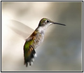
| 10/07/2006 06:08:10 PM |
Full Reverseby NstiG8trComment: 7 - Oh, very nice capture, including of the 'reversing' - just the finer details in such a delicate image, in my opinion, need to be 'super clean', to really make this excellent... I can see traces of sharpening/haloing around the beak, and possibly tail and just some minor grain here and there - but difficult, especially as this is likely a very close crop. Even the gray background works well, as it does help 'showcase' the natural colors in the hummingbird. |
| Photographer found comment helpful. |
| 10/07/2006 06:03:42 PM |
fall spiderby tamatamaComment: 6 - Like this, nice colors, good composition. Just seems to have little texture/definition/depth - which could be a result of 'neat image', but apologies in advance if wrong. |
| Photographer found comment helpful. |
| 10/07/2006 06:01:42 PM |
Cameron At Bayby Jason_CrossComment: 8 - The processing complements the characters in this shot very well in my opinion. Colors are good too. The main things that detract (and fairly minor) in my opinion are: the (dark) visible manhole/drain/something on the left and the skin/lighting on the young gentleman's face on the left (just seems slightly 'inconsistent' with the other two), but fairly minor. The 'blown' areas don't detract and actually add to the good character overall captured, including of the individuals. Good image, which no doubt will be treasured by each of the three. |
| Photographer found comment helpful. |
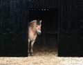
| 10/07/2006 05:52:44 PM |
Life is Goodby messerschmittComment: 7 - Nice image. Could just be a visual thing, and apologies in advance if wrong, but looks like it needs a whisker nudge rotate up on the right. The slightly blown areas in the hay/grass/whatever bottom right detract, but fairly minor. Just a little more definition/detail on the horse would have been good but, difficult. |
| Photographer found comment helpful. |
| 10/07/2006 05:49:47 PM |
Ride Em Cowdogby loriprophotoComment: 8 - Very good. Most likely opportune, so little to be done about the vehicles in the background, although oof and fairly minor. Your call (obviously), but perhaps cloning out the white/gray 'something' bottom right of the saddle, but again, minor. A few nit-picks here and there but really none that detract from an overall great (and fun) shot. |
| Photographer found comment helpful. |
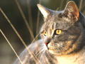
| 10/07/2006 05:31:56 PM |
Contentby BigKComment: 7 - Nice lighting and elements. The few 'blown' areas don't detract too much in my opinion. The only thing might be the slight 'haze', but could be intentional, as well as just a just a little more room above the cat's left ear. Nice composition. Wish it was 720 - and with just a fraction more 'pop'/contrast/etc - but again, might be exactly how you wanted it. edit to clarify: 720 = 720 pixels, the allowance given for this ChallengeMessage edited by author 2006-10-09 15:51:56. |
| Photographer found comment helpful. |
| 10/07/2006 05:27:47 PM |
pumpkinby undieyatchComment: 6 - Like this. The toning/b&w works well in my opinion, especially if the viewers 'knows' the vivid color of these flowers. Can't help wondering if a very feint color left in (on just flower or even flower and leaves) may have just given this a little extra, but your call, obviously. Wonder also, compositionally, whether a little more top and bottom may have given a fraction more overall 'balance'. |
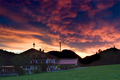
| 10/07/2006 05:23:55 PM |
Shepherds Delightby KHoltComment: 3 - Is a nice sky/cloud capture, with a few nice elements within the image (but also a few detracting ones in my opinion), including the contrasting green (which a bit bolder might have complemented the sky even more) - however the main thing that grabs my attention after the sky is, what appears to be unfinished burning on the hills/mountains. Perhaps it is an 'error', or else a monitor miscalibration, who knows. |
| Photographer found comment helpful. |
Home -
Challenges -
Community -
League -
Photos -
Cameras -
Lenses -
Learn -
Help -
Terms of Use -
Privacy -
Top ^
DPChallenge, and website content and design, Copyright © 2001-2026 Challenging Technologies, LLC.
All digital photo copyrights belong to the photographers and may not be used without permission.
Current Server Time: 06/11/2026 03:43:40 PM EDT.