|
|
|
Showing 2381 - 2390 of ~4957 |
| Image |
Comment |
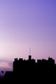
| 11/25/2006 02:50:07 PM | castleby mambaComment: Not sure what you are ideally trying to achieve with these Edinburgh Castle shots, however am willing to offer an opinion on them as they are. I'm not an expert in photography, so the technical aspects, etc will hopefully be provided to you by 'another' (if that is what you are also seeking), otherwise try to educate yourself on them here at DPC or elsewhere.
The subject has been photographed many times, so either you need to do a flawless 'standard' or else try to do something unique, in my opinion. I like the sky in both shots, although the purple tinged one does have a bit more drama, primarily because of the range. This blue one seems to have some issues bottom right corner going down over the steeples, which at a quick glance look like a broad dodge brush stroke, but not sure. This famous historical Castle has a lot of character, so trying to capture that into an image, 'somehow', will also give an edge to these shots.
Besides the sky (which seems relatively 'clean' in both shots), the two main detractors in these shots in my opinion are the shape/silhouette of the castle and the composition/framing. The shape/silhouette with more detail and shape discernible (perhaps even more tightly cropped to 'show' the castle/architectural features more), or else possibly even allowing some light play in 'somehow' to light the subject (unless a silhouette is your intent). Angle, including 'the best', as well as an unusual one, (obviously restricted by access to vantage points), is also important. The composition, whilst the sky is nice, the castle isn't appearing in the frame enough, and the parts that are, are not balanced within the frame/composition. A variation in crop, and also framing (to suit the 'shape' of the composition), would also likely improve these shots. Either choosing a specific profile/side of the Castle and creating an image of it, or else isolating areas of the Castle that you like and 'showcasing' them, via a much tighter zoom.
This 'opinion'/comment covers both images, so will paste a copy onto the other. If you put these into your Portfolio, they'll show up on the recent comments/uploads page, as well as your Profile page & you may get more comments/feedback as well. Also, given you've asked twice in the Forums for feedback on these, it might be a good idea to put what you were trying to achieve in your photographer's comments, as well as the forum post perhaps. edit:removed pasted typo comment, although paying some attention to your titles in general, is also important, in my opinion & edit2:added ThreadMessage edited by author 2006-11-25 15:04:26. |  Photographer found comment helpful. Photographer found comment helpful. |
| 11/25/2006 02:49:56 PM | edinburghblueby mambaComment: Not sure what you are ideally trying to achieve with these Edinburgh Castle shots, however am willing to offer an opinion on them as they are. I'm not an expert in photography, so the technical aspects, etc will hopefully be provided to you by 'another' (if that is what you are also seeking), otherwise try to educate yourself on them here at DPC or elsewhere.
The subject has been photographed many times, so either you need to do a flawless 'standard' or else try to do something unique, in my opinion. I like the sky in both shots, although the purple tinged one does have a bit more drama, primarily because of the range. This blue one seems to have some issues bottom right corner going down over the steeples, which at a quick glance look like a broad dodge brush stroke, but not sure. This famous historical Castle has a lot of character, so trying to capture that into an image, 'somehow', will also give an edge to these shots.
Besides the sky (which seems relatively 'clean' in both shots), the two main detractors in these shots in my opinion are the shape/silhouette of the castle and the composition/framing. The shape/silhouette with more detail and shape discernible (perhaps even more tightly cropped to 'show' the castle/architectural features more), or else possibly even allowing some light play in 'somehow' to light the subject (unless a silhouette is your intent). Angle, including 'the best', as well as an unusual one, (obviously restricted by access to vantage points), is also important. The composition, whilst the sky is nice, the castle isn't appearing in the frame enough, and the parts that are, are not balanced within the frame/composition. A variation in crop, and also framing (to suit the 'shape' of the composition), would also likely improve these shots. Either choosing a specific profile/side of the Castle and creating an image of it, or else isolating areas of the Castle that you like and 'showcasing' them, via a much tighter zoom.
This 'opinion'/comment covers both images, so will paste a copy onto the other. Your title has a typo in this one. If you put these into your Portfolio, they'll show up on the recent comments/uploads page, as well as your Profile page & you may get more comments/feedback as well. Also, given you've asked twice in the Forums for feedback on these, it might be a good idea to put what you were trying to achieve in your photographer's comments, as well as the forum post perhaps. edit:added ThreadMessage edited by author 2006-11-25 15:03:36. | | Photographer found comment helpful. |
| 11/24/2006 06:13:08 PM | Introducing Mr. Geckoby QuincyComment: 9 - Wow. Very nice color. Perhaps the darker color blue/purple underneath dominates a little too much, but then it does offset and complement the darker colors in the gecko. The use of the very shallow dof works really wellhere, not just with the eye and textures, but the leaf(?) and colors as well. Wish it were bigger 'somehow', but I realise it is already 640 width. Maybe a bit more green above (if you had it obviously), just for extra 'size', might change the image too much so, who knows. Good perspective. Nice shot. A frame would likely bring this to life even more, but pixels are precious, especially with an image like this, in this medium. Nice and clean, really can't see any grain at all. If this was neat imaged, it still works well in my opinion, without a little more discernible texture, which would also have likely made this even better. Basic editing Challenge though so, fairly limited. | | Photographer found comment helpful. |
| 11/24/2006 05:55:03 PM | Treesby naomikComment: 6 - Nice image. Wish it was 640. Toning works well. | | Photographer found comment helpful. |
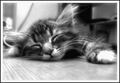
| 11/24/2006 05:53:22 PM | Sleeping Beautyby BlackdoGphotoComment: 8 - Nice image and perspective. Like the angle and use of the wide angle lens. Like the effect of the leaves at the bottom/fore, almost has a 'sweeping' effect. Colors are very nice. Mainly the top right corner, a more refined crop make this even better in my opinion. Maybe on the left too where the tree is, but minor. |
| 11/24/2006 05:41:39 PM | Dreaming Something Sweetby TristeLeucosiaComment: 6 - Nice image. The obvious overexposure on the paw(s) aside, the b&w works well here. Just the background elements detract overall, but fairly minor. Like the ground level perspective. Softness works, undecided if sharper would make this even better, likely just a 'different' type of shot. Depending what you had to work with, a nudge rotate up on the left (without cropping out ears/paws) and 640, likely make this even better in my opinion. Undecided on the dark outer frame. |
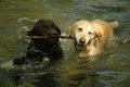
| 11/24/2006 04:58:03 PM | Palsby OmanOtterComment: Nice capture. Lighting is nice on the white/golden lab/retriever. A difficult shot with the color range of the two dogs, the black one doesn't have as much detail, but could just be focal area/sharpness. Perhaps some tweaking in pp to try to get the dogs to 'pop' a little more, might make this even better in my opinion. | | Photographer found comment helpful. |
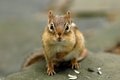
| 11/24/2006 04:55:11 PM | Chipmunkby OmanOtterComment: Nice capture and focal area. Perhaps a slightly finer crop on either side make this even better in my opinion. Difficult, but 'even sharper' also give this even more of an edge - not easy though. | | Photographer found comment helpful. |
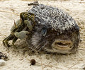
| 11/24/2006 04:52:37 PM | crab.jpgby MistyMuckyComment: Fairly good and unusual capture. They could be friends, except one is dead.. Fraction sharper, slight tweaking of the colors and perhaps a variation in composition/cropping, likely make this even better in my opinion. Like to have seen an even sharper (ground-up) perspective too, but opportune. | | Photographer found comment helpful. |
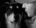
| 11/24/2006 04:49:07 PM | Sympathyby jmritzComment: Good and unusual image and capture. Like the oof on the 'man' just wish it were a fraction sharper on the dog's eyes, however does work as is in my opinion and, anyway, opportune I imagine. edit: removed temporary noteMessage edited by author 2006-11-24 19:15:13. | | Photographer found comment helpful. |
|
Showing 2381 - 2390 of ~4957 |
Home -
Challenges -
Community -
League -
Photos -
Cameras -
Lenses -
Learn -
Help -
Terms of Use -
Privacy -
Top ^
DPChallenge, and website content and design, Copyright © 2001-2026 Challenging Technologies, LLC.
All digital photo copyrights belong to the photographers and may not be used without permission.
Current Server Time: 06/10/2026 03:01:10 AM EDT.
|