| Image |
Comment |
| 12/17/2006 12:09:01 AM |
Skyby amjltComment: 7 - Nice 'character capture' here, just the dots/fabric at the base detract, but fairly minor. Like to have seen the eyes both in focus and more clarity too. |
 Photographer found comment helpful. Photographer found comment helpful. |
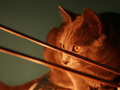
| 12/17/2006 12:08:12 AM |
my sweet pearlby shoggyComment: 7 - Nice. Nice colors and capture. Don't mind the effect created by the object in the foreground. Perhaps the other eye more visible, as the outline of it is there yet no color appearing and just a little sharper too. Perhaps also, the book/whatever Pearl is sitting on, a tighter crop to eliminate that a little more or else 'use' it more, may have also given this an edge. |
| Photographer found comment helpful. |
| 12/17/2006 12:06:40 AM |
Sweet Dreamsby njsabsComment: 8 - Nice colors and lighting. Like the candy cane to be a little more subtle, but mainly for this Challenge. Fractions harper on the eyes/nose, yet still retaining the good dof and softeness around too. |
| Photographer found comment helpful. |
| 12/17/2006 12:05:38 AM |
Is That a Treat for Me?by KrystleComment: 6 - Nice capture - not sure on the crop at the top and the horizontal framing. Bit more contrast/something for more 'depth' make this better too in my opinion. Sharper on the eyes and a little 'clean' too. |
| Photographer found comment helpful. |
| 12/17/2006 12:04:47 AM |
|
| Photographer found comment helpful. |
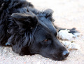
| 12/17/2006 12:03:54 AM |
Bah Humbug!by ellamayComment: 6 - Sharper (and more visibility) on the face and perhaps a variation in angle/perspective to give this more drama/depth, make this better in my opinion. Background color making the dog get a little lost in it. |
| Photographer found comment helpful. |
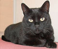
| 12/17/2006 12:02:34 AM |
My catby fchossonComment: 6 - Difficult to tell with the b&w about the eyes and lighting, but looks like the lighting does look too harsh - blown areas on the chin/chest/etc - but could be intentional. Like the composition, but.. although this is quite unique in b&w, do wonder about color. Just a little too brigh in the eyes in my opinion. |
| Photographer found comment helpful. |
| 12/17/2006 12:00:01 AM |
He's not smiling.by jimsappComment: 7 - Very nice clarity and coloring and lighting (even with the blown areas), just the crop and the framing. Wonder about a variation in the framing but, the crop - if you had cropped tighter at the top (especially to eliminate top left darker corner) make this much better in my opinion - even though obviously, the ears chopped would remain, which still works as is but, may be better 'with', who knows. |
| 12/16/2006 11:58:11 PM |
Pennyby GrandadComment: 5 - Like the perspective and pose, just the grain/noise and base/background detract mainly in my opinion. Sharper too. |
| Photographer found comment helpful. |
| 12/16/2006 11:57:33 PM |
Waiting to Playby two_azComment: 7 - Nice shot, just wish the eyes were sharper and had a little more light on them. |
| Photographer found comment helpful. |
Home -
Challenges -
Community -
League -
Photos -
Cameras -
Lenses -
Learn -
Help -
Terms of Use -
Privacy -
Top ^
DPChallenge, and website content and design, Copyright © 2001-2026 Challenging Technologies, LLC.
All digital photo copyrights belong to the photographers and may not be used without permission.
Current Server Time: 05/16/2026 01:05:49 PM EDT.