| Image |
Comment |
| 12/20/2006 06:52:57 AM |
Squeak0198Web.jpgby RistyzComment: '5', maybe 6, from me, hypothetically. This doesn't compare to your entry in my opinion, which is a very nice image. Was surprised to see where it placed. |
 Photographer found comment helpful. Photographer found comment helpful. |
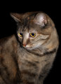
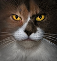
| 12/20/2006 06:51:54 AM |
Tabbyby yankoComment: Wow. '9' likely, hypothetically. Eyes look more 'natural' in this, in my opinion. |
| Photographer found comment helpful. |
| 12/20/2006 06:50:50 AM |
|
| Photographer found comment helpful. |
| 12/20/2006 06:48:54 AM |
|
| Photographer found comment helpful. |
| 12/20/2006 06:36:07 AM |
Corner Kittyby jenesisComment: Nice image. This and your others don't compare with your very good entry though, in my opinion. |
| Photographer found comment helpful. |
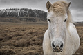
| 12/20/2006 06:09:17 AM |
Braving the weathersby MephistoComment: Originally posted by Mephisto:
..@macrothing: this horse is (unfortunately) not mine, so i don't know its name, i wonder if it even has one...i'll ask it next time i see it |
You do that or.. just make one up next time. Thanks for the response to my comment. |
| Photographer found comment helpful. |
| 12/20/2006 06:01:41 AM |
not entering.jpgby mkComment: '5' likely, maybe 6 - depends where you cropped it to get it 640 ":)". Hope you 'understood' the comment on your real entry. This has a much better 'feel' to it, in my opinion... |
| Photographer found comment helpful. |
| 12/20/2006 05:58:47 AM |
|
| Photographer found comment helpful. |
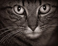
| 12/19/2006 02:59:58 PM |
V.by muur88Comment: 9 - Oh, this is very nice. Really like the simplicity and color choices, including background patterns. The horizontal framing works well, as would a vertical I imagine. Not sure on the black frame, but fairly minor. Could be just a visual thing but the left 'space' seems a fraction bigger / wider than the right. Looks like resizing issues, but just a little more detail / clarity in the eyes.. but likely there full size. Sure this looks good bigger. Seems some shadowing/something going on above V.'s crown/forehead, not sure. Up to 9 from 8. Really like the pose/capture. |
| Photographer found comment helpful. |
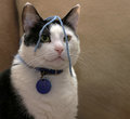
| 12/19/2006 02:58:59 PM |
18 years by yankoComment: 8 - Really like this, especially the symmetry and colors, but the overall 'feel' to it seems a little over processed to me (especially around the eyes), but might just be a matter of personal taste. Just like to have seen more detail and texture, in the eyes, fur, etc - looks slightly unnatural. A fraction wider likely have worked well too, but fairly minor, works well as is. As for the age... with clarity in the eyes like that, one lucky cat. Up to 8 from 7. |
| Photographer found comment helpful. |
Home -
Challenges -
Community -
League -
Photos -
Cameras -
Lenses -
Learn -
Help -
Terms of Use -
Privacy -
Top ^
DPChallenge, and website content and design, Copyright © 2001-2026 Challenging Technologies, LLC.
All digital photo copyrights belong to the photographers and may not be used without permission.
Current Server Time: 07/28/2026 05:08:09 AM EDT.