| Image |
Comment |
| 11/03/2007 01:19:56 PM |
Nemo the dogby robstComment: Nemo's getting lost in the background. A different angle / background would have been better. Image looks tilted too. |
| 11/03/2007 01:17:55 PM |
Coffee Shop Fossilsby AliciaComment: Good scene, but your 'effects' make this too digital art for photography. I doubt it will be allowed by the rules. |
 Photographer found comment helpful. Photographer found comment helpful. |
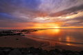
| 11/03/2007 01:16:24 PM |
Dawn Breaksby Shadowi6Comment: Beautiful sunrise. While it, for some reason, doesn't seem to matter much in this image that the horizon is not level, just bringing it up to allow more balance make this better in my opinion. I think the strongest part of the image is center so, while the other areas give good context, the center (at this size anyway) isn't getting the 'stage' as much as it deserves, so maybe a tighter crop, if the quality is/was there. |
| Photographer found comment helpful. |
| 11/03/2007 01:12:10 PM |
Aggiesby jadkpicsComment: 8 - Nice clean image - guessing you have a nice lens/camera. Like the sun shining on the crowd giving an unusual people bokeh. Good image for 50 - if he ever sees it, I'm sure he'd like it. To me this shot is mostly about him, so your title is not 'using' that aspect (if that makes sense) - in my opinion. |
| 11/03/2007 12:54:51 PM |
Newlywedsby kellianComment: Nice image, especially for this 'genre'. Like the bird element, although shame it is not profiled/side on to show the beak. Biggest detractors in this image (my opinion) are the cropping - top of the pier/jetty/boardwalk and the bottom gap in his pants/legs and that the sun, while a nice element is just a fraction too strong and taking away the 'focus' on them. Maybe tweaking in pp may have helped, but I imagine you've already done pp. |
| Photographer found comment helpful. |
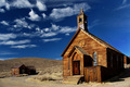
| 11/03/2007 12:51:38 PM |
Abandoned Religionby VenomComment: Nice scene. Find the buildings at the rear slightly distracting, only because I can't see them all, so either more in or 'out', in my opinion. Love the colors of the sky and wood. |
| Photographer found comment helpful. |
| 11/03/2007 12:49:12 PM |
Steel Harbourby jegerComment: Water level seems slightly out, enough that it distracts me. Like the long exposure timing. Maybe the colors 'upped' just a fraction, not sure. They just look a little 'dull' - but could be your intent. |
| Photographer found comment helpful. |
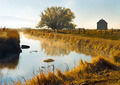
| 11/03/2007 12:46:46 PM |
Praire Morningby NaldComment: 7 - Nice peaceful scene. Like the composition. Like the lines. Like the subtle sky. Not sure on the title, unless it is a typo. Maybe just the rocks (?) at the very fore more in focus, else 'out'. |
| Photographer found comment helpful. |
| 11/03/2007 12:44:42 PM |
Cowby TiNComment: Nice image. Really like the colors. Focus /detail on the cow looks a little 'off' - but could be intentional and/or processing. Like her grass stains on her knees. |
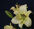
| 10/29/2007 06:29:50 AM |
Seeking Lightby bgslawComment: Originally posted by bgslaw:
I understand several comments state "flat lighting" and lighting could be better. I would like to know how I could improve the lighting.
I shot by a window w/ indirect lighting without a flash. |
Repeat my little 'caveat' in my previous comment.
I usually prefer natural light with flowers (just personal preference). You say you've used natural light, indirect, but it is barely discernible in this image. I wonder if it was more prominent before your processing.
Anyway, first thing I notice in this image is that the focus is off (could be blur too). It is a delicate yellow (I'm trying to work out if it is a day lily, amaryllis or other) - nice flower. You mention in your comments two things that intrigued me - you upped the saturation (which I can't 'see') and you applied an unsharp mask. I'm not sure if you were aiming to achieve a certain effect in this image, but it is not 'strong' either way. The background is not enhancing the colors or making the flower 'pop'. A little more distance between the subject and the background, and ensuring there is no 'crease' line visible, would have helped give the image more depth. Lastly, is the 'cut' flower at the bottom. Obviously a difficult crop, so perhaps paying more attention to your composition and 'framing' in camera, would make it easier for you once you get the image to edit.
I didn't vote in this Challenge, but if I did I likely wouldn't have scored this above 3 - because of my reasons stated above, but also because I had/have a different idea of 'flora' - and Challenge themes are important to me when I vote.
Don't pack up the camera if you 'want' to take images - perhaps see how the camera can help you 'create' an image. If these are your favorite subjects, experiment. Experiment with composition, lighting, etc. Get one of your images printed ('largeish') and put it somewhere and study it. See what could be improved. Imagine and then try. Practice makes perfect ... or so they say. Feel free to rip apart/comment on any of mine if you wish to train your eye. Commenting is educational in itself, in a variety of ways. |
| Photographer found comment helpful. |
Home -
Challenges -
Community -
League -
Photos -
Cameras -
Lenses -
Learn -
Help -
Terms of Use -
Privacy -
Top ^
DPChallenge, and website content and design, Copyright © 2001-2026 Challenging Technologies, LLC.
All digital photo copyrights belong to the photographers and may not be used without permission.
Current Server Time: 07/27/2026 02:34:32 AM EDT.