| Image |
Comment |
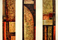
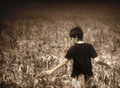
| 03/13/2010 05:10:13 PM |
Trinityby dtremainComment: 6 - Like the framing/composition and the colors are quite nice, but I wonder how much of the image is a literal representation of existing art by another artist. |
 Photographer found comment helpful. Photographer found comment helpful. |
| 03/13/2010 05:08:53 PM |
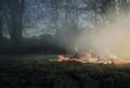
The Burial of the Deadby 4trtoneComment: 6 - It is odd, but not pushed to the extreme it needs to be, in my opinion. What I get of the concept, I don't personally find appealing. |
| Photographer found comment helpful. |
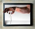
| 03/13/2010 05:07:15 PM |
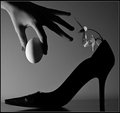
wordby EstimatedEyesComment: 6 - I like the concept, but the composition seems unbalanced - book needs to be a little more dominant in my opinion - but the size constraints might be working against this. |
| Photographer found comment helpful. |
| 03/13/2010 05:06:03 PM |
|
| Photographer found comment helpful. |
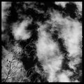
| 03/13/2010 05:04:15 PM |
cleaning the lint trapby smardazComment: 6 - I like that you've gone for oddness, but it is not quite odd enough and doesn't pack enough pp punch, in my opinion. The focal points also detract. |
| Photographer found comment helpful. |
| 03/13/2010 05:02:14 PM |
Perfect Dayby Tlee05Comment: 7 - I like the feel, the mist, the colors, the perspective, the focal points - for me the elements of the picnic are 'off'. But that is just a personal perception thing, i.e.: apple and beer.. Up to 7 from 6. |
| Photographer found comment helpful. |
| 03/13/2010 04:59:48 PM |
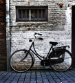
The bicycleby RUEDISCHMUTZComment: 6 - Quite a classic, and you found a bicycle with some character. I wish it were not chopped on the right and compositionally a little variation. |
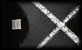
| 03/13/2010 04:58:53 PM |
Sound Through Scratchby MagnumphotographyComment: 6 - I like the colors, the abstractness, the transparency and even the framing - hard to explain, but it seems a little harsh - might be that black area. |
| Photographer found comment helpful. |
| 03/13/2010 04:57:34 PM |
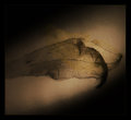
Deveinedby macwilyumComment: 6 - I like the subject and the shadow element, but wish it were more defined/sharper and the composition slightly different - the angle of the shadow and the angle of the leaf/veined thing (might be a pod), just isn't sitting well - despite the good darker corners to try to balance it out. I quite like your framing too. Just seems out, somehow, but may be different on a different medium/larger. |
| Photographer found comment helpful. |
| 03/13/2010 04:53:41 PM |
A Quiet Moment.by BarbBComment: 6 - Maybe it is because of the size constraints, but I wish I could decipher what that orange/yellow thing is. Otherwise, I like the tones and wish this had a little more of a dreamy/fantasy feel overall. |
| Photographer found comment helpful. |
Home -
Challenges -
Community -
League -
Photos -
Cameras -
Lenses -
Learn -
Help -
Terms of Use -
Privacy -
Top ^
DPChallenge, and website content and design, Copyright © 2001-2026 Challenging Technologies, LLC.
All digital photo copyrights belong to the photographers and may not be used without permission.
Current Server Time: 06/25/2026 12:52:27 AM EDT.