| Image |
Comment |
| 02/02/2008 05:00:40 PM |
|
 Photographer found comment helpful. Photographer found comment helpful. |
| 02/02/2008 04:03:17 PM |
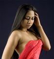
Suzetteby rwo82939Comment: 4 - Seems either a soft focus or slight blur, which I don't find enhances the image, that coupled with the background color and the unnaturally draped fabric. The lighting is quite nice but not strong in the right places, in my opinion. Centered isn't really working (again, my opinion) and I'd like to (again) see it either sharper, or with a true soft feel/focus. |
| Photographer found comment helpful. |
| 02/02/2008 03:16:14 PM |
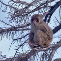
Mr. Macaqueby ZeppKashComment: 6 - Nice composition and elements, wish he 'popped' a little more - not sure on the grain, but could be intentional.... just noticed the oof branches with snow back right... they look good. |
| 02/02/2008 03:14:10 PM |
Escape by redeyedfrogComment: 6 - Like this, just wish more refined crop at the bottom and maybe a straighten. At first thought I'd like to see stronger dof, but the fading works - the blue in the sky is barely discernible, so maybe bringing that in more, but again minor. |
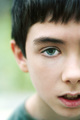
| 02/02/2008 03:11:53 PM |
Danielby JamesAComment: 7 - Nice image. The softness works well. Like the way his eye matches his shirt. Find the mouth open a fraction too much but coul be the angle, but fairly minor. Like your crop. |
| Photographer found comment helpful. |
| 02/02/2008 03:09:51 PM |
Turbulent Skyby codfishComment: 5 - Nice exposure (don't mind the sky), but I wish to see the steeple straight, so the tilt is distracting - it does kind of work like this, and may well be intentional, but perhaps a stronger image with it 'straight'. |
| Photographer found comment helpful. |
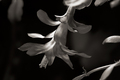
| 02/02/2008 03:04:54 PM |
Zygocactusby undieyatchComment: 6 - Like this. You're brave to remove the beautiful colors that these flowers usually display. The tones work well. I find the top oof leaf a little distracting and compositionally seems like it is slightly off balance, perhaps a variation in framing, not sure. |
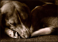
| 02/02/2008 02:59:29 PM |
Samby TammerComment: 6 for Sam. Just a little dark for me, but could be intentional. Like the textures. |
| Photographer found comment helpful. |
| 02/02/2008 02:58:51 PM |
High Jumpby TomComment: 7 - Nice action shot. Good composition. Like to see it 'pop' a little more, somehow. |
| Photographer found comment helpful. |
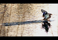
| 02/02/2008 02:57:41 PM |
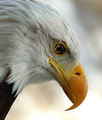
Landing Stripby raishComment: 7 - Nice capture - difficult one to get. Framing works well (although wonder about a variation in color to enhance the bird). Nice image. |
| Photographer found comment helpful. |
Home -
Challenges -
Community -
League -
Photos -
Cameras -
Lenses -
Learn -
Help -
Terms of Use -
Privacy -
Top ^
DPChallenge, and website content and design, Copyright © 2001-2026 Challenging Technologies, LLC.
All digital photo copyrights belong to the photographers and may not be used without permission.
Current Server Time: 07/24/2026 06:26:06 PM EDT.