| Image |
Comment |
| 03/08/2008 08:04:40 AM |
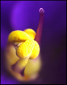
African Violetby beneeComment: I nearly commented on this during the Challenge, but didn't, mainly due to time. I like the concept but the two biggest detractors were the overblown color (yellow) and the lack of sharp focus in the fore area. A variation in composition as well to balance this out would likely have helped as well. I don't know much about shooting with extension tubes, but I think that the focal area is very narrow, if I'm not mistaken, so you would need to adjust your angle/subject to compensate for that. |
 Photographer found comment helpful. Photographer found comment helpful. |
| 03/08/2008 08:01:47 AM |
Abstract Eyeby StuMComment: Perhaps a more extreme crop and composition may have produced a stronger (and true) abstract, as is, this doesn't appear as an abstract image, despite your title. The colors overall and flare on the lights in the trees are nice. |
| Photographer found comment helpful. |
| 03/08/2008 08:00:23 AM |
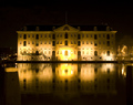
Scheepvaart Museumby ajschelComment: No expert on night photography, but this appears to be overexposed. Especially with the new rules, perhaps trying to combine differently exposed images to create more even lighting may improve upon what it seems you are aspiring to. The reflection is nice. |
| Photographer found comment helpful. |
| 03/08/2008 07:55:43 AM |
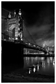
The Suspension Bridgeby sibelingComment: I gave this a 6. Liked the tone/b&w - works very well. A more refined/tighter crop on the left and at the bottom would likely have made this a much stronger image in my opinion, that coupled with 720, especially in a Challenge like this. |
| Photographer found comment helpful. |
| 03/08/2008 07:53:45 AM |
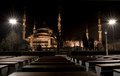
Arabian nightsby NatashaComment: I gave this a 7. Liked the perspective and unusual coupling of the mosque and pews/tables. The lights were/are nice. |
| Photographer found comment helpful. |
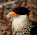
| 03/08/2008 07:52:27 AM |
Caracaraby toddgrayComment: I gave this a 7. Liked the colors, including the background which complemented the bird. Difficult at this angle, but to be able to see a little more of the eye, likely make this a stronger image in my opinion. |
| Photographer found comment helpful. |
| 03/08/2008 07:48:56 AM |
Desert's Delightby RistyzComment: I gave this an 8. Really liked it and was a second away from commenting but didn't. Really liked the curvature of the terrain and the colors of the brush / flora. Nice image. edit: refinedMessage edited by author 2008-03-08 14:56:26. |
| Photographer found comment helpful. |
| 03/08/2008 07:29:16 AM |
Whiskersby MelethiaComment: Came back to add to my somewhat 'short' comment below (but hopefully my score spoke some too). I liked this, especially the concept - wondered during voting about a tighter crop at the bottom to eliminate the oof area of the paw, and reduce the strong highlights which just take a little too much away from those 'pure' looking whiskers. |
| Photographer found comment helpful. |
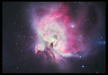
| 03/08/2008 07:25:33 AM |
Orion's nebula - celestial cotton candyby jlanoueComment: Thank you for continuing to share these. This has beautiful colors. Not sure on the frame, wonder about selecting one of the colors within, rather than the green you have chosen. I also wonder about a variation in composition to allow this nebula to dominate the frame more. I couldn't help but notice the 'shafts' of the star cropped out on the right - perhaps including that (if it wouldn't detract from the .. err, 'star' of the show), or else eliminating those blue elements, may have made this an even stronger image. Of course, I cannot comment on the 'astrotechnicals' - maybe 'one day'. |
| Photographer found comment helpful. |
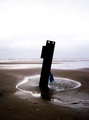
| 03/08/2008 07:20:13 AM |
Stick in the Mudby Rainbow-Coloured-SoulComment: In response to your request for feedback - My first thoughts are that this is blurry and perhaps too much contrast. There is visible noise from pp. Those are the biggest detractors in this image in my opinion, however you may have done those things intentionally, if so, it is difficult to offer an opinion or suggestions, as only you know what it is you are aiming to create. If not intentional, then I think more detail discernible in the 'stick in the mud', so that the viewer can see what it is (hard to tell from this silhouette). I like that the horizon appears straight but again, the position you have placed it in the frame may be intentional, as may be the position / angle that you placed the 'stick' in / over the water. There appears to be some foreign elements in the fore, which if garbage is not appealing, but could be shells. The highlights are extreme too, including the sky - but again I wonder if this was intentional. Having said that, overall it is quite a dark image (including feel) with no real focal point and not abstract enough to give interest. All my opinion of course. I didn't get to this while voting, but likely wouldn't have scored it very high. |
| Photographer found comment helpful. |
Home -
Challenges -
Community -
League -
Photos -
Cameras -
Lenses -
Learn -
Help -
Terms of Use -
Privacy -
Top ^
DPChallenge, and website content and design, Copyright © 2001-2026 Challenging Technologies, LLC.
All digital photo copyrights belong to the photographers and may not be used without permission.
Current Server Time: 07/21/2026 11:58:46 PM EDT.