| Image |
Comment |
| 05/02/2008 05:22:41 PM |
Anno 2008by tamatamaComment: If you crop out the t-shirt, this becomes a very different style of image. Her hairstyle lends itself to a feminine type of image and perhaps a rotate and crop (including tighter at the top to bring her more dominant in the frmae), may have given this something extra. The light on her forehead is perhaps a little strong, but difficult in Basic. |
 Photographer found comment helpful. Photographer found comment helpful. |
| 05/02/2008 05:18:25 PM |
A Timeless Classicby taljComment: Like the concept but the framing and crop is not enhancing the tip of the bud/study of the rose. A little more context (further out) likely have also helped, especially if you wanted to stick with this type of crop/framing. |
| Photographer found comment helpful. |
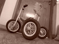
| 05/02/2008 05:16:48 PM |
OLD Time Favoriteby a_jhambComment: If you really wanted to take a photograph of this trike, perhaps taking it outside and trying to recreate an old fashioned scene (which from your title is seemingly your intent), would have helped. The indoors is too distracting and the focus seems sharpest on the indoors rather than the trike. Although the partial corner of the sack bottom right adds a little interest. |
| 05/02/2008 05:13:40 PM |
a benchby linnyComment: The focus seems sharper on the background than the bench. |
| Photographer found comment helpful. |
| 05/02/2008 05:11:54 PM |
Trilliumby nfesselComment: That's nice. Nice clarity/focus. Can't help wondering about a variation in framing - squared perhaps, but your call. The rose colored sepia is nice, but I also wonder about a more traditional hue - it may have brought out a few more elements and depth, maybe. |
| Photographer found comment helpful. |
| 05/02/2008 05:07:34 PM |
In the corner of my gardenby pacpintoComment: Nice little corner. Tones brought out the details well. Just noticed the flower(?) at the rear - or could just be the shape of the leaves. The rock/something keeps distracting me bottom right, although it does add some good context - perhaps a little further out to include it more and have it in focus, not sure. |
| Photographer found comment helpful. |
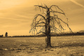
| 05/02/2008 05:05:16 PM |
Branchesby tooterComment: The composition seems off in this image and not sure the hue of the tone is enhancing it, especially in the sky. Image looks tilted, but could be perspective. |
| Photographer found comment helpful. |
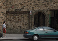
| 05/02/2008 05:03:56 PM |
Along the Wallby fainaComment: 'Oops'. This minus the vehicles - with just the woman and the scene, plus a sepia effect, make a good image. |
| Photographer found comment helpful. |
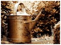
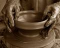
| 05/02/2008 04:57:36 PM |
Work is Key of Joyby L o S TComment: Nice concept, certainly good potential with the sepia effect with the range of tones here. Be good to have seen the hands in sharp focus, especially to discern their texture more - having said that, one of the fingerswith extra 'clay' on it, looks a bit 'unappealing' - minor things like that will enhance or detract from an image, in my opinion. The crop and/or angle refined too. Lastly, your title is somewhat confusing in English and seems to be a poor translation. |
| 05/02/2008 04:45:09 PM |
Right of Passageby awpollardComment: Interesting with the figures. The shades came up well with the tones. Nice clean quality image. |
| Photographer found comment helpful. |
Home -
Challenges -
Community -
League -
Photos -
Cameras -
Lenses -
Learn -
Help -
Terms of Use -
Privacy -
Top ^
DPChallenge, and website content and design, Copyright © 2001-2026 Challenging Technologies, LLC.
All digital photo copyrights belong to the photographers and may not be used without permission.
Current Server Time: 07/21/2026 11:47:01 AM EDT.