|
|
|
Showing 611 - 620 of ~888 |
| Image |
Comment |
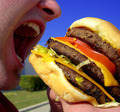
| 06/21/2006 12:33:29 AM | The Triple by DefyTimeComment: Congratulations on the ribbon. This shot received my highest vote. Well done.
|
| 06/21/2006 12:30:12 AM | |  Photographer found comment helpful. Photographer found comment helpful. |
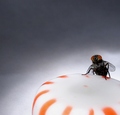
| 06/21/2006 12:21:17 AM | Turning Torso - Luxury Apartmentsby GuGiComment: Congratulation, Gudrun! Another 6 and a great placing. You can really see your Icelandic blood coming through. Just be careful not to raise your average too high before the WPL begins!
Becky | | Photographer found comment helpful. |
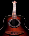
| 06/17/2006 12:43:27 AM | Heaven's Light IIby taterbugComment: Greetings from the Critique Club:
This is a beautiful image, full of symmetry, flowing lines and dramatic lighting. You've been able to pull off sharing the beauty of the guitar with a near spiritual quality to the lighting. It is an image worth printing.
Composition: The symmetry works very well here, adding to the impact of the image. The Point of View is strong and adds to the ascending feeling. There are some very minor ticks that show because of the strong symmetry. Your guitar edge on the left is slightly higher on the left than the right, leading to the feeling the image is slightly twisted to the right. The bridge at the base of the guitar is also slightly off kilter. Most would not notice it, I'm just one of those that does. I also prefer a slightly looser crop, with a bit more space above the guitar and below the bridge. The sides feel right.
Technicals: You have done a wonderful job of choosing aperature, shutter speed and ISO to bring out the color, tone, detail and DOF to make this image shine. You've been able to keep the strong lighting on the frets, leading upward, yet maintaining detail on the frets. Very nice. A small detail, probably caused by the reduction of size, is the artifacting on the curves of the guitar edge. I have found this to be reduced by using Bicubic Smoother when reducing an image with diagnal lines.
Tie to Challenge: This is definately a reshoot of a previous image and you have really taken the comments to heart. You have also been able improve your score over your previous entry.
Overall: A wonderful image which has been improved technically from the original. There is a magic to this image that shines through to most, but not all. | | Photographer found comment helpful. |
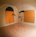
| 06/12/2006 12:51:06 AM | "L" Ghostby srdanzComment: Greetings from the Critique Club!
You under rated yourself. With a 6.008 and a 30th place, you did some things right! You"ve created an interesting image here using the 8mm to warp and create curves. It take this image out of the ordinary and adds appeal in a challenge that could be very repetative. The ghost lens is a very nice effect and leaves the viewer wondering "How?"
Composition: Having the tripod and lens in the center works well for you here. The curved lines created by the lens keep leading the eye back to the lens. You've been able to keep the most important vertical line at vertical.
The diagnol line created by the hanging lamp is distracting to me. The stong contrast, plus the halos and artifacting really draw the eye away from the main focus, the lens. Some ways of remedying it would include: a different placement on the lens so that the hanging lamp would be over the lens creating a vertical line and leading the eye to the lens, or changing the method of resizing to eliminate the "jaggies" (bicubic smoother helps when reducing diagnol lines) or changing the method of sharpening since this is adv editting or cleaning up the halo and jaggies in PP.
Technicals: Your ghosting effect is right on target. You've been able to keep the shadow and image while creating the ghosting effect with the wall and window blinds showing through. The natural vingetting around the outer edges is a nice effect. It allows the composition to work and allows the pull of the eyes to the lens. You are clear and sharp, with little oversharpening (just the lamp and cord). Your choice of aperature, ISO and shutter speed work very well here and were essential to creating the image effect.
Meeting the Challenge: Your room was clearly empty. The light fixture did not seem to cause you any issues, nor should it. Photo freaks (which we tend to be) understand what an L lens is and how it might haunt a Canon owner. You may have lost a 0.1 or so from the Nikon owners, but that's to be expected. (Just a joke!) This image would work very well in a photography challenge.
Overall: You've created a very nice image with a unique interest. While it has some small technical difficulties, it is a very pleasing image with a strong photography connection.
Becky | | Photographer found comment helpful. |
| 06/10/2006 01:13:32 AM | A face that she keeps in a jar by the doorby DoubledizzleComment: Greetings from the Critique Club:
You've taken a well known line from the Beetles and created a very literal image from it. Anyone knowing their lyrics/songs would immediately recognize this image for what it is. From your comments, this leteral image has captured your imagination.
Personal impact to me: I found this image to be slightly distrubing with a human form under water. The hair in front of the face heightens the "horror movie" imact that this image has on me.
Composition: The off-center head and the doorknob in the center works well here. So does the contrast in tones from the head to the door. It provides separation from the background, yet indicates the importance of the door. The missing bottom of the glass bothers me. It feels as if the image is incomplete or floating, however this may be what you intended.
Additionally, the image looks like it is tipping to the right. The left edge of the glass follows the edge of the image, but the glass is not straight up and down, so the glass should be closer to the edge at the top than the bottom. this effect of tipping is emphasized in the lines of the door. This tutorial helps with straightening images.
Technicals: The lighting on the doll and the wood of the door works very well here. You've been able to capture the brightness of the jar without distracting refections or blowing out the highlights. The bright window in the door pulls the eye away from the major elements of the door and doll. The eye is always drawn to the brightest spot. In this case, it does not help. You can decrease the brightness in this image by selecting the bright window area, and decreasing the brightness on that area only.
The focus is good, as is the dof. Your camera settings appeared to have worked well for you.
Meeting the Challenge: This image clearly meets the challenge and is easily recognizable.
Overall: You've created an image that clearly meets the challenge. You've caught the imagination of some of the voters. With more attention to the details of the image, this could be much stronger.
Becky |
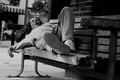
| 06/10/2006 12:34:15 AM | all the lonely peopleby akioeComment: Greetings from the Critique Club
Let me welcome you to DPC and congratulate you on your first entry. This image is a very nice start. You've been able to capture a very straight forward scene in an unusual way. The low perspective works very well here. You've used the technique of leading lines very well here as the lines of the bench, the foot and the arm all lead you to her face.
Composition: You've used leading lines and the rule of 1/3's effectively, bringing her face to the center of attention. The rough wood texture and sole of her shoe add interest without detracting.
There are, however, two items that do distract. The first is that the image is tilted to the right as shown by the leaning lightpost and meter in the background. Tilted images are quickly noticed and quickly take away from the image. This link will take you to a tutorial which explains how to correct the tilt. The second distraction is the busy background behind her head. You have already corrected it partially with a shallow depth of field. In this case, an even shallower dof would provide more separation from the subject and less distraction. An f4 or even f2.8 would probably get what you need here.
Technical: Your choice of settings worked for you, except for the dof background. The shot is in focus and the lighting works for this image. Black & white is a good choice for the mood of this shot as it emphasizes lonliness. The contrast is off on the white end as noted in your comments. You have many greys and shades into black, but the whites are not being used to your advantage. You can look at the histogram in Levels and make sure that the tones are represented from left to right. If you are missing any tones, place your arrows at the beginning and ending of your histogram to allow all the tones to be used.
Meeting the challenge: Your image clearly portrays the title of a Beetle's song. There is a homeless/destitute look to the woman that implies lonliness, but doesn't shout it.
Overall: You've captured an interesting slice of life from a strong perspective. There is much going for it, and with some editing changes could be even stronger. This is a wonderful start to your career at DPC, which should give you a feeling of fulfillment. I expect to see strong work from you in the future.
Becky |
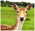
| 06/09/2006 12:13:29 AM | Martha, My Deer - The White Albumby GrahveComment: Greetings from the Critique Club:
John, you have an engaging portrait of a deer which captures a personality. Congratulations on your new personal best score.
Composition: You've used the rule of 1/3's with this shot to create an overall pleasing image. The background row of trees and bright sky is fighting for attention from the delightful doe eyes. There are several fixes to this problem. One, done during shooting is to raise or lower your shooting angle in order to have that row fall well above the deer or well below the eyes. The second fix would be to use a gradiant fill in the sky to tame down the brightness and add a natural color. This must be use carefully however, in order to keep from creating a major element.
Another item that detracted is the appearance of a crooked horizon line. The image does appear to be tipped to the right as evidenced by the tree trunks that also tip to the right. This tutorial will help with how to rotate the image to the correct angle. While it is a small detail, it is rarely tolerated at DPC without a lowered score.
Technically: The DOF adds to the separation of the deer from the background, helping her "pop." The sharpening is well done. There are no halos or artifacts, and the individual hairs create interest and depth.
Meeting the challeng:The title added to the shot with a pun which matched the character of the deer. It also meets the challenge.
Overall: You've captured a nice shot which is interesting and captures a character. Small changes in the angle of shooting and post processing could make this nice image even stronger.
Becky | | Photographer found comment helpful. |
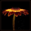
| 06/08/2006 11:49:03 PM | A Magical Place by SherwinJamesComment: Greeting from the Critique Club:
As the comments and blue ribbon indicate, you have a well received and appreciated image here. You have all of the aspects of well done photography here, including a creative take on a commonly photographed item.
The composition is strong and classical, the technique is spot on and the image clearly meets the challenge. Often the hardest thing to add is a spark of magic or emotion to your image. You have managed to do that through your lighting and bubbles. While seemingly simple, combined that add the wow that won the ribbon.
Enjoy the success. This is a beautiful shot.
Becky | | Photographer found comment helpful. |
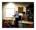
| 06/08/2006 11:26:24 PM | Teacher Taking Down The Last Bulletinby sanxComment: Greetings from the Critique Club
This image has a wonderfully nostalgic feel to it. My first impression was that I was looking through a window into this scene. The lighting supports that feeling. This shot is highly emotive with a highly candid feel.
The composition of this shot bothers me somewhat. The bookcase and materials visually outweigh the white board pulling my eye away from the teacher. In fact, I find my attention bouncing between the teacher and board, the bookcase, the orange chair in the front corner and the left chairs which are facing a different direction than the back desks. Perhaps cropping the left 1/4 or the right 1/4 would provide a stronger balance and focus on the teacher. Each element of the shot carries visual information to create the whole image. In this case all of the pieces overwelm the focus on the teacher. Eliminating one of them could allow it back.
The biggest stickler in this photo was the grain. For me, it creates the drama and emotion, however, for most voters, the grain indicated a poor quality photo, instead of the artful rendition of an emotion. You run the risk of losing the voters when you try a dramatic shift in photographic style. In this case, most of the voters did not stay with you.
Meeting the challenge: Clearly the major light source is artificial as asked for in the challenge. There are other light sources evident, which may have been a stumbling block with the voters, also.
I was amazed to see that such a risky, artistic shot would come from a 14 year old. This shot indicates you see the world through different eyes that have much to add over the future years.
Overall: A highly emotive slice of life which was not able to pull the voters in because of the choice of post processing, yet appealed some especially because of it's uniqueness.
Becky | | Photographer found comment helpful. |
|
Showing 611 - 620 of ~888 |
Home -
Challenges -
Community -
League -
Photos -
Cameras -
Lenses -
Learn -
Help -
Terms of Use -
Privacy -
Top ^
DPChallenge, and website content and design, Copyright © 2001-2026 Challenging Technologies, LLC.
All digital photo copyrights belong to the photographers and may not be used without permission.
Current Server Time: 07/18/2026 12:10:52 AM EDT.
|