| Image |
Comment |
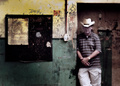
| 12/06/2007 04:45:30 PM |
Derelictby MichaelCComment: Wow this is sharp as a tack, i can almost read the fine print on that poster! Nice composition too |
 Photographer found comment helpful. Photographer found comment helpful. |
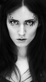
| 12/06/2007 04:44:32 PM |
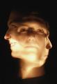
Pardusby MyrkvaComment: Leopard spots! (horray for google, im not that smart). I really like this photo, your stare is quite piercing, almost hauntingly so. My only knit to pick is your choice of framing. I dont think the height adds anything to the photograph, I'm kinda cropping the bottom 1/3rd off with my hand and I think it makes the image more stable and effective. Cutting of the bottom places your eyes right in accordance with the "rule of thirds", and anyway, below your neck appears grayer and flatter and just detracts from the interesting stuff around your eyes. Nice job and GL, 9 |
| Photographer found comment helpful. |
| 12/06/2007 04:26:47 PM |
|
| Photographer found comment helpful. |
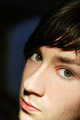
| 12/06/2007 04:25:38 PM |
Framed and Capturedby cnsComment: The composition and lighting are very nice here. I especially like the tiny bits of space above and to the left of your head that are framed by that background window hatch thingy, it really draws you in. |
| Photographer found comment helpful. |
| 12/06/2007 04:23:28 PM |
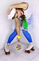
Roxy Roller by ShermyComment: very nice! love the make-up and attire and the overall colors of the image. Also kudos to you for the original pose. 9 |
| Photographer found comment helpful. |
| 12/06/2007 04:22:16 PM |
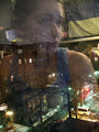
Winter Reflections in Fenwayby hannkaComment: I really like where you're headed with this, so this is the only reason i feel compelled to leave an extended comment.
I feel like some technical shortcomings detract from the image. For one, looks really noisy/grainy, as though the image was underexposed and you tried to brighten it up in photoshop, but that inevitably results in a lesser quality image. Or maybe you were just using a hight ISO. In any case you could have remedied this (to an extent) by smoothing the picture with noise-reducing software like neat image. Also, I think you could have bumped the contrast a bit, the dynamic range of the photograph seems relatively limited -this could have been augmented through some levels or curves work. Finally, dodging and burning are your friends! Some subtle selective brightening of your (for example), could really have a drastic effect on the overall feel of the photograph, play around with it!
I especially like the person sitting in the background of the reflection with their back turned to you, i think that adds an added element of depth both physically and emotionally and brings the image to a new level. Oh and Chicago is a great city, i was just there visiting a friend. Sorry for the long read and good luck! |
| 12/06/2007 04:08:32 PM |
|
| Photographer found comment helpful. |
| 12/06/2007 04:07:59 PM |
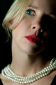
Pearlsby MelissaRaeComment: great composition and light and use of DoF, but I think IMO you went a tad overboard on the processing... skin looks too porcelain and the eye looks over-saturated.. but maybe thats what you were going for i don't know! good luck 7 |
| 12/06/2007 04:03:10 PM |
|
| 12/06/2007 04:02:40 PM |
Sanctuaryby xianartComment: awesome composition, really like the editing/tones in the image too |
| Photographer found comment helpful. |
Home -
Challenges -
Community -
League -
Photos -
Cameras -
Lenses -
Learn -
Help -
Terms of Use -
Privacy -
Top ^
DPChallenge, and website content and design, Copyright © 2001-2026 Challenging Technologies, LLC.
All digital photo copyrights belong to the photographers and may not be used without permission.
Current Server Time: 07/17/2026 12:57:32 AM EDT.