Continuum Riftby
levyj413Comment: Critique Club Review:
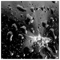
Color Saturation and Hue: N/A image is monochrome
Brightness and Contrast: The darkest areas are nice and inky black. Very nicely done. The brightest areas lose detail, and that would bring it down a bit for me.
Focus and depth of field: Focus is excellent. Depth of field is very good. I have some qualms around the "scar" area. I can't quite tell if the apparent softness is due to processing, depth of field, or just an optical illusion. I'll go with the latter, since I seem to be the only one who sees it.
I'm a little put off by the white area. Compared to the rest of the image it looks almost like a fungus. There are angular bits, but then the whole thing seems a bit soft. The angles are, to me, a bit of a jarring contrast to the drops; to the point where they compete with each other.
I really like the texture of the drops and the surface of the tomato. If the white part were more muted, or not even there, I might even like it a bit better.
As is, a nice creative take on the challenge, and I think it should have finished a bit higher in the voting.