| Image |
Comment |
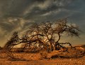
| 04/04/2009 10:11:40 AM |
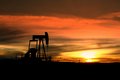
IMG_4978.jpgby MsAmbrosiaComment: I like the richness of this image. This would be perfect for a multiple exposure HDR, as in this presentation the highlights around the sun are blown out. The horizon is a little tilted, though I think the slope of the land exaggerates the effect. But if you take the left handrail upright, at the oil pump, it is a little off vertical.
Great sky and nice silhouette. The oil well pump gives some really nice texture, that adds to the image. |
| 03/18/2009 09:46:37 AM |
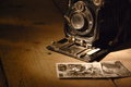
Remember those photos??by bibuComment: I like the lighting. I would have liked a little more depth of field, and to have seen more of the camera. But then I'm a camera nut, so go figure. |
 Photographer found comment helpful. Photographer found comment helpful. |
| 03/18/2009 09:45:03 AM |
Ancient Database Serverby h2Comment: Ancient?! I got one of those on my desk, ancient! I like the lighting, and I think the borders here, were a positive addition to the image. |
| Photographer found comment helpful. |
| 03/18/2009 09:42:13 AM |
|
| Photographer found comment helpful. |
| 03/18/2009 09:41:00 AM |
|
| Photographer found comment helpful. |
| 03/18/2009 09:39:40 AM |
|
| Photographer found comment helpful. |
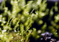
| 03/17/2009 11:10:36 PM |
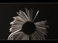
LittleForestby KaliComment: Neat way to demonstrate depth of field. Would make a nice illustration for a photography lecture. |
| Photographer found comment helpful. |
| 03/15/2009 07:39:09 PM |
|
| Photographer found comment helpful. |
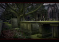
| 03/15/2009 07:36:19 PM |
Sepulchreby hesitantComment: A little overprocessed for my taste. But nicely done overall. |
| Photographer found comment helpful. |
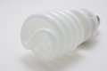
| 03/15/2009 03:06:11 PM |
A "Light" on white...Harharharby mshimer5Comment: Critique Club Review:
Color Saturation and Hue: Colors and Hues are realistic, nothing is over saturated.
Brightness and contrast: Brightness is well done, I might have liked a little more contrast.
Focus and depth of field: Focus is a little soft, but appears to be intentional and works well in this image. Glass is normally perceived as hard, and this gives it a softer feel. Depth of field is hard to judge, due to the overall softness, yet it also works well here. Had the printing on the barrel of the bulb, or the threads at the bottom been in sharp focus, they would have stolen the attention from the subject.
Subjective: Very punny... A fairly obvious pun, given the subject of the theme. Reading the photographer's comments, it appears that not a whole lot went into this; yet more may have come out of it than the photographer intended. Had it been titled "Light on White", some gallery might pick it up for display. |
| Photographer found comment helpful. |
Home -
Challenges -
Community -
League -
Photos -
Cameras -
Lenses -
Learn -
Help -
Terms of Use -
Privacy -
Top ^
DPChallenge, and website content and design, Copyright © 2001-2026 Challenging Technologies, LLC.
All digital photo copyrights belong to the photographers and may not be used without permission.
Current Server Time: 07/17/2026 10:06:24 PM EDT.