|
|
|
Showing 511 - 520 of ~1613 |
| Image |
Comment |
| 11/24/2011 01:04:48 PM | what a stare..!by lobrinComment: Critique Club Review:
Color Saturation and Hue: N/A image is monochrome. However, the choice here made a stronger image. As others have noted, there does seem to be a pink cast to the whites of her eyes on my monitor as well. If I separate the image from the rest of the page, and make it larger, there seems to be a slight pink cast to the image overall.
Brightness and contrast: Brightness is well done, as is contrast. I would not have wanted the image any brighter, or with any more contrast.
Focus and depth of field: Focus is very nicely done. Depth of field is nice and shallow, separating her from the rest of the crowd. The right shoulder tends to blend into the background a little bit too much for me.
Subjective: I like this image. The wary look on her face, as she notices the photographer, really makes the image. I might have cloned out the stray hair between her ear and mouth. I'd also recommend not cutting off the top of her head. But then again, in these street shots, it is not always possible to get a perfect composition. |  Photographer found comment helpful. Photographer found comment helpful. |
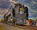
| 11/24/2011 12:54:35 PM | Engine 844by phinbobComment: Critique Club Review:
Color Saturation and Hue: Colors are very saturated and hues are commensurate with HDR processing.
Brightness and contrast: The brightness is good. The contrast is a little harsh, as are most HDR processed images. Still it makes for an interesting effect.
Focus and depth of field: Focus is very nicely done. Depth of field is deep, which is appropriate for this image.
Subjective: Overall, a good image. However, the processing was a little over the top for most voters. The result was a little harsh on the eye. The processing brought out some really nice detail, but at the same time introduced artifacts such as the aura or glow around the right side of the engine. (I've had this happen using the Spicify setting in Topaz Adjust.) I like that you chose to include people in this image, it helps to give scale to the engine. I've seen this engine up close. Your effort is great on the detail of this mammoth beast. I'd like to see this redone with a little less harshness, and for a challenge such as this, a bit more grain. Voters can be very literal. |
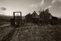
| 11/24/2011 12:45:30 PM | Coming Homeby BrinComment: Critique Club Review:
Color Saturation and Hue: N/A image is monochrome. However, the choice here made a stronger image. I believe color would have detracted from this image.
Brightness and contrast: Brightness is well done, as is contrast. Though the detail is lost a tiny bit in the shadows near and to the right of the building.
Focus and depth of field: Focus is very nicely done. Depth of field is deep, maybe a little too much so, for my taste. The subject is the ghostly figure, but the house competes a bit too much for attention.
Subjective: Overall, a very good image. To my eye, it looks like there is a little bit of barrel distortion. And I would have liked it more, if the dark bar did not cut the ghostly figure in two. Still, this is an excellent effort and the top 20 in a 178 entry challenge is something to be proud of. | | Photographer found comment helpful. |
| 11/21/2011 10:27:38 PM | Motionby MightyPirateComment: Critique Club Review:
Lighting is good, depth of field is just a little bit shallow. Part of the mallet is in sharp focus, but the rest seems a little soft. A darker background would have helped this image pop. Part of your score problems is that many probably did not see this as meeting the challenge. Had this been a stop motion challenge you would have scored higher. The voters can get quite littersl. If you were going for a completely stopped motion, a flash under dim lighting can achieve this. If you wanted a little more motion blur, then a slower shutter speed would have done the trick. As is, the out of focus particles in the lower part of the image make the image look dusty or soft. Lighting from the left or right, as opposed to from the top, would help as well. Not bad at all for a second entry. This image has good bones, and I like the idea of the ice cream cone. Lots of potential here. |
| 11/18/2011 08:28:39 PM | Duty Doneby tvsometimeComment: I saw this before the challenge, so I can't vote. But it is a very strong and meaningful image. | | Photographer found comment helpful. |
| 11/18/2011 08:26:21 PM | | | Photographer found comment helpful. |
| 11/18/2011 08:26:03 PM | | | Photographer found comment helpful. |
| 11/18/2011 08:24:17 PM | | | Photographer found comment helpful. |
| 11/18/2011 08:18:23 PM | we salute youby jmritzComment: Oh, I really like this. At first glance, you think what is this. Then like ghosts from the past, or ancient memories, they come and form before your eyes. If this doesn't get a posthumous from Don, I will be disappointed. 10 from me. | | Photographer found comment helpful. |
| 11/18/2011 08:15:17 PM | | | Photographer found comment helpful. |
|
Showing 511 - 520 of ~1613 |
Home -
Challenges -
Community -
League -
Photos -
Cameras -
Lenses -
Learn -
Help -
Terms of Use -
Privacy -
Top ^
DPChallenge, and website content and design, Copyright © 2001-2026 Challenging Technologies, LLC.
All digital photo copyrights belong to the photographers and may not be used without permission.
Current Server Time: 07/17/2026 07:55:55 AM EDT.
|