|
|
|
Showing 1341 - 1350 of ~1613 |
| Image |
Comment |
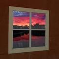
| 02/09/2003 10:55:58 PM | Reflection of days endby togtogComment: Critique Club Review
Great Colors! The angle of the window against the lines of the blocks surrounding it, seems a bit off to me. Perhaps cropping closer to the window itself, or a more "head on" angle would help. About the only other thing I notice is that the focus on the window seems softer than the scene within.
It is hard to recommend much here, as this is already a very good photo. |  Photographer found comment helpful. Photographer found comment helpful. |
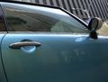
| 02/09/2003 08:50:06 PM | Door reflecting windows and doors.by catpixelComment: Critique Club Review
I am not sure what size the original image was, but along the roof line and at the bottom of the window you can see the bane of resizing photos, the dreaded jaggies. Lines at just the right diagonal angle cause this effect as the software tries to "average" pixels together.
Your choice of location and lighting works well. The drawbacks are the Street Lamps sprouting out of the side view mirror, and the fan shaped structure competing for attention to the right of the mirror.
I suspect that your camera's autofocus was fooled by the reflection in the window of the car. Objects that are reflected off a surface, keep their original distance. So if the building is 20 feet from the car, and you are 5 feet from the car, the reflection is not really 5 feet away, but 25 feet away. Time to use the manual focus, as the door handle looks soft here. Also a manual exposure with a small aperature (large f stop number) will give you better depth of field to help get it all in focus.
I like the lighting and the setting. The color of the car works well with the grey of the buildings. Also the distorted reflection of the vertical bars in the window, work well as a counterpoint to the vertical lines of the building across the street.
|
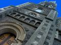
| 02/09/2003 08:39:09 PM | Inspiredby PtmanComment: Critique Club Review
Definetly a different perspective on things.
The lines of the building tend to guide the eye right past the door and windows, off into an impossibly blue sky. Looks almost like a frame out of a dream sequence. Very disorienting and unusual. Which is not necessarily a bad thing. The focus and depth of field here is excellent. Color renditon is also very realistic. (Well except for the sky anyway.)
Overall I like this picture. However, my eye keeps wishing for something in the sky. (Sun, clouds, birds, God, etc.)
There is a lot of texture to this picture, which I find very enjoyable. The wet looking stone, and arch over the door are fantastic. | | Photographer found comment helpful. |
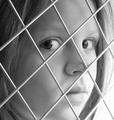
| 02/09/2003 08:31:48 PM | Looking Throughby PaigeComment: Critique Club Review
I think the Black & White really works here. I think the effect of the fence would really have lost a lot had this been in color. I also like the way the fence is just a touch soft. This helps keep the attention on the subject. As for any suggestions.... I think that lighting that brought out the shadows of the fence on the girls face might have worked well. As it is the lighting is good, but it does make the area on the jaw/cheek to the right of the mouth look like they are slightly out of focus. I am not sure that this is completely a focus issue, as the hair on that side is less focused than to the left, but still within reason.
Her expression really makes this picture. A smile would have really knocked it down a notch or two.
Overall a really good picture. | | Photographer found comment helpful. |
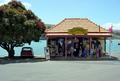
| 02/01/2003 10:02:46 PM | WEIGHBRIDGE........old roadsign in akaroa NZby HoogieComment: Critique Club Review
There is a lot going on in this photo, perhaps a bit too much. Overall I like this picture. However, as related to the challenge, the sign is overshadowed by the rest of the picture. I like the shop, and the car under the tree. It looks like something you would have seen here in California in the 60's. A bit too much parking lot in the foreground I think. Also focus seems a bit soft looking at the people in the shop. It looks like you were fighting a very bright day here, as the roof is almost bleached white to get any kind of light into the shadows in the shop. Judging from the shadows, this was a "high noon" shot, which are the worst for getting detal as the direct overhead sun wants to render things flat. Perhaps another shot later in the day would give better results. |
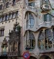
| 02/01/2003 09:55:06 PM | Signs by Antoni Gaudiby bcncrazyComment: Critique Club Review
Overall a very pretty picture. I love the building. The sign, seems like an afterthought here, because the building is really what the picture seems to be about. Placed so low in the photograph, and taking up so little space, it is almost not there. If anything, it seems to be in the way of the street lamp. I do like the colors, and the focus. The lighting could be a little bit brighter but it is not bad. This would have been a very good photo for the "My Corner of the World" challenge. |
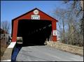
| 02/01/2003 09:49:32 PM | Old Bridge- New Signby scab-labComment: Critique Club Review
Color, exposure, and focus are all very well done. I had to read your comments to figure out which sign you meant. The only drawback I see to this photo, outside of the fact that a sign was not the object of interest, was that the bridge was vacant. This left a rather large dark cavern right in the middle of the frame. The opening at the other side helps some, but there is still a lot of dark relatively featureless space. Either a different time of day, where the light penetrates deeper into the interior, or a vehicle in the opening might have helped here. | | Photographer found comment helpful. |
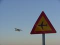
| 02/01/2003 09:42:48 PM | Roadsign?by jonrComment: Critique Club Review
I really like this picture. You did an almost perfect job of lining uo the air plane and the road sign. Just a smidge higher would have been spot on. However, it is obvious that there isn't a whole lot of time to carry it off. The reflection across the sign is a minor distraction, but nothing fatal.
Overall the picture is a little dark. Brightened a bit and then adjusted for contrast and saturation if needed, this picture would look great as a poster. |
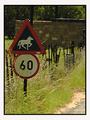
| 02/01/2003 09:29:15 PM | Quantity or Speedby sulamkComment: Critique Club Review
I can see that the sign was your central focus point. However, there are some many things here competing for attention. The grass is in the way of the sign along the left side, the back lightng calls attention to the wall further on, and in general the light angle from behind the sign, tends to diminish the importance of the sign as all else is brightly lit. Naturally you cannot make the wall go away, but a bit of a different angle could have brought a bit more of the road into play. (It is barely there in this photo.) Also this would be a very good time to use a small f stop to shrink the depth of field. With the background out of focus, and the sign in focus, the sign would not have to compete for attention and at the same time the rural feel would be kept. It also might be the time to tramp down a bit of the weeds trying to cover the sign. The picture does express your title well, and I do like the overall effect. | | Photographer found comment helpful. |
| 01/28/2003 10:50:12 AM | |
|
Showing 1341 - 1350 of ~1613 |
Home -
Challenges -
Community -
League -
Photos -
Cameras -
Lenses -
Learn -
Help -
Terms of Use -
Privacy -
Top ^
DPChallenge, and website content and design, Copyright © 2001-2026 Challenging Technologies, LLC.
All digital photo copyrights belong to the photographers and may not be used without permission.
Current Server Time: 07/17/2026 02:48:10 PM EDT.
|