|
|
|
Showing 1331 - 1340 of ~1613 |
| Image |
Comment |
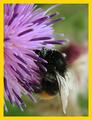
| 06/17/2003 01:44:06 AM | |  Photographer found comment helpful. Photographer found comment helpful. |
| 06/17/2003 01:36:30 AM | Canadian Gardeningby mcraelComment: Great shot! Excellent depth of field and color rendition. Nice positioning for a cover photo. The cover logo and info could fit in this picture quite well. 10! | | Photographer found comment helpful. |
| 04/27/2003 07:03:13 PM | Flutter Flutterby caroleeComment: Critique Club Review
Overall this is a pretty good picture. Color is good, exposure very good, compression was a bit overdone. The artifacts around the flags tend to throw the eye off a bit. Good idea with the flags to show that the breeze is blowing the clouds into the picture. I think that a slightly different angle could help some. As it is, the left side of the picture seems to be a bit left out of the game. You did a very good job of keeping details in the clouds and the depth of blue to the sky. The only other thing that comes to mind is, that the eye keeps wanting to see where those clouds go. Over all a nice job. I think the picture is technically superior to the score you received. I would have rated it in the low to mid sixes. However, it lacks a bit as far as telling a story. (Carol Kings old song, "Every picture tells a story don't it?" keeps running through my head.) The next step is to tell a story with the picture. We can tell from this picture that it was sunny and breezy, but it is more of a deduction to get to warm. day, than a telling of the information. As to what you might put in the picture, ah there is the rub. It needs to come from the photographer, not the viewer. You've got a good eye and you are headed in the right direction. | | Photographer found comment helpful. |
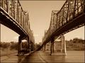
| 04/10/2003 05:42:26 PM | Across The Mighty Mississippiby sherComment: Critique Club Review
It's hard to come up with much improvement for this photo, and your score shows it. Great symmetry, and the arch of the bridges takes the eye right to the center between them. I'm trying to imagine this photo in color, to see if I think that could have helped... But I think that sepia or B&W was the better choice. If I would suggest anything different, I would say that to have taken the photo with the sun higher in the sky so that the shadows of the bridges would have been in synch also might have made it a tiny bit better. Also, while clouds do move slowly and seldom do we have all day to take a pic, they are the only distracting elements of this picture I could find. These are tiny, tiny nits that I am picking here. This is a very good picture and one I could see hanging on a wall in my house.
Great job! | | Photographer found comment helpful. |
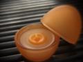
| 03/13/2003 12:12:06 AM | Egg Carrierby RefractedComment: Critique Club Review
Nice play on the basket carrying women you see in village photos.
I would like to have seen more of the egg. The lighting on the figurine is very dramatic, but not so the egg. So they tend to clash a bit. Almost looks like it could have been two different photos.
I can't help but wonder what a picture with the egg died and decorated in a african motif might have looked like.
Overall exposure, contrast, focus, and depth of field are very good. Especially do for the figurine. | | Photographer found comment helpful. |
| 03/13/2003 12:05:55 AM | One Strange Bird...by basia03Comment: Critique Club Review
The depth of field is just a bit short here. The sharpness of the front of the basket wants to hold the eye there. By the time you get to the back two eggs, things are already getting soft. It also looks like the sharpening tool may have been a bit overused. I would suggest a bit higher vantage point for the camera. The front egg is pretty well hidden, and to see more of the design would be nice. Also a higher vantage point looking a little more downwards would help with the previously mentioned depth of field. The lighting could use some angle to it. As is, the lighting is pretty uniform and flat. More of an angle with a little shadow, would help define the shape of the eggs, and make them pop. Overall exposure, and color rendition is good. I think you have a great idea here, and it could make a really interesting poster. | | Photographer found comment helpful. |
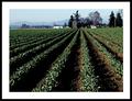
| 03/12/2003 11:57:55 PM | Rowsby robbiehComment: Critique Club Review
Overall a very good picture.
Very good lighting. You made great use of the angle of the sun here. No flat, boring, high-noon lighting here. Color rendition, over all exposure, and contrast are all very good. About the only point I see to mention here, is that the rows you selected lead right between the buildings into a black void. The eye follows the rows, and then has to search for a point of interest. Since the buildings are relatively small in this picture, it would help to be pointed to the object you want us to see, a little more directly. Still, this is a very good photo, and you should be proud of it. |
| 03/03/2003 11:08:15 PM | Vegan Eggby SarahWMComment: Clever! A smidge soft... Not sure I see this as a soft focus type of object, but overall a very good photo. 8 |
| 03/03/2003 10:59:36 PM | The World Disappears When I Close My Eyesby greenem2Comment: Critique Club Review
Very good focus and depth of field. Interesting lighting. Very good, but a bit of washout at the base of the neck. With such a severe angle on the lighting, the fingers leave the face in darkness. Perhaps this was a goal for a subtle message, but it also hides the look of despair. With the lighting and angle, this could also be something out of the Aliens movies where they get grabbed by the face. Despair or assault? I think a second, low key light that revealed more of the expression behind the hand, could have been the ticket here. | | Photographer found comment helpful. |
| 02/10/2003 12:37:39 AM | | | Photographer found comment helpful. |
|
Showing 1331 - 1340 of ~1613 |
Home -
Challenges -
Community -
League -
Photos -
Cameras -
Lenses -
Learn -
Help -
Terms of Use -
Privacy -
Top ^
DPChallenge, and website content and design, Copyright © 2001-2026 Challenging Technologies, LLC.
All digital photo copyrights belong to the photographers and may not be used without permission.
Current Server Time: 07/17/2026 01:43:58 AM EDT.
|