| Image |
Comment |
| 09/23/2004 08:00:35 PM |
|
 Photographer found comment helpful. Photographer found comment helpful. |
| 09/23/2004 07:52:11 PM |
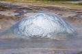
Geyser ready to blowby GautiComment: The background and the ropes compete with the image. Perhaps a bit more contrast would help the bubble stand out. I know you were also fighting the steam which makes contrast and sharpness look low. Howver, the bubble abouit to burst is really a good catch. 6 |
| Photographer found comment helpful. |
| 09/23/2004 07:43:53 PM |
|
| 09/19/2004 10:09:16 PM |
|
| Photographer found comment helpful. |
| 09/19/2004 10:08:17 PM |
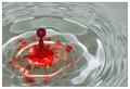
RGB Smoke by EddyGComment: I'd sure like to see how this was done after it's over. Great pic. |
| Photographer found comment helpful. |
| 09/19/2004 09:57:42 PM |
|
| Photographer found comment helpful. |
| 09/19/2004 09:56:57 PM |
|
| Photographer found comment helpful. |
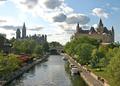
| 09/19/2004 09:30:09 PM |
Canada`s Capital Regionby Dim7Comment: Critique Club Review:
What would have helped here is a pocket level. Small levels that you can place on the camera to make sure that the horizion is level. Here the picture slopes from left to right.
The editing has left the coulds blown out at the whitest parts on the left side of the frame. Yet the rest of the frame works quite well, as this reminds me of a 50's travel brochure, the way the colors and lighting are on the grass and people. (I love those old photos.)
Overall a very good picture, and well meets the challenge as it makes me want to come see it in person also. |
| 09/19/2004 09:24:53 PM |
Welcome to Poyningsby Apollo2077Comment: Critique Club Review:
The trouble with framing is that sometimes there can be too much of a good thing. The foliage on the right works well. The brightness of the left competes, and the center obscures the building. The depth of field falls short, as the camera has focused on the foliage at the fence leaving the building a bit soft. It should be the other way round. The upper fence rails at first appear as if they were part of the building due to this effect.
Color and saturation are good. A bit of editing could punch up the coulds in the sky to add more drama to this picture. |
| Photographer found comment helpful. |
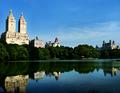
| 09/19/2004 09:16:04 PM |
A Serene Morning on the Banks of Central Park Lake, NYCby ccaseyComment: Critique Club Review:
Overall I really like this picture, so I'll have to nitpick here.
Perspective is a smidge off. Either the camera was a tiny bit off level, or there is some distortion from the lens. The buildings on the left should be absolutely vertical. The taller the building the more telling it is. The key to this shot is the reflections. Including all of the buildings would have made it even better. (Perhaps it wasn't possbile from available vantage points, but it is something to keep in mind.) I also might have cropped the bit of light colored building at the bitter left edge of the picture. Finishing the left edge of the building in shadow really works here, and the bit of brightness doesn't add anything.
Color and saturation is very good. Reminds me of a Kodachrome(tm) slide. The buildings are the tiniest bit soft, but at 640x480 there can only be so much sharpness.
As I said at the opening, I really like this picture. It makes me want to see it in person, which was the object of the challenge. Well done! |
Home -
Challenges -
Community -
League -
Photos -
Cameras -
Lenses -
Learn -
Help -
Terms of Use -
Privacy -
Top ^
DPChallenge, and website content and design, Copyright © 2001-2026 Challenging Technologies, LLC.
All digital photo copyrights belong to the photographers and may not be used without permission.
Current Server Time: 07/17/2026 01:43:38 AM EDT.