|
|
|
Showing 1261 - 1270 of ~1613 |
| Image |
Comment |
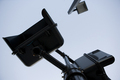
| 09/07/2006 02:29:58 PM | black and blueby rethsComment: Critique Club Review:
I'm not sure what this is, but many purists would call it a subject. You have a couple of objects competing for attention. The massive object wins, and the light pole jutting in from the top winds up as a distraction. Part of the low scores could also come from so much dark area in the picture, with a featureless sky as a background. The picture does have almost a monochromatic feel, which I like, and which could be played up, perhaps with a bit different shapes. |
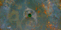
| 09/06/2006 07:14:06 PM | My Entryby EssAreDubyaComment: Critique Club Review:
Very interesting photo. The picture definetly has a center of interest, but is it really a subject? Almost a 3-D effect, I half expect my mouse cursor to fall in the "hole". I would have really expected this picture to do better. I can only guess that it was a little more abstract than some people were ready for. Exposure is good, contrast is good, saturation and hue are just fine. This does break the "rule of thirds" for purists, but it would not have worked as well had the hole been off center. If anything, maybe cropping the picture to a square, to play off the circle, might help. Otherwise I think it is a fine abstract piece, and certainly meets the challenge. |
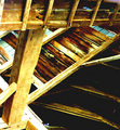
| 09/06/2006 05:51:01 PM | Barn Interiorby snafflesComment: Critique Club Review:
As you have already read, the smaller images do not do well in a challenge. You need to make it is large as you can, and still stay within the size limitations. Same goes for file size. The more bytes in the file, the more info in the picture, resulting in a better representaion. Some of the sufraces, lower left, are completely burned out and devoid of detail. This is a picture where being able to see the texture of the wood, would have really added to the piece. I like the juxtaposition of all the different angles. The lower right may be just a little bit dark, as I feel that a little more light there would have made it a little less heavy and added to the opposing angles theme. |  Photographer found comment helpful. Photographer found comment helpful. |
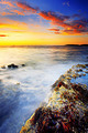
| 09/06/2006 05:37:19 PM | Peace of mindby terjeComment: Critique Club Review:
Wow! If this isn't processed, I really need to go see your home town. I can see where purists might think this is a good thing taken too far. However, I believe that just and an artist can do impressionist work with a brush, so should a phtotographer be able to do the same.
Personally I find the colors to be very pleasing. If the challenge were to be a restful scene, there is too much energy here. But that was not the case, and the more I look at this picture, the better I like it. I like the color, the lighting, the exposure, and depth of field. Your timed exposure really added to the result. The darkened sky at the upper right, helps guide the eye to the left, and the whole picture seems to start over again. I could see this hanging on my wall. | | Photographer found comment helpful. |
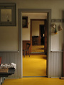
| 09/06/2006 05:27:34 PM | Mennonite House Interiorby FromacComment: Critique Club Review:
This is an excellent photo, as your score indicates. With the constraints of available light, and location, you did a heck of a job. Depth of field is fantastic. Color saturation is spot on. The way you aligned the door really makes this pictur work. About the only things I see and they are really minor, is the cloth covered article in the foreground distracts a tiny bit, and the darker shades at the top of the rooms tends to push the eye down, while the doors pull the eye up, which causes a little tension in the picture. Again this is a very minor point and given the shooting location and available light, there is little that could be done and what was done worked very well. | | Photographer found comment helpful. |
| 09/06/2006 04:00:48 PM | A Time For Usby JudiComment: Critique Club Review:
Tough challenge, and tough photo to critique. I love the colors, lighting and contrast. There definetly is no subject, and there isn't supposed to be one. At the same time, I find my eye being pulled around the image by competing objects. The closest vegetation begs for attention, but the whole scene gets rather busy and distracting. The horizon seems to tilt just the slightest bit, but could be an optical iilusion caused by the narrowing of the body of water. Overall I think this picture should have scored higher. Perhaps had there been no shrubs it would have done better. Personally, I like the picture. | | Photographer found comment helpful. |
| 09/04/2006 09:39:48 PM | My Buddyby fotomann_foreverComment: Critique Club Review:
What a neat photo. Almost painterly. Exellent lighting, color saturation and contrast. You can see the detail in the darkest places, and nothing is burned out in the highlights. Love the detail in the fur. To be extremely nit-picky, as I really like this picture, I would say that cutting off the dog's left ear, maybe a bit too much body, and his right ear tends to blend into the body just a tiny bit. There you have it, all the nits for what is otherwise an excellent demonstration of soft focus. | | Photographer found comment helpful. |
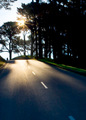
| 09/04/2006 09:28:11 PM | He's at the end of the road, on the hill there.by vjozComment: Critique Club Review:
Works as kind of a "Where's Waldo" picture. The biker is not seen at first and the eye is drawn away. The only real thing that I see is that the sky is a bit bland and featureless. Shooting into the sun gave you a great starburst, but the sky came out pale. My personal instinct is that the rider is where the eye should be drawn. Not sure what the three spikes are that threaten the rider. Cloning them out might have helped a bit. |
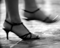
| 09/04/2006 09:21:01 PM | Dancingby JacbowronComment: Critique Club Review:
I'm afraid I have to join the chorus here. The motion blur, makes this look more like an out of focus snap shot, than a soft focus picture. Soft focus shots usually come out, welll... soft sort of dreamy, magical, mystical, pick one, fantasy, what have you. The black and white makes the picture harder and colder. Dancing would seem to be a warmer softer subject. Thus the picture tells a tale that seems to be the opposite of what one might think it should.
It is an interesting photo, and with a sharper focus, would work for a different challenge. It just has a hard time working here. |
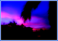
| 09/04/2006 09:14:25 PM | Cloudy Sunsetby DAWARComment: Critique Club Review:
Too soft a focus I'm afraid. I see potential here, the colors are very interesting, almost abstract. The branch of the palm, especially in soft focus, doesn't frame the photo, it almost cuts the abstract colors in two, like a dagger to the heart of your picture. Unfortunately there is also too many angles and objects sticking up along the structures in the lower left. Had you found a horizion a bit smoother, like rolling dunes, or buildings with fewer angles and vegetation, this picture could concentrate more on the play of the colors, which is what I think you may have been aiming for. |
|
Showing 1261 - 1270 of ~1613 |
Home -
Challenges -
Community -
League -
Photos -
Cameras -
Lenses -
Learn -
Help -
Terms of Use -
Privacy -
Top ^
DPChallenge, and website content and design, Copyright © 2001-2026 Challenging Technologies, LLC.
All digital photo copyrights belong to the photographers and may not be used without permission.
Current Server Time: 07/17/2026 02:47:42 PM EDT.
|