|
|
|
Showing 1121 - 1130 of ~1613 |
| Image |
Comment |
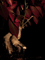
| 09/25/2006 12:45:10 AM | Akai Bonsaiby lil_moComment: Critique Club Review:
Interesting picture.
I've never seen a plant that color. Reading your comments solves the mystery. At first it looks like you took spray paint to it.
Focus and depth of field are very good.
There is a lot of negative space here. The dark background runs into the subject, and the soil around the tree becomes particles mixed in the the negative space.
I think part of the problem the viewers had, was the perspective of the piece. The leaves block out part of the curve of the trunk, and almost cut it in two. We see a couple of small leaves attached to a branch, but it takes a bit to notice. At first glance it leaves the viewer with the impression of a bunch of leaves perched at the top, not necessarily connected.
The branch that starts in almost the center of the picture runs right up and out of the picture, taking the eye with it. |  Photographer found comment helpful. Photographer found comment helpful. |
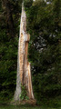
| 09/24/2006 09:22:31 PM | Wasting Awayby renegade1966Comment: Critique Club Review:
I like the way the lighting separates the tree from the rest of the picture, it meets the challege very well.
The detail and texture are excellent.
However, I might have liked it a bit more, had you used a shallower depth of field to isolate the tree from the background as well.
In the upper areas, especially on the right side, the background is almost seeming to engulf the tree and competes for attention.
Color, saturation, hue, contrast, and brightness are all done very well.
Nice photo. | | Photographer found comment helpful. |
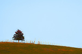
| 09/24/2006 03:53:07 PM | Lone Tree on the Hillby lifternessjtComment: Critique Club Review:
Colors look a little over saturated to me. It could work as a painterly effect, except for the sky. As you've already noted, the sky is big, and empty. Unfortunately clouds to not appear on command.
I wonder what this would have looked like at sunrise or sunset. With the current lighting, it looks a bit flat.
Since the sky was not your friend this day, I would recommend less of it. A tighter crop, and closer in to emphasize the tree might have helped. I would suggest leaving the gate in, and cropping before the fence dissapears. As is, the line of the fence leads the eye down the hill and away from the subject.
| | Photographer found comment helpful. |
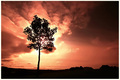
| 09/24/2006 03:45:33 PM | Uprightby BrinComment: Critique Club Review:
Wow! What a great photo.
Focus and depth of fied are great. Nice and sharp everywhere, which is needed in this picture. The detail and texture of the sky are fantastic
The way the cloud formation seems to mirror the shape of the tree is amazing. Although it is extremely bright to the point of burnout at the top of the trunk, it works here because the tree then looks almost as if it were on fire.
The trunk of the tree does bother me a little. It seems a bit odd. If you follow the line down from the limbs, it isn't a smooth curve like most trees. It looks almost pixillated like it has the jaggies from a lower res rendition blown up. Since it happens in several places, I don't think it is an illusion, or a trimmed off limb. Looks almost as if it were assembled.
I like the color of the sky, but wonder how this might have looked in color if it were one of those majestic blazing sunsets we get now and then.
Overall this is a very good photo, one I could see hanging in a gallery. Congratulations on a well deserved top 20 finish. | | Photographer found comment helpful. |
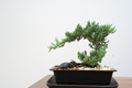
| 09/24/2006 02:45:52 AM | Bonsai Treeby mkramarcComment: Critique Club Review:
You've already heard about the overwhelming white space, the table and the tilt.
Color, particularly the green of the tree, looks a little washed out. Perhaps it's an effect of the white, which against the table makes the picture look harsh and cold.
A more dramatic lighting angle would help. Here it makes the tree look flat.
I keep thinking, if you took the tree outside, and used it to frame a sunset or sunrise, that might bring a lot to the picture. As is, the tree has a very interesting shape that brings a lot of ideas to mind.
|
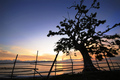
| 09/23/2006 05:11:37 PM | New Day!by davidus428Comment: Critique Club Review:
Tilt or no tilt I like this picture. From what I can tell, it is really hard to tell. The sea and sky get really close in color and tend to merge at the horizon. With the shadows of the clouds also on the water, it really is difficult to measure exactly. I also think that when it gets to that point, it starts to get just a wee bit silly. So I'm going with optical illusion here. That being said, it still makes the photo look tilted. Interesting effect, but for voters who are going to take all of 10 - 15 seconds to look at some of the pictures, they may not stop to analyze.
Very good focus and depth of field. Color is good, though personally I might have preferred a bit richer color. (I'm a sucker for saturated flaming sunsets.)
I like the composition. The fence adds to this piece. I've seen them as distractions in so many others.
I found the kite. That is so cool... I might not have found it, were it not mentioned. Then it becomes a "Where's Waldo" like hunt. Once you find it, it really stays obvious.
Had the picture appeared more level, and possibly with more saturation in the sunset colors, I think your score would have gone up quite a bit.
As it is, this is an excellent photo. One I could see hanging on my wall for a long time. Very nice job. | | Photographer found comment helpful. |
| 09/23/2006 02:25:41 PM | Blue Steelby TlemetryComment: Critique Club Review:
Interesting photo, and interesting range of comments from the viewers.
For me it meets the challenge well. Nothing said the trees had to be live or real. I like the sky, a little more drama would be nice up there. However, that is usually something beyond the control of most photographers.
As is the sky and tree colors match well, and it is very effective as a monochrome piece.
Focus and depth of field are excellent. Brightness, contrast, and saturation are good as well.
Nice job. | | Photographer found comment helpful. |
| 09/23/2006 02:13:09 PM | Young at 37 yearsby RasaiComment: Critique Club Review:
Color saturation and hue are very good. Focus and depth of field are excellent. I really like your use of depth of field to isolate the subject from the rest of the picture.
I would have liked a little more light/detail at base of the tree. Not much, because I like the contrast. But just a little because the longer I look at the picture, the dark area starts turning into a hole in the photograph. And in the end the contrast of the darkness at the bottom and the background, starts to compete with the tree itself.
The tree and base appear a little oversharpened to my eye. The edges of the leaves on the left are starting to get halos.
Overall a very nice photo that I enjoyed. | | Photographer found comment helpful. |
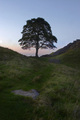
| 09/23/2006 02:05:17 PM | Sycamore Gapby AngelisComment: Critique Club Review:
I'm impressed the shot is as clear as it is with an 8 seond exposure. Focus is very good for conditions. And reasonable even if it weren't a timed exposure.
I find the foreground rock a bit distracting. However, at the same time I like the leading lines of the path that take the eye to the tree. I might try this shot with a depth of field that softens the foreground a bit to see how that works. Or alternatively, crop just above the rock to save as much of the leading lines as possible.
The only other problem I see is the sky. It's almost empty. Maybe a day with a better (more colorfu) sunset... Or a day with some great clouds. As is, there is a fair amount of blank canvas in this piece that begs for the artist.
Overall a very nice picture.
|
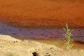
| 09/23/2006 01:55:10 PM | The Ultimate Fight: Nature Against Men’s Pollutionby AlainComment: Critique Club Review:
Interesting picture. Well meets the challenge.
Focus and depth of field are very good. I really like the colors and saturation in the background. The foreground dirt looks a bit bright and washed out. The tree color looks a little off and pale. Were these colors accurate? An effect of the mining? I'm wondering if a polarizing filter would have helped here. As this is an advanced edting challenge. Perhaps a bit of burning in the post processing might have been in order.
I do like the abstract feel to this piece, and definetly think the symbolism is clearly communicated to the viewer.
Nice work.
| | Photographer found comment helpful. |
|
Showing 1121 - 1130 of ~1613 |
Home -
Challenges -
Community -
League -
Photos -
Cameras -
Lenses -
Learn -
Help -
Terms of Use -
Privacy -
Top ^
DPChallenge, and website content and design, Copyright © 2001-2026 Challenging Technologies, LLC.
All digital photo copyrights belong to the photographers and may not be used without permission.
Current Server Time: 07/18/2026 06:03:05 PM EDT.
|