|
|
|
Showing 1101 - 1110 of ~1613 |
| Image |
Comment |
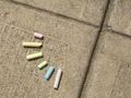
| 09/26/2006 06:56:08 PM | Geometry of Playby jesusismyprinceComment: Critique Club Review:
I might have waited till a little late in the day for the picture. 10 to 2 the sun is almost directly overhead and makes features look flat.
Rotating the camera a bit so that the expansion joints in the concrete formed an X or two triangles, on inverted over the other might have helped also. Or if you had made the suquare teh chalk was in a triangle, by putting the intersection of the expansion joints at the very top or bottom of the photo so that you only see two lines coming together.
I like the way you arranged the chalk. Gave the picture a nice effect.
Nice take on the challenge. Very creative with minimal resources. Hope you enjoyed your first challenge.
|
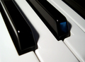
| 09/26/2006 04:10:59 PM | Lines and Angles in Perfect Harmonyby SquishyBComment: Critique Club Review:
Either focus or depth of field is a little off. A smaller f-stop would have helped a lot here.
Lighting is dramatic. But the first black key doesn't show enough detail for me. I noticed one person was troubled by the reflection in the second key. To me it gices some reference for the shape of the key face.
Overall I like the picture. The composition is good, the whites are nice and white. It's the focus issue I notice the most. |  Photographer found comment helpful. Photographer found comment helpful. |
| 09/26/2006 04:03:48 PM | tied wireby lissaComment: Critique Club Review:
Size matters, size matters, size really does make a difference. As you can see by the comments you have already received, a small picture no matter how good, has a hard time doing well. You should take advantage of the dimensions and the number of kilo bytes allowed in any challenge. Small pictures make it difficult to see detail and can hide issues like poor focus, noise, and grain. Many voters will suspect the entrant has done just that when submitting a small photo.
As for the photo, it looks good. I like the use of depth of field to soften the wire in the background. Lighting, saturation, hue, and brightness look good. The box is a bit distracting. I think the printing is the issue. Painting, or covering it would help. Aluminum foil comes to mind for contrast.
A little more color or drama in the lighting would have helped also. |
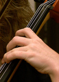
| 09/26/2006 11:59:57 AM | Parallel Stringsby photom1946Comment: Critique Club Review:
Color, saturation and hue are good. Brightness and contrast are good as well. Skin tones are very natural.
Focus is good. Depth of field is soft in the foreground, as evidenced by the hand, and a bit deep in the background. The hair is rendered sharply and I think it causes distraction.
I have to agree that the hand has become an unintended subject, as it is cutting the intended subject in two, and dominates the center of the photo with size and brightness. I would recommend leaving it out of the picture.
The strings were a good idea for the challenge, and I'm wondering how a shot down the neck of the instrument, letting the strings dissapear into the distance, would have worked. |
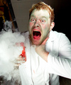
| 09/26/2006 02:29:50 AM | Soon to be Mr.Hydeby russiComment: Critique Club Review:
Excellent photo. Light, saturation, color, focus all are very good.
About all I can offer is the structure on the left is distracting. Would like it all bricks, or even better all black.
The red lips were a bit odd, but figured it might be what he was drinking. Otherwise a different color might work better. | | Photographer found comment helpful. |
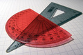
| 09/26/2006 02:25:36 AM | Protractorsby ogremerkComment: Critique Club Review:
I like the way the graph paper fades towards the back. It helps keep the graph lines from pulling the eye away from the subject.
A little more angle on the light would have emphasized the shadow cast by the protractor. Increasing saturation would have made the red have a little more energy. Not a lot of increase would be needed. "Moderation in all things..."
To make the protractors look newer, wipe them down with a bit of oil. (Cooking oil is fine.) And the buff them dry a bit so they don't stain the paper. Nice glossy finish that washes off with soap and water. Hides minor scratches too.
Interesting photo... | | Photographer found comment helpful. |
| 09/25/2006 09:27:07 PM | Straignt and Angular Perspectivesby solarysComment: Critique Club Review:
Depth of field is too shallow here. The legs form the angles, but are soft in this picture so they do not get the attention they deserve.
I think most viewers are used to a sharp foreground and a soft background. Here the body is extremely soft halfway up the picture.
The head and antennae look great though.
Color, saturation, hue, contrast and brightness are all very good. |
| 09/25/2006 09:17:30 PM | By Degreesby JacquiDComment: Critique Club Review:
Meets the challenge. Focus and depth of field are good. The triangle on the left distracts a bit. Perhaps because it is not in line with the other lines in the picture.
The pencil lines lead the eye, but come together off the image, thus leading the eye out of the picture.
The big problem for me, is there is no real center of interst. The eye just kind of wanders around not knowing what you wanted to really show. A more dramatic lighting might have helped. I'd have to agree this angle made things look a bit flat. |
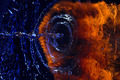
| 09/25/2006 09:10:21 PM | Hydro vs Pyroby smykComment: Critique Club Review:
This is such a great photo. Once I read how it was done, I am even more impressed.
Color, saturation, hue, focus, depth of field, lighting, brightness, contrast are all excellent.
I'm not sure why you presented it the way you did, but I think that is the only thing that kept you from a ribbon.
I really think the horizontal presentation cost you a few points. Everything else is just amazing. I think black0star got it right. Flames on top, with a supporting column of water, would have been magic.
Excellent photo!
| | Photographer found comment helpful. |
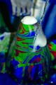
| 09/25/2006 09:03:58 PM | KINDERGARDEN VOLCANIK CHEMSTRYby akhoopesComment: Critique Club Review:
I'm not sure what the stream of water is supposed to represent. To the left of the cone, it looks like there is a spot or drop of water on the lens.
Color and saturation are good. The foam at the top of the volcano is just about burned out and featureless. Could just be the foam is.
Depth of field is a little shallow here. Things are getting soft towards the base of the cone.
To me it appears that you are a little too close to the cone with the camera. Also a little late with the picture. It looks like the eruption is about over.
This is a creative take on the challenge. I'd like to see this picture again with a little wider angle, more depth of field, the eruption in mid flow for a little more drama and without the stream of liquid frozen in time, it is a little distracting. |
|
Showing 1101 - 1110 of ~1613 |
Home -
Challenges -
Community -
League -
Photos -
Cameras -
Lenses -
Learn -
Help -
Terms of Use -
Privacy -
Top ^
DPChallenge, and website content and design, Copyright © 2001-2026 Challenging Technologies, LLC.
All digital photo copyrights belong to the photographers and may not be used without permission.
Current Server Time: 07/19/2026 10:03:57 AM EDT.
|