|
|
|
Showing 1071 - 1080 of ~1613 |
| Image |
Comment |
| 10/05/2006 03:28:26 PM | good to the last....by ehoscaComment: Critique Club Review:
I feel this image should have scored much higher. Perhaps color would have helped.
Focus, and depth of field are perfect. Especially after we see how it was done. No hint of all the umbrellas in the background, even after you know how it was done.
Brightness, lighting, and contrast are dead on. I can see where some might feel it isn't abstract, but looking at the other photos, I would say this one is in the same league. |  Photographer found comment helpful. Photographer found comment helpful. |
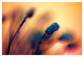
| 10/05/2006 03:08:22 PM | Lavender In The Corn Fieldsby KitaComment: Critique Club Review:
Focus is OK, could be a bit sharper. Depth of field does isolate the subject, but is so shallow that the subject is getting soft arouind the top edge. The object to the left appears to be approaching sharpness in the center of the stalk, which is a bit distracting.
The rest of the image looks great. Nice blur for the background. Maybe a little more light further down on the subject would help a bit. But still a very interesting and pleasing photo.
I really like the play of the colors and contrasts.
Good job. | | Photographer found comment helpful. |
| 10/05/2006 03:03:20 PM | Bands of Colorby escapetoozComment: Critique Club Review:
Interesting play on color. Color, saturation and hue are good. Brightness and contrast are good as well.
Focus is good, but depth of field is a bit too shallow. I see you were already at f-11. I don't know what your lens was capable of. You may have needed to shift the center of focus a little further back.
The charm is well lit, but at the same time, it the lighting appears to have been pretty equal, and comes across as a bit flat.
One question that comes to mind, is whether or not the charm is supposed to be polished silver, or antiqued? In the photo, at this close range, it comes across tarnished and dirty. | | Photographer found comment helpful. |
| 10/04/2006 08:31:25 PM | Hostile Environmentby JucaComment: Critique Club Review:
Interesting picture.... I think that one of the things that hurt your score is a lack of an idenfifier to show the scale of the objects. There is really noting there to say the leaves aren't the size of your hands or larger. Hence the questions about this being a macro. (My entry suffered a similar fate even though the lens was less than an inch away from the subject.) Enough about me....
Focus is excellent, and depth of field quite good for the subject.
The colors selected are a bit unusual. I would have preferred brighter flowers. The subject is centered, which surely put you in trouble witht the rule of thirds police.
The leaves that have detail look a little grainy, as if they were oversharpened a bit.
I think your photo does communicat the title well.
|
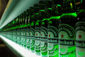
| 10/02/2006 01:06:28 AM | Let's drink together guysby onarComment: Excellent photo!
Color, saturation, hue, brightness, contrast are all done quite well.
Lighting is great!
Focus and depth of field are very good. A little deeper depth of field would have worked well too.
I have to agree with one of the other commenters, a little human interaction, (hand taking a bottle) would have been a nice addition, or even one bottle missing from the row. Inidcating that someone is having a drink. Would have been a nice touch.
This is an excellent photo, and well deserving of a top ten finish. | | Photographer found comment helpful. |
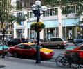
| 10/02/2006 01:00:58 AM | Totally Assimilated and (almost) Unnoticedby gg3rdComment: Critique Club Review:
Focus is excellent. I would suggest using depth of field to soften the background, as the busy appearance of the building across the street distracts heavily.
I agree with the other commenters that the subject is too centered, and would have been nice to see it lighted.
Color, saturation and hue are done well. Lighting is a bit flat and cool. (Looks like an overcast day.) Though there is some shadow, which if accurate, says high noon, which is a bad time for photos.
Too bad you couldn't stage some bicycles in front of the light pole. That would have further communicated the assimilated theme. | | Photographer found comment helpful. |
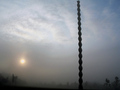
| 10/02/2006 12:54:14 AM | "The Infinity Column"(Constantin Brancusi)by blacjackComment: Interesting picture....
Although the ISO is 50, the picture looks a little grainy to my eye.
I like the fog, and the half hidden shapes. I agree with the other suggestions that the picture should be cropped right at the top of the column so that it does appear to go on for infinity.
I would also suggest a slight rotation so that the column appears to be vertical. With this view it appears to be leaning and could topple over.
I like this picture and find it thought provoking. | | Photographer found comment helpful. |
| 10/02/2006 12:48:51 AM | Coloursby Rino63Comment: Critique Club Review:
Focus and depth of field are good. Color, contrast, saturation and hue are good as well.
I think you've already heard about the biggest problem, the finger. Nothing in the title, or in your comments, gives the viewer any reason for the finger, except to hold the disk for the photo. This being the case the finger overwhelms the colors of the disk.
If the finger was intended as the subject, I would suggest lighting it from the opposite side. We are left looking at a finger mostly in shadow. | | Photographer found comment helpful. |
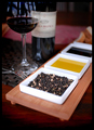
| 10/01/2006 01:27:21 AM | Peppery Antipastiby hotpastaComment: Crtique Club Review:
Focus is good, but depth of field is a bit too short. I would have liked to have seen sharpness through the front edge of the platform for the spices. At the very least all the peppers should have been sharp.
Color, saturation and hue are done well. Lighting is done well also.
Composition is good, and draws interest to the pepper corns as it should.
With corrections to depth of field, this would make a nice magazine layout. | | Photographer found comment helpful. |
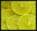
| 10/01/2006 01:22:43 AM | Lemon seedsby ShauryaComment: Critique Club Review:
Color does seem a bit off. The parts that should be white, aren't which I think has people seeing green for some reason.
Lighting as others have mentioned is a bit harsh, and combined with the processing leaves the picture looking almost as if it was over sharpened.
The border does compete with the picture a bit. A lighter touch (thinner border) would have helped here.
The upper left slice, seems a bit shadowed as it does not have highlights similar to the other slices.
Focus and depth of field are very good. | | Photographer found comment helpful. |
|
Showing 1071 - 1080 of ~1613 |
Home -
Challenges -
Community -
League -
Photos -
Cameras -
Lenses -
Learn -
Help -
Terms of Use -
Privacy -
Top ^
DPChallenge, and website content and design, Copyright © 2001-2026 Challenging Technologies, LLC.
All digital photo copyrights belong to the photographers and may not be used without permission.
Current Server Time: 07/19/2026 03:56:56 PM EDT.
|