|
|
|
Showing 1041 - 1050 of ~1613 |
| Image |
Comment |
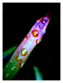
| 10/10/2006 05:56:33 PM | Untitledby PollyBeanComment: Critique Club Review:
Focus is very good. Depth of field is a bit shallow for me. I like the way the other green bits in the picture are soft. However, I would have liked to see all the drops in sharp focus.
Color, saturation and hue are good. I like the change of the color across the bend of the plant. I realy like the large water drop in the red section.
Brightness and contrast are good, and lighting is good as well. I like the highlights on the water drops. Adds depth and texture to the piece.
I might have like a little thinner border.
Overall a very nice picture, one I could see hanging in a gallery. |  Photographer found comment helpful. Photographer found comment helpful. |
| 10/09/2006 03:46:00 PM | Sunset beachby PixelstateComment: Critique Club Review:
Wow! What a picture!
Focus, and depth of field are excellent.
Color, saturation, hue, brightness and contrast are great.
Lighting is very well done.
Horizon is nice and level if a bit centered. i would like to have seen more ocean, or even some beach, and a little less sky. The clouds look very good, but I would sacrifice some of them first. Cropping say just above the bright cloud that is a bit separate from the others on the right. That's just a very minor point, as this is an excellent photo. One that I could look at on my wall daily and never tire of the scene.
Congratulations on a well deserved top five finish.
| | Photographer found comment helpful. |
| 10/09/2006 03:38:04 PM | Purple Orchidsby kervinchongComment: Critique Club Review:
Focus and depth of field are very good.
There is not a lot of purple here. I don't think the picture has to be all purple to meet the challenge. However, the red so overpowers the purple, that it almost erradicates it. Hence the comments you received below.
I find myself wondering what colors these flowers really were. I'm not a flower expert by any means, but the colors here just don't look natural. Things that don't look natural, often don't score as well as things that do; even though the latter image may be a better image. If these are the real colors, then I want some.
Overall a nice composition.
|
| 10/09/2006 01:20:50 AM | Cycle of Deathby Dr.ConfuserComment: Critique Club Review:
Focus is excellent. Lazer sharp capture.
Color/saturation/hue: I think you lost points on the lack of purple. I noticed it commented below, and the purple is minimal on my monitor also. Did it look more purple on your monitor? There is some nice purple reflection in the chrome. Nothing is over saturated, and hues look normal.
I would have liked to see a little more of the engine work and tank towards the front of the bike. But then that could be more of a personal I like bikes request as opposed to absolutely necessary for the image thing.
Great detail on the engine, all the various lines and surfaces reflect and compliment the image well.
I would have thought this image would have scored somewhat higher. It wasn't a very purple image, but it is a very good image. | | Photographer found comment helpful. |
| 10/09/2006 12:40:41 AM | Freedom is painting in the skyby Rino63Comment: Critique Club Review:
Focus and depth of field are good.
Color/saturation/hue: The sky looks fine, the hand is a bit pale and the skin tones do not seem quite right.
Lighting appears to come from a different direction than does the rest of the photograph.
I would like to see more of the hand and brush, and the house in the lower right serves only to distract. Or, alternatively you could have sacrificed a brush, put paint on it and let it dry in a bent position as if it really were applying paint to the sky; and then shot with a closer focus on the brush.
Nice concept, it has the bones of a very good surreal photo. | | Photographer found comment helpful. |
| 10/08/2006 08:47:53 PM | Spun and suspendedby KHoltComment: Critique Club Review:
Very nice photo!
Focus is excellent. Depth of field leaves me wishing for a little deeper depth of field for more of the "jewels" in the sharp zone. However, it does a good job of isolating the subject from background clutter.
Brightness and contrast are very good, and I especially like the starburst highlights.
I also like the way you cropped the photo to emphasize the vertical nature of the subject.
Overall a very pleasing photo I could see hanging in a gallery. | | Photographer found comment helpful. |
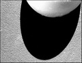
| 10/08/2006 08:42:41 PM | Cracked Shadowby melismaticaComment: Critique Club Review:
Focus is very good. Depth of field is shallow, leaving the top of the egg soft and a bit distracting.
I do like the texture of this piece. The edge of the shadow is fascinating. The shadow in a great black void, very well done!
I think what hurt you the most, was the egg. It just doesn't hold up well to the drama of the jet black shadow, with a razor sharp edge, and all the texture of the background.
I would also like to see this photo in color. I think the energy that some bright color could add, would help here.
Overall, a good photo that I think scored a fair bit lower than it should have. | | Photographer found comment helpful. |
| 10/08/2006 08:37:31 PM | La La La Laby Shea927Comment: Critique Club Review:
Focus is good, depth of field is a bit shallow as the disk appears to go soft at the edge.
I know you liked it because the other side showed throoug, but all the numbers and writing are competing with each other for attention.
I would suggest a closer photo, where the picture starts just to the left of the numbers around the center hole. This way you get the subtle lettering coming through from the other side, a less centered subject, and a more abstract photo. Especially if you took a shaper angle on the lighting for a more dramatic effect.
I do like the green and all the colors in this picture. Nice energy. | | Photographer found comment helpful. |
| 10/08/2006 08:30:54 PM | colorby riderComment: Critique Club Review:
Focus is soft, depth of field does isolate the subject from the background. I don't think depth of field is a problem here, as the subject appears equally soft across the image.
Color, saturation, and hue are good. Brightness and contrast are good as well.
The background appears a bit grainy. Likely due to the ISO 400 used. A lower ISO would have helped with this, and it looks like you hade enough speed avaiable to stop any motion blur.
The other thing I would suggest is rotating the picture 180 degrees. In this view the wings hang down. The energy seems drained. The other way the wings would point up, and appear to have more energy. (It's fun to have a flat panel display that I can rotate.)
I do like the colors and shapes, the biggest point as mentioned by others is the focus. It really needs to be sharper. | | Photographer found comment helpful. |
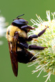
| 10/08/2006 08:23:19 PM | Digging Inby pedahel7Comment: Critique Club Review:
Nice picture. Your score suffered a bit due to the lack of an abstract element. But still a very good photo.
Focus and depth of field are very good. The subject is nice and sharp, the depth of field isolates the subject well from any distractions in the background.
The exposure of the bee is very good. Detail is spectacular. But the flower burns out and loses detail on the upper surfaces. Also the highlight on the bee's back, just below the head is approaching burnout. As this is an advanced challenge, some dodging and burning in this image would help.
Nice touch with the sharpening. A job done well as it is not obvious and introduced no distracting artifacts.
Very nice picture.
|
|
Showing 1041 - 1050 of ~1613 |
Home -
Challenges -
Community -
League -
Photos -
Cameras -
Lenses -
Learn -
Help -
Terms of Use -
Privacy -
Top ^
DPChallenge, and website content and design, Copyright © 2001-2026 Challenging Technologies, LLC.
All digital photo copyrights belong to the photographers and may not be used without permission.
Current Server Time: 07/21/2026 06:28:08 PM EDT.
|