|
|
|
Showing 1021 - 1030 of ~1613 |
| Image |
Comment |
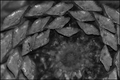
| 10/17/2006 07:28:11 PM | The Coneby CaitlynComment: Critique Club Review:
Technical: Focus and the applied depth of field are good. Brightness is good, contrast is low as applied to this challenge.
Reaction: Overall this is an interesting picture. I too like the effect that you achieved here. I believe most voters were looking for a high contrast betwen the bright and dark areas of your photo.
I do see an interesting contrast between the harpness of the points of the cone, and the relative softness of the center. Is this what you were going for?
|  Photographer found comment helpful. Photographer found comment helpful. |
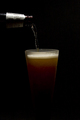
| 10/17/2006 01:23:58 AM | Shiner Liteby bj16060Comment: Critique Club Review:
Technical: Focus and depth of field are spot on. Color, saturation and hue are realistic, which is needed for this type of image.
Reaction: I like the way the beer glass fades to black. Gives a bit of extra feel to the image. Could also be a subliminal message that the calories seem to dissapear. Would also leave room for needed text, were this a real beer ad.
If we were looking at real beer ads; the image here while very well done, never shows the name on the bottle or on the glass. For a real ad this would be a sin. Personally I like a little thicker head.
Overall a very good and convincing photo. I wouldn't be suprised to see on like this in a magazine, or on a billboard. | | Photographer found comment helpful. |
| 10/16/2006 08:56:08 PM | wearyby PegasusComment: Critique club Review:
Technical: Focus and depth of field are done well for this subject.
Lighting, brightness and contrast work very well for this challenge.
Reaction: I feel you communicated your title very well. Is teh image razor sharp? No. Are areas blown out? Yes. However, it all works quite well here. The subject looks _WEARY_. I could easily see this hanging in a trendy gallery.
I can only hazard a guess at why you got the score you did, and that is because it isn't "pretty." Pretty pictures do well. Something in life aren't pretty. That's life. And you did a very fine job of communicating the title of your picture. I feel this picture should have made the top 20, if not the top 10. | | Photographer found comment helpful. |
| 10/16/2006 01:32:30 AM | Sunrise Terraceby carloComment: Critique Club Review:
Interesting picture.
Technical: Focus and depth of field are very good. Brightness, contrast, and lighting are done well.
Reaction: There are so many ways to look at this picture. I note from your comments that your concern was the play of the shadows of the table and chairs. Interesting... Had you not written that, I would have passed by what concerned you most. For me, the shadows, and the chairs, railing, and boards of the deck are almost overload. They all compete and interfer with each other.
What I really like is the simplicity of the can on the table. Had you been able to move the table into full light, and captured the can, table and tops of the chairs, you could have taken the can's shadow quite dark. At the angle of the photo you have here, I think it could have been a really good picture, with sort of an abstract art feel. | | Photographer found comment helpful. |
| 10/16/2006 01:22:26 AM | Durga - The Goddess of Power Peace and Integrityby names_amitComment: Critique Club Review:
Now this is different, and difficult to review.
Very creative. I took your advice, and it does come together and look much better further away from the monitor. Nice effect. Up close, it almost hurts my eyes to view it.
I don't know that I would call this high contrast. High motion maybe. High energy for sure.
I like the colors, the movement, and the energy in this photo. I think your score is a result of viewers not being able to see your comments during the voting, and unless they sat back by chance, unable to appreciate the photo in the proper context.
I've learned one new thing here, and that is to look at each photograph at different distances and angles before I vote.
Up close, this picture is about a 4. At five feet, it is more like an 8.
| | Photographer found comment helpful. |
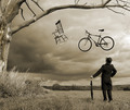
| 10/15/2006 08:41:31 PM | Quite Perplexing by ColeyComment: Critique Club Review:
Technical: Focus, and depth of field are excellent. Brightness and contrast are very well done. I think making this picture black and white put you over the top. I have a hard time imagining this picture looking as good in color.
Reaction: Perhaps this picture says unreal more than unrelated. The coat and hat adds to the whole matter here. The feel reminds me of something out of the 60's maybe around the time of the Beatles. I could see this as an album cover for some phychedelic music. It has a very British look and feel to it, though from your bio I believe you are in Canada. Commonwealth eh?
Though playing the game how are these two alike, you sit on both. I find the whole much more than the sum of the parts.
Everything worked here. The frame created by the tree, the angle of the chair, the costume, the bicycle, all of it.
Congratulations on a well deserved firt place.
| | Photographer found comment helpful. |
| 10/15/2006 03:09:44 PM | The Model Behind the 8 Ballby BrianRComment: Critique Club Review:
Technical: Focus and depth of field are good. Color, saturation and hue are fine as well.
Reaction: Sorry, this one is over my head. The two objects are definetly unrelated. However, the picture doesn't really send me a message. It's a nice model and a nice eight ball. But I don't see a story, or a pun, or a play on words here. I keep trying for the "Oh, I get it!", moment. But it just doesn't come.
Sorry to say it looks to me like it was two items picked at random.
It is a well done photo, and I think it should have scored somewhat higher on technical merit alone. But it is one that is hard to "read".
Perhaps the term is unique to Austrailia. In which case it would work well. We do have the term, "Behind the eight ball" here in the USA, which is used to denote a person in trouble. Something bad usually is happening to a person behind the eight ball here.
I do wish there was more in your comments that explained what you were trying to do. If you would like to PM me, I'd be happy to take another look. |
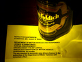
| 10/15/2006 01:44:56 AM | DEFIANCEby dmaddenComment: Critique Club Review:
Focus is good. Color, saturation and hue are done well.
The lighting is a little harsh and the reflected highlights on the paper are a little distracting.
I'm not sure about the significance of the drops of liquid on the paper. Spilt whiskey? Tears? Drool?
I would have liked this better if the label were easier to read. You really have to work a bit to make out the word "Scotch". Rotating the bottle a bit would have helped. As would have a shallower angle.
I noted the title was defiance. Perhaps a poured glass of scotch would have been in order. Or even a partially consumed, or almost empty glass would also help communicate the notion.
Interesting start on a composition with some potential. | | Photographer found comment helpful. |
| 10/15/2006 01:33:14 AM | "Ain't Room in This Town for the Both of Us"by freakin_hilariousComment: Critique Club Review:
I find the lighting of the duck to be a bit bright. The duck almost blends with the background at the tail.
Focus and depth of field are quite good and fit the image well.
Interesting take on the challenge. Both are poultry. But one is kitchen and one is bath. Nice subtle message.
I like this picture, but I find the idea of a slightly different angle that would further emphasize the height of the wisk even more, an atttractive idea.
Nice bit of humor. | | Photographer found comment helpful. |
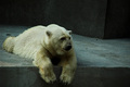
| 10/14/2006 02:33:22 PM | Polar Depressionby smykComment: Critique Club Review:
That is one unhappy bear. He looks like he is ready to cry.
Your color manipulation did help to communicate the intended message. Perhaps even a little more coolness to the colors would have been even better. At the moment I'm picturing a black & white background with only the bear in color, and in my head it works pretty good.
Perhaps your message was so strong, it affected your score. No matter, it is a very good photo as is, and should have scored higher.
I think you did an excellent job of getting your message across. This could be a poster for a campaign to improve the zoo.
Good job! | | Photographer found comment helpful. |
|
Showing 1021 - 1030 of ~1613 |
Home -
Challenges -
Community -
League -
Photos -
Cameras -
Lenses -
Learn -
Help -
Terms of Use -
Privacy -
Top ^
DPChallenge, and website content and design, Copyright © 2001-2026 Challenging Technologies, LLC.
All digital photo copyrights belong to the photographers and may not be used without permission.
Current Server Time: 07/22/2026 06:19:38 AM EDT.
|