|
|
|
Showing 1001 - 1010 of ~1613 |
| Image |
Comment |
| 06/23/2007 07:42:56 PM | The girl in the caféby BrinComment: Critique Club Review:
Except for the hair style, this could be an 80 year old picture.
Depth of field is used well to set the subject apart from the rest of the image. Though I might have preferred even a bit shallower depth of field.
Lighting is very good for this piece, and a very good job of capturing a "far away" look in the subject's eyes.
Good job of not letting the whites get blown out, or the contrast too shallow.
A good photo tells a story, and this one tells a story of a young lady whose mind is elsewhere.
Good job. |  Photographer found comment helpful. Photographer found comment helpful. |
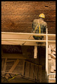
| 06/23/2007 07:36:08 PM | At Workby jjusaComment: Critique Club Review:
Overall I really like this photo.
I do think that the parts, bricks, and other material along the right side of the frame are a bit distracting and competitive with the subject of the photo. The board below the man's foot on the left, leads the eye away a bit also. I realize this was not a posed shot, so there was only so much you could do.
That being said, I really like the lighting that brings out texture of the brick, and contrary to other, I think this works best without seeing his face. This photo is for me, more of a mood piece, and sepia feeling of the color tones add to the picture as well.
The one missing brick also helps set off this picture. It does tie the loose bricks on the right, back in a bit, as I study the picture more.
Camera angle was done well, it brings a little extra life and mood to the photo.
Nice photo! | | Photographer found comment helpful. |
| 11/26/2006 07:15:03 PM | Industrial Paradiceby egillbjarkiComment: Critique Club Review:
Technical: Focus and dept of field are excellent. Brightness and contrast are done very well. Color/saturation/hue N/A
Reaction: I really like this picture and I am surprised it did not do better. Centering yourself in the power lines works. Looks like rays of energy to me. The power plant in the background contrasts well with the parka, and it look on the subjects face. He really looks cold, and/or angry. This image could work well for a group protesting industry.
Overall and excellent photo that I believe was overlooked in the voting.
|
| 11/26/2006 07:08:57 PM | Motorway Musicby coronamvComment: Critique Club Review:
Technical: Focus and depth of field are excellent. Brightness and contrast are done well. Color, saturation & hue: N/A
Reaction: Interesting angle but I'm left unsure as to why it was done this way. There are no visual clues, or anything in the title, would give a reason. You don't necessarily need a reason, but it usually helps. I would have preferred seeing the subjects from the front. The backs of heads is what you usually get from quickie snap shots. I do like the play of light on the wall. Had the subject posed there, and faced the camera, there could have been a nice album cover out of this. I also think this picture is one that works best in B&W. Had this been done in color, there would have been too many distractions. |
| 11/26/2006 06:28:35 PM | HDR in Providenceby valknerComment: Critique Club Review:
Technical: Focus and depth of field are excellent. Color, saturation, and hue: Color balance appears a bit off. Saturation is done well.
Reaction: The sky is just scary. Looks like something out of the Stephen King movie "The Langoliers". I'm not sure what you were going for here. (Though it appears skasuba loves it, so mine isn't the only opinion.) As this is an advanced editing submittal, I would recommend correcting the perspective of the building. Tall structures, when photographed without perspective correction, appear to be falling over, as seen here. You might want to look at cloning out the car also. I think this picture could really pop if done in black and white. I too would like to see a little more picture, to the left looks like it might work best. But then again, no telling what was there for you to work with.
Overall a good photograph with plenty of possibilities. | | Photographer found comment helpful. |
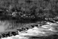
| 11/26/2006 06:01:47 PM | babbling brook...by notonlineComment: Critique Club Review:
Technical: Focus and depth of field are very good. Brightness and contrast are good as well. There are some highlights on the water, that are at the point of being blown out, but the size and shape of the areas still make it work for the image.
Reaction: I'm going to have to second Ivory on the background. The subject is the water. The background is so busy, it needs to be muted a bit to reduce the distraction. Though the longer exposure water thing has been done ever so many times before, and this may have hurt your score a bit, I still think an image should be judged separate from any other and stand or fall on its own. In this case I really like it. The contrast above and below rocks it what this picture is all about for me. A little longer exposure would have given the illusion of a bit calmer water above. However, my only real complaint is the busy background.
Overall this picture really works, and I think that your score should have been higher. | | Photographer found comment helpful. |
| 11/26/2006 05:53:39 PM | All Caught Upby escapetoozComment: Critique Club Review:
Technical: Focus and depth of field: Image comes across as soft and slightly out of focus. Does not appear to be going for a soft focus effect. Brightness and contrast: Several areas near the head, shoulders, and haunches are blown out with no remaining detail.
Reaction: The composition is great, the technicals are what let you down. I notice that the ISO is jacked up to 1600, yet the speed was still only 1/60 and the aperture at 4.5. I think you were hampered by low light more than anything else. I love the look on the cat's face, and overall a very playful and pleasing composition. I would really like to see this one redone, with better lighting and focus. Do it in color with Christmas ribbon and paper, and you could probably sell it as a Christmas card. | | Photographer found comment helpful. |
| 11/26/2006 05:45:50 PM | Cattyby RebeccaComment: Critique Club Review:
Technical: Focus and depth of field are excellent. Brightness and contrast: The top of the hand and parts of the forehead are blown out, but the high contrast and the lighting angle helps to make the whole thing still work, as the areas are small and the rest of the shapes give the appearance of detail where there is none.
Reaction: I like the work around the eyes. The dodging really made the eyes stand out. I'm going to have to go with kiwiness on the hand. It distracts from the face, and with the high contrast and lighting, it almost looks photoshopped in, or like it was someone other than the subject.
Overall I like the picture, reducing the attention to the hand, (lowering it to allow more of the face to be seen, or holding it further back), I believe would help here. Nice work. | | Photographer found comment helpful. |
| 11/18/2006 07:16:35 PM | .by moviemanComment: Critique Club Review:
Technical: Focus and depth of field are good. Color, saturation and hue: Either lighting or processing has left a little bit of a green cast to the image. Notice the color of the beard, and the middle area of the forehead as examples.
Reaction: Overall I like the picture. However, I think I would have liked it a bit better with the lighting more to the side, so as to leave the subject's left eye in shadow, and made a sharper distinction between the light and dark areas. I tend to think the processing made some of the tones go green. I would have liked the photo better, had this not happened. This is an advanced editing challenge, so the extra time processing would have helped here. | | Photographer found comment helpful. |
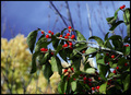
| 11/07/2006 06:39:58 PM | Honeysuckle in Autumnby kelli_KComment: Critique Club Review:
Technical: Color, saturation, and hue are good. Focus is nice and sharp. However, a shallower depth of field would have helped isolate the subject from the background.
Reaction: I really like the red berries and the amount of detail in each. The leaves look a little wilted. Was the branch cut earlier and placed there? The leaves just look a little sickly. The sky looks a little grainy, especially for an ISO of 80. The big thing is too much detail in the background. A shallower depth of field would help a lot here to create the soft backgrounds normally associated with bokeh. A larger f-stop would have helped here. Not sure how wide the C-5000Z can go, but I would like to see this picture again, with a softer background. | | Photographer found comment helpful. |
|
Showing 1001 - 1010 of ~1613 |
Home -
Challenges -
Community -
League -
Photos -
Cameras -
Lenses -
Learn -
Help -
Terms of Use -
Privacy -
Top ^
DPChallenge, and website content and design, Copyright © 2001-2026 Challenging Technologies, LLC.
All digital photo copyrights belong to the photographers and may not be used without permission.
Current Server Time: 07/21/2026 05:10:50 PM EDT.
|