| Image |
Comment |
| 05/10/2006 09:45:05 PM |
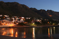
Some Enchanted Eveningby overthemoonComment: Doesn't quite strike me as interesting. The lights run right through the middle of the composition...perhaps if you did something more extreme like drag the houses to the bottom and show a lot more sky, it could make more impact. Though the reflections in the water are pretty cool, too. |
| 05/10/2006 09:43:09 PM |
|
| 05/10/2006 09:42:51 PM |
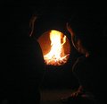
Better than TVby lkpackardComment: Not quite enough detail in the shadows to really grasp what's going on. I think it may be a chiminea, but a tad more brightness would help a lot. |
 Photographer found comment helpful. Photographer found comment helpful. |
| 05/10/2006 09:41:47 PM |
|
| 05/10/2006 09:41:25 PM |
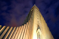
Tower of Faithby StructorComment: Beautiful. I'm sure someone's brought up the hotspot at the bottom. A little burning in advanced editing would help. Good job overall. |
| Photographer found comment helpful. |
| 05/10/2006 09:40:21 PM |
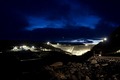
Kárahnjúkadamby biggisComment: I can't quite tell what's going on. My eyes wander from the light in the sky, the the bright lights in the middle, to the lit foreground. No major focal point to rest on. Nice blues in the sky, though. |
| Photographer found comment helpful. |
| 05/10/2006 09:38:46 PM |
walk in the streetby chusterComment: Great style! Definitely a powerful image...I can see it on a huge advertisement for teen clothes. |
| 05/08/2006 08:59:57 PM |
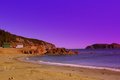
IMG_6726.JPGby ApertureComment: The colors look fake and over-processed in the blue/purple tones. Also, it's fighting with the orange glow falling onto the rocky cliffs...my mind is confused whether it's sunrise, sunset, dusk or dawn. Not a bad photo though by any stretch. |
| Photographer found comment helpful. |
| 03/29/2006 08:20:20 AM |
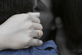
Amour - Never let it go.........by honikumComment: I agree about the DOF...it's actually too shallow. Hard to tell what's going on in the background. Had you not posted in a thread, I wouldn't have known. Even if you stood to the right a bit more, there may be more detail in the faces where the hand is blocking any kissing action as it is.
I'm also not crazy about the selective color. That pulls your eye to the foreground even more, which is what you don't want since the focus is supposed to be on the "amour". Also, how does the fact that someone has a blue shirt add to the image? I didn't vote in this challenge, but thought I'd add an IMO per your thread request. Very creative idea! |
| Photographer found comment helpful. |
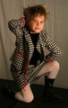
| 02/23/2006 06:48:08 PM |
School Fashionby mferg265Comment: light to dark background is distracting...more so are the wrinkles in the backdrop...pose looks uncomfortable...perhaps some color cast as well...lighting is rather soft for fashion...I figure a lot of your voters are looking for bold/sharp/vibrant images (i.e. not necessarily a bad pic, just not what viewers are likely looking for). moving away from background, more natural pose, and a spunkier expression to match a spunkier outfit would help |
Home -
Challenges -
Community -
League -
Photos -
Cameras -
Lenses -
Learn -
Help -
Terms of Use -
Privacy -
Top ^
DPChallenge, and website content and design, Copyright © 2001-2026 Challenging Technologies, LLC.
All digital photo copyrights belong to the photographers and may not be used without permission.
Current Server Time: 04/01/2026 01:26:25 PM EDT.