| Image |
Comment |
| 06/21/2006 06:24:32 PM |
|
 Photographer found comment helpful. Photographer found comment helpful. |
| 06/21/2006 06:10:36 PM |
|
| 06/21/2006 06:08:47 PM |
Sailing at Sunsetby ReddenComment: This looks like a nice shot, but it is so small relative to others, it is hard to judge the detail. |
| 06/08/2006 03:26:11 AM |
|
| Photographer found comment helpful. |
| 06/07/2006 02:56:39 AM |
Day 5, 30 day candidsby MayaMComment: Nice color and DOF. I bet he doesn't really want to sell it...unless to buy another one that is better. |
| Photographer found comment helpful. |
| 06/07/2006 02:46:21 AM |
June 06by talikfComment: I hope I like your challenge entry as much as I like this "green" photo. The only thing I might have done differently would be to have your model look directly, smack-dab into the lens of the camera with an "I love apples" attitude on her face. (Of course that may be a crazy idea, too.) The way you have it is very appealing. |
| Photographer found comment helpful. |
| 06/07/2006 01:43:24 AM |
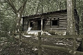
Back Home Againby tngrndreamComment: Trading post comment
I liked the idea of the cabin in the woods as "architecture" and thought the cabin itself was sharp enough, but a bit dark. What troubled me about this photo, though, was the confusion I felt because the background appeared to be heavily processed and competed adversely with the cabin itself. There is not much difference in tone...much of the photo has a similar cast to it, so my eyes never got to rest anywhere. The background seems to be too strong IMHO.
I gave it a 5. |
| 06/07/2006 01:36:58 AM |
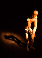
Woody Presleyby tngrndreamComment: Trading Post Comment
I thought the photo was a bit harshly lighted with the right thigh blown out (at least on my monitor). The DOF also seems to shallow because the shadow is fuzzy, which might not happen with more depth to the picture.
The composition was good. I would have liked to see a stronger, cleaner shadow, because in a sense this photo is as much about the shadow as the Woody IMHO.
I gave this a 5. The idea was fine, the lighting and DOF didn't work for me though. |
| Photographer found comment helpful. |
| 06/07/2006 01:25:42 AM |
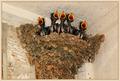
"Crying, Waiting, Hoping"by MelethiaComment: Trading Post Comment
Wonderfully funny photo...great capture (and having read your account, great patience too).
I think the lighting is a tad bright and (given the location of the nest) it doesn't permit much shadow. The photo, therefore, appears a bit flat or two dimensional to me, even though it is in a corner. Color is not dominant in this shot, so I wonder if it would do well in B&W.
This obviously is well received. Congrats on the top 20 finish. I didn't vote in this challenge (I don't know where my head was, because I am of the Beatles generation and always enjoyed their music) but I would have voted it relatively high - mostly because of the impact of the subject matter. |
| Photographer found comment helpful. |
| 06/07/2006 01:12:21 AM |
Public Libraryby MelethiaComment: Trading Post Comment
I liked this photo a lot. The abstract nature of the composition with all the diagonals, sharp edges, and angles, as well as the near-complementary shades of blue sky and orange/peach/rust color of the building really works for me. (I notice a similar choice in my own picture, so obviously I like what you did.)
I also like the interplay of light and shadow and the way they define the volume of the spaces and walls.
I just read some of the comments below and I (respectfully) disagree with two notions expressed there: (1) I think the A/C belongs in the photo. It repeats the vertical lines in the building itself and it provides one more shape/volume to the picture. It also balances with the rectangular shapes in the building on the left side of the photo. Without the A/C I think the picture suffers from the loss. (2) The idea that the concept of "architecture" is somehow lessened because the photo emphasizes the "abstract" nature of the lines, shadow, shapes, etc. rather than, say, the look of the whole building in its entirety seems illogical to me. (You might as well tell Frank Lloyd Wright his buildings aren't "architectural" because they are too "abstract".) Your photo's concentration on the abstract is an artful depiction of the architecture IMHO. Obviously we all have different and valid views of things (I don't mean to take away from anyone's view to the contrary) and that's part of what makes dpc (and this trading post) fun and valuable. I just wanted to add my two cents because I thought otherwise and thought you should know.
I scored it a 7 and should have scored it higher. Message edited by author 2006-06-07 01:13:02. |
| Photographer found comment helpful. |
Home -
Challenges -
Community -
League -
Photos -
Cameras -
Lenses -
Learn -
Help -
Terms of Use -
Privacy -
Top ^
DPChallenge, and website content and design, Copyright © 2001-2026 Challenging Technologies, LLC.
All digital photo copyrights belong to the photographers and may not be used without permission.
Current Server Time: 06/21/2026 07:48:21 PM EDT.