Image |
Comment |
| 12/08/2005 06:22:27 PM |
Asking Dad For Adviceby IndigoButterflyComment: Hello from the Critique Club!
I have studied your image and have the following to offer:
Composition/perspective – first offâ€Â¦very emotive shot. You have captured a mood and feeling quite well. The focus of the shot is good and the distance to the main subject adds to the strength of the image. I read your comments and agree with the tilted stone. It is a shame others didn’t see it. It does add to the mood of the shot as you wanted in my opinion. It is not easy visiting a grave and you added that element without an awkward addition to the photo that wasn’t there naturally. I do find the background a little distracting to the mood though. It looks like a tennis court or some other recreational area (??) The foreground stone being cut off is a good element – makes you focus immediately to your subject. Subject placement via rule of thirds is done quite well. The subject takes up just enough space to be a force, but not too much to make you wonder why he is there. I also like that you cannot see his face and his apparent uneasiness in the location (as evidenced by his foot being slightly off the ground). Really adds to his presence in the shot. Overall well done!
Color – b/w, the conversion was properly executed. The shades across the shot appear even and the dark and light areas you would expect to be the same in shade are. Well done!
Lighting – natural lightâ€Â¦well controlled exposure. The texture of the grass and the lines in the stones are well preserved. The jacket appears a little dark, but overall it is a very even exposure that is pleasing to the eye.
Challenge requirements – may have lost a bit here with the voters. You have to be willing to accept the setting to appreciate the force of the image. I noticed a few comments that did not like the tilted stone. I don’t think they spent enough time on the image to absorb the context. Just my opinion.
Overall/my opinion – this is not a shot to be judged on the technicals. They have been handled quite well in the image. But the subject matter may be a little too close to home for some, and too hard for others to grasp for whatever reason. But it is a strong image that was well thought out and executed quite nicely!
|
Photographer found comment helpful. |
| 12/08/2005 05:46:57 PM |
I've been everywhere....by mandyturnerComment: Hello from the Critique Club!
I have studied your image and have the following to offer:
Composition/perspective – right off I am struck by the illusion of leaning in this photo. This may have been enhanced by the crop/resizing, not sure. But the boot appears to be standing straight while the glasses directly behind it appear to be leaning slightly back. Placement of the glasses to the left (Paris/Australia) a little farther back may have prevented this. Not really a distraction, just a noticeable anomaly. Hard to tell exactly where the plane of focus is. The front of the boot appears to be it, but it gets lost in the clear glass with reflections on it. The glasses to either side which are farther back as well as the rear glasses all seem just slightly out of focus. The grouping is good, but perhaps if the boot was turned so the label showed, it would have helped eliminate some of the glare as well as helping the focus. The background is slightly off white. If this was whiter it might help to hide the glare on some of the glass since they all are clear and empty. Being off white, it makes the glare stand out more. However, on the other side of that, if it was whiter, the only part of the glare/shadow that appears to be an actual object (in the boot just to the right of the label) may also have been made more prominent. Tough call.
Color – the white is not fully developed and I think it would be a stronger image if it was. The control of the rest is good as evidenced by none of the green getting lost in the black around Las Vegas. Again this is evident in the London glass – the small bits of red still stand out and don’t get lost. Well done!
Lighting – perhaps could have been better. Hard to shoot clear glass against a white background, but it can be done. Overall, it appears as though this is natural light from a window (ha, just read your desc. And see it is a window, duh!). For the shot it is well done. The shadows are not overbearing and it is not so strong as to make the front surfaces of the glasses to just show reflection.
Challenge requirements – for collections this meets the challenge requirements fairly well. It is definitely a collection, but the glasses themselves, with the labels, cause you to look around the shot to read them as opposed to taking in the shot as a whole.
Overall/my opinion – the lighting perhaps is the weakest part of the shot. Using a custom white balance may have helped with the background which would have helped in this aspect. The shot has an overall ‘greenish’ tint to it. In my opinion, this may have been where it fell short with the voters.
|
Photographer found comment helpful. |
| 12/07/2005 05:41:34 PM |
Industrial Bronzeby fotomann_foreverComment: To expand on my earlier comment and support my vote on this:
Composition - her pose looks very forced/fake. Like she is being yelled at to stand still or something. The skin, to me, is very unappealing in this setting. If there were beads of sweat to show activity, maybe, but as it is she just looks like she needs a shower. Her expression is strange and adds to the 'forced' look of her pose. Above the head there are two flares or errant sparks or possibly something in the background that make it look like her head is skewered (perhaps adding to the strange expression). I find the beams and structure elements in the background to be very distracting - below her arm, above the grinder to the left. The lighting across her chest/face is very bright and in conflict with the rest of the image.
Although she has a grinder in her hand, I don't get industrial from it. She could be in her garage working on a sculpture which is not industrial. Too ambiguous in my opinion. A grinder is not indicative of industry, just a power tool. Having her nude is totally unnecessary. A pair of dirty overalls with no shirt would have been just as good and stronger in my opinion. Saftey goggles would have added an element that would lend to industrial, but not necessary.
The focus seems slightly off or it is the color/processing. The line of her back has a distinct red line that is separate from the shadow. Whatever it is she is grinding on is not sharp either and the bright spots on them draw away from her face (might be a plus but I don't think you intended it that way).
The overall color...her skin looks yellow, not tanned or white (I have calibrated monitors and have viewed this image on three - I see the same on all). The browns and rust, if developed more, would offset that some. The background would have been better if all black and the faded objects in it were not visible at all or else completely visible to support an industrial setting.
EDIT: Typos only Message edited by author 2005-12-07 18:26:52. |
Photographer found comment helpful. |
| 12/06/2005 08:58:38 AM |
A Distracted Paintingby pa_cuthbertComment: Very interesting composition. Shows creativity and the ability to translate an idea to image very nicely. My only criticism would be the division between your face and the posterboard. If that was a little less discernable this would have been a much stronger contender. Well done! |
Photographer found comment helpful. |
| 12/06/2005 08:41:34 AM |
sapphire lodeby tcmartinComment: Hello from the Critique Club!
I have studied your image and have the following to offer:
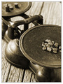
Composition/perspective - the choice of processing for this image was well done. The colorization is not too heavy and really sets a nice mood/feel for the image. The angle to the subject is nice. My only comment on this aspect would be it is not readily evident if the scale is actually balanced or not. The crop is a little tight on the right side - it would have been nice if the stones were not cut off. The focus is crisp and the DoF is nice - keeps you focused on the plane of interest in the shot. Well done!
Color - b/w, very well processed. The contrast between the subject and the background keeps the subject up front throughout the image.
Lighting - overall the shot is well and evenly lit. There is one bright spot on the base of the scale, but it is not really a distraction. The small bright spot on the arm doesn't hurt the image either. The detail in the textures of the plate, stones, table top is well preserved and adds a lot of 'feel' to the image.
Challenge requirements - in this area perhaps it could have been a little stronger. The implication is that the scale is balanced, hence even. But from the perspective it has to remain an assumption and in fact it appears to be heavy on the weight side of the balance. If it was shown to be balanced it would have been much stronger in this area.
Overall/my opinion - well done image that has a lot of strong elements working for it. I would have liked to see all the stones and perhaps more of the balance, but as it is it is still a strong image. Overall very well done! |
Photographer found comment helpful. |
| 12/05/2005 06:05:24 PM |
symmetryby imagesloyolaComment: Hello from the Critique Club!
I have studied your image and have the following to offer:
Composition/perspective - right off the bat I find the mouth a big distraction. Perhaps because it is open and it doesn̢۪t really fit the image. Perhaps if it was closed. Not sure if it is the teeth or the expression. Cropping it lower to remove it would not have hurt the image. Plus the only part of the image that appears at all out of focus is the chin area and the shoulder just behind the chin. The armpit on that side is a little blurry as well, but that is not as noticeable as the above mentioned. Seems the center of focus was just above the naval. The pose and your angle to the subject is good. Almost gives it a 3-D appearance. The curves of the pose interact quite well with the confines of the image. Apparent distance to the subject is good. Enough detail of the skin is present without taking away from what the main focus should be (see below).
Color – b/w, control over the subtle shades of gray and the slight shadows is very well done here. Not over processed which would make them look fake.
Lighting – very well done! All the detail in the muscle patterns is clearly visible. Nothing is hidden by shadow or lost in the glare. The subject stands out from the background and does not get lost in it.
Challenge requirements – a good example of symmetry and as such meets the requirements of ‘Even.’
Overall/my opinion – as stated above the only thing I find distracting is the mouth. I can live with the slight OOF in that area, but the expression just isn’t right. The bottom of the chin appears to have some motion blur in it as well.
|
| 12/05/2005 05:48:39 PM |
Alcoholby glodaComment: My only problem with this image was for the challenge requirements - not really sure she could not be an adult. If there was some other element on her clothing perhaps that indicated youth or more of her face which I assume looks young were showing might have made this a stronger image. |
Photographer found comment helpful. |
| 12/05/2005 05:46:59 PM |
On The Rocksby RikkiComment: Very interesting image and well shot. Lighting and focus are good. Subject placement is well done. The added element of the glass shape itself really sets it up nicely. Well done! |
Photographer found comment helpful. |
| 12/05/2005 05:44:37 PM |
Let me be your mirrorby messerschmittComment: Wish this had done better. Very clean image. Well focused and lit perfectly. The skin tones look completely natural. WEll done! |
Photographer found comment helpful. |
| 12/05/2005 05:33:49 PM |
|
Photographer found comment helpful. |
Home -
Challenges -
Community -
League -
Photos -
Cameras -
Lenses -
Learn -
Help -
Terms of Use -
Privacy -
Top ^
DPChallenge, and website content and design, Copyright © 2001-2025 Challenging Technologies, LLC.
All digital photo copyrights belong to the photographers and may not be used without permission.
Current Server Time: 09/11/2025 12:01:03 PM EDT.