|
|
|
Showing 891 - 900 of ~2097 |
| Image |
Comment |
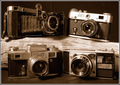
| 12/11/2005 08:36:52 AM | From Russia with Loveby edmengComment: Hello from the Critique Club!
I have studied your image and have the following to offer:
Composition/perspective – the composition of this shot is very well done. Placement of the cameras was well thought out and very nicely executed. Not pointing directly at any of the lenses adds a lot of strength. The wood is a very nice element and adds a very nice contrast between the hard elements of the cameras and the softer wood grains and textures. Very nice aspect of the scene. The focus seems just a bit on the soft side – I find this a plus (intentional?) and really helps to add to the nostalgic mood of the scene. The processing (see below) is also another element that just adds to the mood and the perfect choice. I don’t think this would have been as strong if done in pure black and white. The top right hand camera is a little bright, but the camera ID is still clearly visible so nothing is really lost. Overall, very well done composition.
Color – b/w, processed to sepia, I think this is one of the stronger elements of this composition. Pure black and white I don’t think would have translated the mood of this shot as well as the sepia does. Excellent choice!
Lighting – not too bright although a little on the bright side. Shadows are well controlled and there are no really bright or dark areas where detail is lost. Placement was well thought out as the reflections all seem well placed/controlled.
Challenge requirements – certainly meets the requirements of the challenge. Strong subject objects that capture the interest right away really help this image stand out.
Overall/my opinion – there are a lot of subtle elements in this shot that give it a unique look and feel – the wood, placement of the cameras – slightly opposing, the slight angle of the top camera lend to it being more natural as opposed to a perfect set up job. Well done!
|  Photographer found comment helpful. Photographer found comment helpful. |
| 12/10/2005 09:57:20 AM | COLLECTIONby KRAZY2101Comment: Hello from the Critique Club!
I have studied your image and have the following to offer:
Composition/perspective – the amount of area covered by your shot is good. The relative placement of the subjects is also quite good. They are even throughout the shot while not being crowded or too spread out. I like the mix of base elements in the shot – water, plants, stone wall. The crop may be a little tight on the right side, but the birds are not cut off so that helps it there a bit. The focus seems a little off. This may be more camera shake than focus though, hard to tell. Your relative position to the subjects is nice – not too much above or below. This really works with the combination of birds – flying, swimming, walking/standing. Very nice mix and one of the stronger elements of the shot. The size of the shot is one of the weaker points (see below) and can be corrected. Some sharpening applied to the shot would help to define more of the textures in the scene – the stone wall, reeds in the background, feather definition on the foreground birds and wing detail of the flying birds.
Color – adjustments in contrast and saturation would help to separate the like colored elements. The lighter green of the reeds would contrast better against the dark green water. This would also help with the top standing bird to not blend so much into the stone wall.
Lighting – natural light, dealt with fairly well. The two flying birds appear to be blown out a bit in the white areas – much brighter than the rest of the image. Some of this can be seen as well on the neck of the swimming pelican. Some adjustment in levels may have eliminated this.
Challenge requirements – although this is a nice group of birds, it doesn’t really meet the requirements of Collections except in the very broadest sense. It may have lost some with the voters in this area.
Overall/my opinion – a nice scene that with some adjustments or slightly different adjusts made in post processing could help to strengthen it. I noticed in your comments you said they were small to make the 150k limit. There are many ways to resize and compress an image to make the limit and still have a larger image – 640 x 640. If this is something you are unsure how to do or would like to learn other methods, you can search the forums and find many threads about this. Also, posting a question in the forums will definitely get you helpful responses. If you PM me I will also help as much as I can.
| | Photographer found comment helpful. |
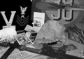
| 12/10/2005 09:32:36 AM | Spoils Of Warby CaitlynComment: Hello from the Critique Club!
I have studied your image and have the following to offer:
Composition/perspective – At first look, the image appears to be out of focus. Looking deeper I see that it is more of a DoF situation. The plane of focus appears to be the very back of the image. This leaves the foreground to stand on its own. This may have hurt the image some. Being a little busy in the foreground does not translate well with it being slightly out of focus. It makes it look busy and somewhat separate as opposed to part of the composition as a whole. The uniform being partial is ok, but the sign becomes a bit of a distraction being cut off. It may have helped to adjust your object placement/distance to subject to show the whole numbers at least. There is also a small white patch between the sigh and uniform that could have been removed or objects adjusted to hide it. The only other objects I find distracting are the objects next to the bag at the bottom of the sign. Not sure what they are, but they lack any real definition or indication of what they are which makes them appear as though they do not belong in the scene.
Color – b/w, the conversion overall seems to have been done fairly well. There is a little imbalance between some of the black areas – the uniform appears very black while some of the black/darker objects in the foreground appear to be starting the shift to grays. The whites in some areas appear a little bright, but not overly so.
Lighting – this looks like a flash shot or at minimum a single light source. This is one of the strongest elements of the shot. The scene is evenly lit and nothing is obscured by dark shadows and there are no bright spots/glares. Well done!
Challenge requirements – there is no doubt this meets the requirements. A unique choice of collections to portray.
Overall/my opinion – in my opinion this could have been a much stronger entry if the focus/DoF was adjusted a bit. I think this may have played a role in the voters acceptance of the shot. The collection itself works off a strong topic and the image would have contained a much stronger emotive force.
| | Photographer found comment helpful. |
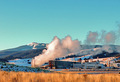
| 12/09/2005 06:01:04 PM | Silcion Mountainby linda12201Comment: Hello from the Critique Club!
I have studied your image and have the following to offer:
Composition/perspective – I think your distance to your subject is pretty good, but there is too much image to support it nicely. Being so far away you lose a lot of the structure detail, but you gain the nice view. Perhaps cropping off the left side of the image and maybe a little off the top before resizing would allow an overall larger image (closer to 640x640). On the right side of the image the buildings are cut off. However, there seems to be a break between the buildings just in front of the white stack. Cropping between the buildings would allow the one to be complete while eliminating the one that isn’t. I am not sure about the grass in the foreground. Perhaps if sharpened a bit more to show more of the detail would help it as an element of the shot. But as is it just seems to take up the bottom of the picture with no real purpose. It is not necessary to show your distance. The focus front to back in the image is done well. But again, a little sharpening would help to define the details of the building.
Color – the colors are very vibrant in this image. But some of the white areas look artificially blue (to the left of the steam, on the hill in the background to the right. Perhaps it is just the way the sun is hitting the snow near those areas making the shadows look that way. The saturation might be a little high – the red staircase for example.
Lighting – natural light, most of the image appears to be in the same light with some areas in shadow. The steam has a large bright spot on it I find a little distracting. The detail though is still present in most of the image – the trees on the hills. Some detail is lost though in the confusion just in front of the plant.
Challenge requirements – for industrial it meets the challenge requirements well.
Overall/my opinion – as stated above I think a different crop may make this a stronger image as well as some sharpening. A pet peeve of mine, but may have hurt you some with the voters – the spelling error in your title. Gives the impression you don’t really care enough about your image to spell the title correctly.
Message edited by HBunch - Fixing CC glitch. |
| 12/09/2005 05:59:18 PM | |
| 12/09/2005 03:48:05 PM | boudoirby nolockComment: Hello from the Critique Club!
I have studied your image and have the following to offer:
Composition/perspective - there are some subtle elements in this image that help it work - the lines in the floor, the geometry between them and the corner of the bed, the shoe crossing an intersection (on purpose? if not, nice accident). The focus seems a bit soft - I am assuming you were going for this as it suits the scene quite well. The top of the drapes is a little bright, perhaps cropping lower a bit would remove that and not hurt the image at all. The angle of approach to the subject is quite nice - not directly down, a smooth approach from a short distance. This really works well here. Allows the subject items to have a lot more definition. The edge of the bed is also a little bright. Not sure what could have been done there. It isn't really a distraction, but it does stand out in stark contrast to the overall yellow hue to the shot. Obviously I have no idea how hard it would have been, but perhaps if the bed was moved a bit, the subject items could all have been in the reflection from the window. I like them being off the corner of the bed though.
Color - the whole image has a yellow hue or tint to it. This doesn't hurt the image and helps to set the mood. The black and red of the subject items stand out nicely against this.
Lighting - it appears to be natural all from the window and is well controlled. Except for the areas pointed out above as being bright, the whole image is evenly lit. The detail in the bedspread is not lost and the grain patterns in the floor are clearly visible. Well done!
Challenge requirements - certainly conveys the concept of adulthodd and there definitely are no adults in the shot. Meets the challenge requirements nicely. No question what you were going after.
Overall/my opinion - for a minimalistic setting, the mood of this shot is strong. Based on your description you were able to translate your idea to this image quite well. I think the area that weakened it with the voters a bit is the overall yellow. But, in my opinion, good image and well done! |
| 12/08/2005 06:53:58 PM | Pointe Shoes by angela_packardComment: So glad this won a ribbon. Very nice composition and well done photo. Despite the fact I can relate to this on many levels, the presence of the subject is strong and very well presented. Well done! | | Photographer found comment helpful. |
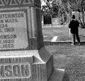
| 12/08/2005 06:22:27 PM | Asking Dad For Adviceby IndigoButterflyComment: Hello from the Critique Club!
I have studied your image and have the following to offer:
Composition/perspective – first off…very emotive shot. You have captured a mood and feeling quite well. The focus of the shot is good and the distance to the main subject adds to the strength of the image. I read your comments and agree with the tilted stone. It is a shame others didn’t see it. It does add to the mood of the shot as you wanted in my opinion. It is not easy visiting a grave and you added that element without an awkward addition to the photo that wasn’t there naturally. I do find the background a little distracting to the mood though. It looks like a tennis court or some other recreational area (??) The foreground stone being cut off is a good element – makes you focus immediately to your subject. Subject placement via rule of thirds is done quite well. The subject takes up just enough space to be a force, but not too much to make you wonder why he is there. I also like that you cannot see his face and his apparent uneasiness in the location (as evidenced by his foot being slightly off the ground). Really adds to his presence in the shot. Overall well done!
Color – b/w, the conversion was properly executed. The shades across the shot appear even and the dark and light areas you would expect to be the same in shade are. Well done!
Lighting – natural light…well controlled exposure. The texture of the grass and the lines in the stones are well preserved. The jacket appears a little dark, but overall it is a very even exposure that is pleasing to the eye.
Challenge requirements – may have lost a bit here with the voters. You have to be willing to accept the setting to appreciate the force of the image. I noticed a few comments that did not like the tilted stone. I don’t think they spent enough time on the image to absorb the context. Just my opinion.
Overall/my opinion – this is not a shot to be judged on the technicals. They have been handled quite well in the image. But the subject matter may be a little too close to home for some, and too hard for others to grasp for whatever reason. But it is a strong image that was well thought out and executed quite nicely!
| | Photographer found comment helpful. |
| 12/08/2005 05:46:57 PM | I've been everywhere....by mandyturnerComment: Hello from the Critique Club!
I have studied your image and have the following to offer:
Composition/perspective – right off I am struck by the illusion of leaning in this photo. This may have been enhanced by the crop/resizing, not sure. But the boot appears to be standing straight while the glasses directly behind it appear to be leaning slightly back. Placement of the glasses to the left (Paris/Australia) a little farther back may have prevented this. Not really a distraction, just a noticeable anomaly. Hard to tell exactly where the plane of focus is. The front of the boot appears to be it, but it gets lost in the clear glass with reflections on it. The glasses to either side which are farther back as well as the rear glasses all seem just slightly out of focus. The grouping is good, but perhaps if the boot was turned so the label showed, it would have helped eliminate some of the glare as well as helping the focus. The background is slightly off white. If this was whiter it might help to hide the glare on some of the glass since they all are clear and empty. Being off white, it makes the glare stand out more. However, on the other side of that, if it was whiter, the only part of the glare/shadow that appears to be an actual object (in the boot just to the right of the label) may also have been made more prominent. Tough call.
Color – the white is not fully developed and I think it would be a stronger image if it was. The control of the rest is good as evidenced by none of the green getting lost in the black around Las Vegas. Again this is evident in the London glass – the small bits of red still stand out and don’t get lost. Well done!
Lighting – perhaps could have been better. Hard to shoot clear glass against a white background, but it can be done. Overall, it appears as though this is natural light from a window (ha, just read your desc. And see it is a window, duh!). For the shot it is well done. The shadows are not overbearing and it is not so strong as to make the front surfaces of the glasses to just show reflection.
Challenge requirements – for collections this meets the challenge requirements fairly well. It is definitely a collection, but the glasses themselves, with the labels, cause you to look around the shot to read them as opposed to taking in the shot as a whole.
Overall/my opinion – the lighting perhaps is the weakest part of the shot. Using a custom white balance may have helped with the background which would have helped in this aspect. The shot has an overall ‘greenish’ tint to it. In my opinion, this may have been where it fell short with the voters.
| | Photographer found comment helpful. |
| 12/07/2005 05:41:34 PM | Industrial Bronzeby fotomann_foreverComment: To expand on my earlier comment and support my vote on this:
Composition - her pose looks very forced/fake. Like she is being yelled at to stand still or something. The skin, to me, is very unappealing in this setting. If there were beads of sweat to show activity, maybe, but as it is she just looks like she needs a shower. Her expression is strange and adds to the 'forced' look of her pose. Above the head there are two flares or errant sparks or possibly something in the background that make it look like her head is skewered (perhaps adding to the strange expression). I find the beams and structure elements in the background to be very distracting - below her arm, above the grinder to the left. The lighting across her chest/face is very bright and in conflict with the rest of the image.
Although she has a grinder in her hand, I don't get industrial from it. She could be in her garage working on a sculpture which is not industrial. Too ambiguous in my opinion. A grinder is not indicative of industry, just a power tool. Having her nude is totally unnecessary. A pair of dirty overalls with no shirt would have been just as good and stronger in my opinion. Saftey goggles would have added an element that would lend to industrial, but not necessary.
The focus seems slightly off or it is the color/processing. The line of her back has a distinct red line that is separate from the shadow. Whatever it is she is grinding on is not sharp either and the bright spots on them draw away from her face (might be a plus but I don't think you intended it that way).
The overall color...her skin looks yellow, not tanned or white (I have calibrated monitors and have viewed this image on three - I see the same on all). The browns and rust, if developed more, would offset that some. The background would have been better if all black and the faded objects in it were not visible at all or else completely visible to support an industrial setting.
EDIT: Typos only Message edited by author 2005-12-07 18:26:52. | | Photographer found comment helpful. |
|
Showing 891 - 900 of ~2097 |
Home -
Challenges -
Community -
League -
Photos -
Cameras -
Lenses -
Learn -
Help -
Terms of Use -
Privacy -
Top ^
DPChallenge, and website content and design, Copyright © 2001-2026 Challenging Technologies, LLC.
All digital photo copyrights belong to the photographers and may not be used without permission.
Current Server Time: 07/24/2026 05:03:13 AM EDT.
|