| Image |
Comment |
| 12/14/2005 07:12:33 AM |
|
| 12/11/2005 02:23:40 PM |
Eye for Colours by librodoComment: Hello from the Critique Club!
I have studied your image and have the following to offer:
Composition/perspective – very interesting perspective in this image. The angle of the camera to the subject sets up a very nice illusion. You are drawn to where the pencils are pointing, but once focused there it appears as though everything is radiating outward. Excellent placement via rule of thirds the focal point. Alignment and placement appears nearly flawless which really adds strength to the scene. Nothing distracting at all. Focus is very good and the DoF used really makes it work near to far across the image. Not much to say other than very well done! A simplistic idea executed very nicely and translated to a very appealing image.
Color – across the spectrum here obviously, but each seems to have retained the original hue. Saturation is good as no color appears flat at all. Against the black background is the perfect choice and really allows each shade to stand on its own.
Lighting – very well done! Everything is well lit and defined while at the same time no distracting glares or reflections off the shiny surfaces.
Challenge requirements – very creative way to meet the challenge requirements.
Overall/my opinion – very well done image! Extremely hard to critique as I find it pleasing to look at; simple yet manages to grab you right away. Very well done!
|
 Photographer found comment helpful. Photographer found comment helpful. |
| 12/11/2005 12:10:22 PM |
Industrial Bronzeby fotomann_foreverComment: Hello from the Critique Club!
I have already left an extensive comment very similar in style to my critiques. If you desire to have another opinion, please PM me and I will arrange it. |
| Photographer found comment helpful. |
| 12/11/2005 12:07:17 PM |
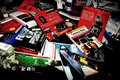
Book Collectionby shaverComment: Hello from the Critique Club!
I have studied your image and have the following to offer:
Composition/perspective – I am immediately hit with the crop on this image. I find the black areas at the bottom and on the lower right corner to be distracting. A slightly different crop and you may have been able to achieve an overall larger image – closer to 640x640 which would have put a lot more emphasis on the collection itself. At this distance to the shot it almost just looks like a pile of books as opposed to a collection of books. The focus is good, all the edges are clean and a lot of the text is clear, even the smaller text. Not sure why you used the exposure combination you did for this shot. I think it gives it sort of a removed look or a strange feel. Placement of the books may have been adjusted some to bring out more of the natural contrasts in the cover colors. Or even angle of approach of the camera to alter the center of focus. As it is it seems I am drawn to the two large areas of red while glancing over the rest. I also find the crop on the top a bit of a distraction, just looks too busy along the top for some reason.
Color – a lot of nice colors in the shot. May be a little over saturated – the appearance of some of the text against the colors is not as crisp as it could be. Red dominates the shot leaving the green to get lost which could have given a nice contrast. The darker covers could have been placed a little differently to help with some of the smaller areas of color.
Lighting – seems a bit dark overall while the white just below center appears very bright. A bit of a distraction and in conflict with the rest of the image. Good control over reflection off the glossy covers though. Some of the shadows are a bit dark, but these areas (above) could be cropped out.
Challenge requirements – meets the challenge requirements as far as a collection goes. All the books appear on topic so there is no dispute there. May have lost some with the voters in this area though. Some may have seen it as not very creative. Tough call.
Overall/my opinion – not sure what it is with the image, but just does not seem to have that element that makes it stand out. The lighting seems to set an awkward mood for the scene that just appears in conflict with the subject matter.
|
| Photographer found comment helpful. |
| 12/11/2005 11:04:19 AM |
The Ultimate Pez Collectorby gurlwithapenComment: Hello from the Critique Club!
I have studied your image and have the following to offer:
Composition/perspective – at first look it is very busy and the face is a bit of a distraction. All the dispensers appear just slightly out of focus. However, the edges of the dispensers are still fairly clean. This tells me the image needs to be sharpened a bit. Tried this and the difference is amazing. All the face detail on the dispensers comes out crisply and the whole image takes on a different look. I think it is nice you included the collector. But not sure it was necessary. Maybe in a different setting. Here I think she presents a conflict to the camera – being so close, the difference in height from the floor between the top of her face and the top of the dispensers is enough to affect the DoF. It appears as though the plane of focus is on her face which leaves the dispensers in the background. This takes away from them as the main subject. The dispensers themselves are a very strong subject as a collection with something almost everyone can relate to in the variety of figures. An adjustment in levels would help to minimize the floor and maximize the dispensers. A lot of the dispensers are yellow on the base, and even some of the red and green ones present and awkward contrast to the overall hue of the floor.
Color – there are a lot of colors in this shot. I think the hair color and the floor color present a hard contrast to the bright colors of the bases. After a levels adjustment, contrast adjustment really made a lot of the duller shades here stand out and made the stronger ones even richer and fuller. This also helped with the floor coloration.
Lighting – except for the bright spot which appears to be a flash or at least a single bulb, the overall appearance is a little on the dark side. The colors are so vibrant I feel a different setting with different lighting and this collection would be a lot stronger as a subject. Using a solid white or black background would have allowed a more complimentary lighting to be used.
Challenge requirements – excellent representation of a collection. The set up shows a creative idea that is well represented.
Overall/my opinion – I really think this collection has a lot of photographic potential. They are such great subjects and offer so many possibilities that I just don’t feel this scene meets that potential. I find the woman a distraction and as stated above really feel she presents a big conflict for the camera that didn’t need to be.
|
| Photographer found comment helpful. |
| 12/11/2005 10:30:09 AM |
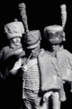
HUSSARby mia67Comment: Hello from the Critique Club!
I have studied your image and have the following to offer:
Composition/perspective – your angle and approach to the subjects is very nice. Being on eye level and looking level really adds a lot of mood and feel to the scene. Almost makes you feel as though the statue is actually walking towards you. Very well done. The DoF can go either way. As it is it works. Adds to the feel of them approaching and you are focused on the lead guy and the others are just following along. On the other hand, with just slightly different placement and a slight adjustment for DoF, a lot of depth could be added which would propel it farther to looking real and having a 3D quality. The focus is very sharp. The detail of the front subject is excellent. Even the two background subjects show a lot of fine detail. However, a small amount of sharpening and all the fine lines in the face and brim of the hat become very sharp and crisp and really adds a lot of definition. Another strong and natural appearing detail is the placement – with the two faces in half shadow and the one in full light, you again get the feeling that they are moving, as if passing by and something has caught the one’s attention. Very well done and strong image!
Color – b/w, well developed conversion. The subtle differences in tone of the various uniform parts is very well preserved. Not much to say here as the palette presents a pleasing image to the eye. The dark areas/shadows allow the figures stand out.
Lighting – this appears to be a single source from the one side. Very nice relationship to the camera. The dark shadows this produces allows the figures to stand out and gives them a lot of natural looking definition. This is almost a surreal effect as you almost expect them to start moving. I think this whole feel to the image is set up by the lighting. Very well done!
Challenge requirements – obviously they are ‘like’ statues which for the challenge requirements makes them a collection. While there are only three, they make quite a statement in this image.
Overall/my opinion – very interesting image with a lot of very nice aspects. The ‘almost real’ feel to the image is perhaps the strongest which makes it stand out. Really not sure why it didn’t do better. Technically not a bad photograph. A little sharpening is all I would do to it. Perhaps it was not viewed long enough for it to ‘work’ on the viewer. Well done!
|
| Photographer found comment helpful. |
| 12/11/2005 10:05:46 AM |
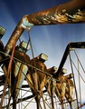
Night Shiftby labudsComment: Hello from the Critique Club!
I have studied your image and have the following to offer:
Composition/perspective – very strong perspective in this shot. Allows you to feel close, like the subject is looming over you while at the same time giving you a wide open feel with the sky and apparent size of the subjects. A real nice contrast that adds a lot of strength to the shot. The focus looks quite well done with only the foreground pipe being a little out of the depth of field. Not enough to be distracting as the rest of the scene is where your focus goes. The placement of the subjects is very nice – I find myself using the pipe as a lead to the top of the tanks which then I am led across the image. The mechanics work very well. It may have been better with a little more of the sky showing, or more of it not in cloud. There are only a few stars showing. This is the only connection to your title. It just would have been nice to see more of a connection. Overall I think this is a strong image that was very well executed.
Color – there are a lot of good strong colors in this image. The browns of the rust are maintained quite well and they present a very nice contrast to the lighter areas of metal. The dark rust against the sky across the top is a real nice contrast. The colors palette here has been well maintained and richly processed.
Lighting – for most of the shot the light appears to be what is there naturally and coming from the same direction. The only weak spot I see is the bottom of the foreground pipe. This appears to be lit differently which seems a bit awkward. Especially since the bottom of the background pipe is not lit at all.
Challenge requirements – certainly has an industrial feel and look in the scene. Even with the absence of buildings or other machinery, the theme certainly meets the challenge requirements.
Overall/my opinion – very well done composition with a lot of good texture and feel in the shot. Very serene, like the calm before the day shift comes on. The color retention is excellent. I would have liked to see more stars or even perhaps fewer clouds. The dark blue against the rust is a very nice contrast. Overall very well done!
|
| 12/11/2005 09:48:55 AM |
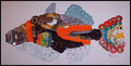
CD fishby sarnComment: This image was disqualified from the challenge. Due to the nature of the disqualification, I am not going to perform the critique of this image. Message edited by HBunch - Removed Critique Club status. |
| 12/11/2005 09:44:54 AM |
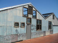
Blue Shedby bruxerComment: Hello from the Critique Club!
I have studied your image and have the following to offer:
Composition/perspective – the spatial relationships in this scene are well done. Not too much sky or roadway; just enough building. Entering and leaving the scene at the sides instead of the bottom is a very nice aspect to the shot. The building itself acts to lead you across the scene. The angle to your subject is a nice perspective allowing you to see the building in one sense as a whole and then in another as just a shell. Well done! The shot is well focused and shows a lot of detail and texture in the many elements. The red brick against the smooth steel is a nice contrast. I think this image fell short in the processing area. Sharpening just a bit brings out a lot more detail in the brick pattern and really makes the window frames stand out. It also helps to define the waves and dents in the metal siding. Slight adjustment in levels (the image has a great histogram to work with) really helps to define the light and dark areas and sets up many more great contrasts in the image. This gives the image a lot more depth as well as feel.
Color – A boost in contrast really makes the red brick stand out and develops the blue shades more. This gives the image a very rich tonal range and palette. This also helps to define the textures present.
Lighting – well controlled natural light. There are no overbearing shadows and no distracting bright areas. The exposure was well executed.
Challenge requirements – this may be one area where it fell a bit short with the voters. Although this does appear to be some sort of old plant, there is not really anything that says industrial. The buildings themselves could be any sort of building. There are no fixtures that say industrial. There is no old equipment or stacks or what most would be looking for in an industrial setting.
Overall/my opinion – this image has a lot of potential and can be much stronger on its own with some post processing. It is a little weak for the challenge, but is still a good image that has a lot to offer the viewer.
|
| Photographer found comment helpful. |
| 12/11/2005 09:03:58 AM |
Two Flaws In My Collection.by Peshaw-99Comment: Hello from the Critique Club!
I have studied your image and have the following to offer:
Composition/perspective – the composition is set up very centered.. The quarter is dead center in the image. A different crop to place this off center may have helped – more in line with the rule of thirds. Although this is a collection (see below) it is a theme that has been seen many times and with this one, even with the title and the apparent challenge to find the flaws, doesn’t have too much to make it really stand out and grab you. At first the overall focus seems off. Although the edges of the coins seem crisp, the detail of the coins is not. With a hard subject such as metal coins, the image would gain more strength if it was crisp. This tells me some sharpening is all it needs to make all the detail pop right out. There is one penny near the top that is much brighter than the rest. This draws attention to it immediately – even over the quarter. This is in contrast to the rest of the pennies that in general seem a little dark. With some levels adjustment the tonal range in the whole image can be developed more giving more balance to the light and dark areas. A boost in contrast would help to bring out the variations in the pennies colors and add a lot more interest to the photo by bringing out a lot of the rich tones across the image.
Color – the color here seems a little flat. The pennies have a lot of natural color variation and with the added patina of use, there is a wide range of excellent tones and shades that are not as developed as they could be. Using levels and contrast can reverse this nicely.
Lighting – not sure what the light source is here. Appears to be a single source or a flash. The quarter and the one penny seem to be the beneficiary of the light. The rest of the image seems a little dark. This may be due to the pennies not being flat and just did not pick up the light due to the angle they are laying on. A more directed light at an opposing angle to the camera to control reflections may have worked better.
Challenge requirements – although a little weak in my opinion, it is a collection, it is a very common subject – coins. There is just not enough ‘wow’ to the shot to make it stand out and this may have hurt in the voters eyes.
Overall/my opinion – this could be a much stronger image with a little post processing or slightly different post processing. Piles of coins/arrangement of coins is a common subject (seen in many challenges) and for one shot to stand out it needs some element that is unique or have just the right combination of factors that the viewer is immediately grabbed by the image. With the post processing mentioned in this critique (I downloaded the image and applied) the image turns into a whole new scene with lots of detail, lots of great color variations across the scene and a lot more appeal. The potential is definitely there.
|
| Photographer found comment helpful. |
Home -
Challenges -
Community -
League -
Photos -
Cameras -
Lenses -
Learn -
Help -
Terms of Use -
Privacy -
Top ^
DPChallenge, and website content and design, Copyright © 2001-2026 Challenging Technologies, LLC.
All digital photo copyrights belong to the photographers and may not be used without permission.
Current Server Time: 07/25/2026 11:19:05 AM EDT.