| Image |
Comment |
| 05/15/2006 07:47:25 AM |
The Kindergarten Teacherby scarbrdComment: Very nice portrait. The exposure is perfect for the environment aspect of this shot. The motion of the kids really emphasizes the subject very nicely. Well done! 10 |
 Photographer found comment helpful. Photographer found comment helpful. |
| 05/12/2006 08:02:43 PM |
clara and brienne.jpgby margiemuComment: The crispness and clarity of this photo is superb. It appears a bit over sharpened, but not so much that it becomes a distraction. it appears a bit bright. It also appears that a bump up in contrast would help to define the light and dark areas as well as emphasizing their presence. The crop is good and the DoF is good. You have captured their expressions well and the pose/composition is good.
Just a quickie... |
| Photographer found comment helpful. |
| 05/11/2006 06:39:43 PM |
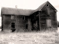
Abandonment - Sepiaby alfrescoComment: I like this composition. The building has a very strong presence. The processing really adds to the character of the structure and helps to keep it in its own time frame. Nicely done! |
| Photographer found comment helpful. |
| 05/11/2006 06:37:09 PM |
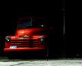
The Orange Truckby JutildaComment: Very nice image! The color in the truck is very well preserved and adds a really strong element to the shot. The dark shadow really helps to emphasize this aspect and serves to focus your attention. Gives it an 'emerging' feel. Very nicely composed and processed perfectly! Nice job! |
| Photographer found comment helpful. |
| 05/11/2006 05:47:16 PM |
Sunset Lakeby HedsIcComment: The only thing I don't like in this iamge is the boat. If it was stationary it would be a stronger element I think. Moving, in this shot, it becomes a distraction. |
| 05/11/2006 05:45:18 PM |
Overviewby GoodEndComment: I like the scene and the balance of sky and skyline. A little centered but it works. What i don't like is that none of the lines look sharp. |
| Photographer found comment helpful. |
| 05/11/2006 05:39:33 PM |
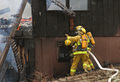
"Heads Up!" Falling Timber!by hahn23Comment: Hello from the DPC Critique Club!
I have studied your image and have the following to offer:
Composition/perspective: perfect placement to get just the right shot. Very nice subject placement. I am torn though, the left side of the image really has nothing to do with your composition and title combination and I find I am drawn to the fire there. The strength of your image is the fireman. I don't think it is overly distracting, but it does draw your attention a bit. However, overcoming that IS the strength of your subjects. They are caught in action, unaware of your presence and it really has an impact. The falling timber really sets up a nice element you have used very well with your title. It is a strong composition and certainly deserves attention. You definitely were in the right place at just the right moment. Very well done!
Color: the colors are well preserved and represented all across the image. Very nice contrasts and the fireman really stand out as the bright spots - they grab you right away. The flames and smoke are absolutely true in tone.
Lighting: very well used and controlled natural lighting. The dark areas still show full detail (the water in the window for example) and the brighter areas, particularly the flame and smoke, are clear and crisp.
Challenge requirements: I felt this was one of the strongest images in the challenge. It definitely is a photojournalistic image. It also was not forced/set-up which adds all the more strength. I could picture this on the front page of any local newspaper. Excellent job!
Overall/my opinion: as stated I thought this was a really strong entry for the challenge. It is powerful, has impact, and certainly portrays the situation extremely well. The processing applied preserved all the detail in the wood and burnt timbers - real nice textures - and was not overdone at all. I don't think I would change a thing. It really makes you feel like you are there. Very well done in every aspect. |
| Photographer found comment helpful. |
| 05/11/2006 12:01:28 AM |
H.O.B.by wmprkgComment: if only you knew what H. O. b. really meant...nice image |
| Photographer found comment helpful. |
| 05/10/2006 10:51:45 PM |
Leeds Welcomes Back Kaiser Chiefs in Millenium Squareby BobsterLobsterComment: Hello fron the DPC Critique Club!
I have studied your iamge and have the following to offer:
Composition/perspective: the balance in this shot is perfect. On one hand you are drawn right into the crowd and their enthusiasm. On the other hand you are drawn to the building in the background which gives it its political sense. Well thought out, even though it appears a spontaneous shot, and that is exactly what gives the image its strength. Your message, via title, is expressed perfectly and captures you instantly. Your angle of approach to the shot lends a real interesting element of apparent movement without motion blur that works well.
Color: well preserved colors throughout. The bright colors in the bio tubes in the foreground, that are so well captured, compared to the muted night colors of the background is very well done. Both retain their strength and present the local subjects perfectly.
Lighting: top half: very well controlled exposure to preserve and not distort the detail and gradations. Bottom half: extremely well controlled exposure for the foreground. The difficulty in balancing a dark background and a bright foreground (flash?) is so well done that both the top and bottom work not only together, but probably separaely as well.
Challenge requirements: very well met. Your message and intent is clear and well executed. I could picture this on a cover - rag or mag - very easily.
Overall/my opinion: at first glance you are drawn to the foreground, eliminating the background. But in the context of photojournalism, you are forced to look at the whole image and take in the combination of scene and headline. This image takes you to the exact point you should be at when viewing such a photo - the mood at the time - both sides. Very well done composition and and extremely well done image! |
| Photographer found comment helpful. |
| 05/10/2006 10:11:42 PM |
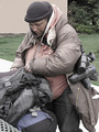
Homelessness on Rise Among Womenby aberrationComment: Hello from the DPC Critique Club!
I have studied your image and have the following to offer:
Composition/perspective: this was a hard one for me. I like the composition as it is. There is a lot of force in this image. I could definitely see this on the front page of a paper or a cover of a news pub along with the title you have applied. This is one of the stronger elements of this image. But as a commentor said previously, eye contact would have added a real strong emotive force that would have been hard to argue with. Your idea is strong and very well portrayed, but it could have been stronger with other elements attended to (see below).
Color: you didn't list processing details so this is a bit hard to critique. I don't know if you were going for the muted look to emphasize your point or if it is a shortcoming in processing. My opinion is that the colors could use a boost in saturation and contrast. They all seem flat where it appears that the only really flat color is her jacket and the building in the background. Overall it appears that the colors are muted and somewhat hovering around the same curve in the middle of the grayscale.
Lighting: well controlled natural lighting. Between the material of the bags and the items attached to her shoulder strap there was a lot of potential for flares, bright spots, abberations. None of these exist. The small white spot on her jacket still holds a lot of detail. This is a stronger element of this image and carries it, but color is a downfall (see above).
Challenge requirements: one of the stronger elements of the scene. Your message is clearly conveyed and there is no room for ambiguity/misinterpretation. The composition lends itself well to a front page image in that the subject and the message are both well contained within the frame. Very well done and good eye!!!
Overall/my opinion: you have met the challenge requirements very well.
It could use some work on the colors and processing end. But that should be easy to overcome. The hard part you seem to have down fairly well - subject, environment, composition. It would be stronger with eye contact, but as is is still a strong image. |
| Photographer found comment helpful. |
Home -
Challenges -
Community -
League -
Photos -
Cameras -
Lenses -
Learn -
Help -
Terms of Use -
Privacy -
Top ^
DPChallenge, and website content and design, Copyright © 2001-2026 Challenging Technologies, LLC.
All digital photo copyrights belong to the photographers and may not be used without permission.
Current Server Time: 07/23/2026 12:55:49 AM EDT.